Table of Contents >> Show >> Hide
- Why True Size Maps Matter
- 30 Real World Maps That Reset Your Brain
- 1. Greenland vs. Africa
- 2. Greenland vs. South America
- 3. Greenland vs. the Democratic Republic of the Congo
- 4. Greenland vs. Algeria
- 5. Greenland vs. India
- 6. Alaska vs. Libya
- 7. Brazil vs. the Contiguous United States
- 8. Brazil vs. Canada
- 9. China vs. the United States
- 10. China vs. Canada
- 11. Russia vs. Canada
- 12. Russia vs. Africa
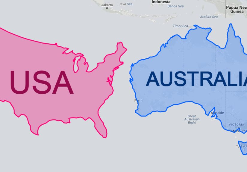
- 13. Australia vs. India
- 14. Australia vs. Brazil
- 15. Mexico vs. Greenland
- 16. Saudi Arabia vs. Greenland
- 17. Kazakhstan vs. Argentina
- 18. Algeria vs. Saudi Arabia
- 19. Libya vs. Mongolia
- 20. Peru vs. Chad
- 21. Niger vs. Mali
- 22. Angola vs. South Africa
- 23. Colombia vs. South Africa
- 24. Ethiopia vs. Bolivia
- 25. Tanzania vs. Nigeria
- 26. Pakistan vs. Namibia
- 27. Turkey vs. Chile
- 28. Spain vs. Thailand
- 29. Norway vs. Japan
- 30. The United Kingdom vs. Uganda
- What These Maps Actually Teach Us
- Experiences That Make True-Size Maps Stick
- Final Thoughts
- SEO Tags
Most of us grew up with a world map that looked perfectly reasonable. Europe sat proudly near the middle, Greenland looked like a hulking ice monster, and Africa somehow seemed big but not that big. Then you see a true-size country map for the first time and your brain makes the same noise an old laptop makes before it restarts.
That shock comes from projection distortion. The famous Mercator projection is terrific for navigation because straight lines can represent constant compass bearings, but it stretches land farther from the equator and shrinks the psychological importance of places closer to it. In other words, it is a useful sailor’s tool that somehow became the classroom celebrity. Great for ships. Not always great for your sense of scale.
That is why real world maps that compare the true size of countries are so satisfying. They do not just correct trivia. They reset how you think about power, distance, climate, culture, travel, and history. A country that looked “small” on a wall map can suddenly sprawl across half a hemisphere when moved north. A place that looked gigantic can shrink like a wool sweater in hot water when dragged toward the equator.
Why True Size Maps Matter
Every flat map has to make trade-offs. You can preserve some combination of direction, shape, distance, or area, but not all of them at once. That is the cartographic version of “choose two and try not to complain.” If your goal is comparing the actual size of countries, equal-area views and true-size overlays are far more helpful than the familiar Mercator look.
That matters because map size affects perception. When some countries are visually inflated and others are visually deflated, people end up with a warped mental map of the world. Suddenly, countries near the poles look like the main characters, while countries near the equator get reduced to supporting cast. True-size maps fix that problem in the most dramatic way possible: by letting your own eyes do the correcting.
30 Real World Maps That Reset Your Brain
1. Greenland vs. Africa
This is the grand champion of map surprises. On many traditional world maps, Greenland looks close to Africa in size. In reality, Africa absolutely bulldozes that illusion. Put Greenland over Africa on a true-size map and it stops looking like a giant continent and starts looking like what it is: a much smaller landmass wearing excellent PR.
2. Greenland vs. South America
Mercator maps make Greenland look weirdly competitive with South America. Real world maps shut that down immediately. South America is dramatically larger, and the comparison is so lopsided that it feels like your old classroom atlas owes you an apology.
3. Greenland vs. the Democratic Republic of the Congo
Here is a comparison that really scrambles expectations. Greenland looks enormous in many people’s heads, yet the Democratic Republic of the Congo is in the same general size neighborhood. A true-size overlay turns this from a fun fact into a full-blown worldview correction.
4. Greenland vs. Algeria
Algeria rarely gets talked about in “largest places on Earth” conversations, but it is huge. Slide Greenland over North Africa on a true-size map and Algeria holds its own beautifully. It is one of those comparisons that makes you realize the equatorial and subtropical world has been getting visually shortchanged for years.
5. Greenland vs. India
India often looks modest on distorted world maps because it sits closer to the equator. Move its outline north, however, and it suddenly feels much more like the continental-scale heavyweight it really is. Comparing India with Greenland is a fast cure for bad map habits.
6. Alaska vs. Libya
Alaska looks monstrous on Mercator maps, as if it might detach and swallow Canada for a snack. In reality, Libya is slightly larger. This is one of the best true-size map comparisons because it clashes so hard with what many Americans were taught to picture.
7. Brazil vs. the Contiguous United States
Brazil is one of the most underappreciated giants on the planet. On many standard maps it looks large, sure, but not that large. Then you compare it with the contiguous United States and realize Brazil is bigger. Suddenly South America stops feeling like a side table and starts looking like the giant furniture piece it is.
8. Brazil vs. Canada
Canada looks huge on Mercator projections because high-latitude countries get the visual inflation package. Brazil, by contrast, tends to look smaller than it deserves. On a true-size map, Brazil comes much closer to Canada than many people expect, which is a nice reminder that tropical countries are not “small” just because old maps treated them that way.
9. China vs. the United States
This one is less about shock and more about nuance. Real world maps show that China and the United States are remarkably close in overall area. Depending on how people imagine those countries from standard maps, they are often surprised that the matchup is basically a heavyweight fight rather than a landslide.
10. China vs. Canada
Canada’s northern location makes it look almost absurdly large on common projections. Yet true-size maps reveal that China is right there in the same league. It is a great example of how “looks gigantic on the wall map” and “is gigantic in reality” are not always identical statements.
11. Russia vs. Canada
Both countries look huge even before distortion enters the chat, so this comparison is less about correction and more about calibration. Russia really is larger than Canada, but true-size maps help you see the difference without Mercator turning the north into a cartographic bodybuilder contest.
12. Russia vs. Africa
Russia is the largest country in the world, which makes it a favorite in size debates. Then you place it over Africa and the continent still wins comfortably. This map is the geographic equivalent of learning that the “small coffee” is secretly a bucket.
13. Australia vs. India
Many people think of India as dense, busy, and somehow smaller than it really is. Australia gets imagined as a giant island continent with endless open space. True-size maps show that Australia is larger, yes, but not by the kind of comic-book margin some people assume.
14. Australia vs. Brazil
This is another terrific Southern Hemisphere comparison because neither country gets the same visual ego boost as northern giants. On a true-size map, Brazil comes out larger than Australia, which often surprises viewers who unconsciously think in Mercator proportions.
15. Mexico vs. Greenland
Mexico feels “medium-sized” on most classroom maps, while Greenland looks like a hulking frozen kingdom. Put them into a true-size comparison and the gap becomes much smaller than people expect. It is a fantastic example of how latitude can mess with your instincts.
16. Saudi Arabia vs. Greenland
Saudi Arabia and Greenland sit in a surprisingly similar size bracket. That sounds ridiculous until you see the overlay. This is one of those maps that makes people lean closer to the screen, squint dramatically, and question every poster they ever had in fifth grade.
17. Kazakhstan vs. Argentina
These two countries live on opposite sides of the planet and almost never share a conversation, but true-size maps show they belong in the same broad area class. It is a reminder that world geography gets more interesting the second you stop treating continents like separate trivia decks.
18. Algeria vs. Saudi Arabia
Put Algeria and Saudi Arabia side by side and you get a brilliant “desert giant vs. desert giant” comparison. Both look different depending on projection, but true-size maps reveal that they are much closer in area than many casual map readers would guess.
19. Libya vs. Mongolia
These countries do not usually get paired in geography quizzes, but they should. Libya and Mongolia belong to the same general size neighborhood, and comparing them works especially well because they occupy very different regions and climates while still landing in a similar map footprint.
20. Peru vs. Chad
This might be the sleeper hit of the list. Peru in South America and Chad in Africa are far apart culturally and geographically, yet true-size maps show them as near peers in area. It is the kind of comparison that makes the world feel both larger and more connected at the same time.
21. Niger vs. Mali
These neighbors already look substantial on African maps, but true-size comparisons help show just how much land they cover. Both countries are enormous, and seeing them in an equal-area context reinforces how wildly underrated the scale of the Sahel is in popular imagination.
22. Angola vs. South Africa
South Africa gets more global attention, but Angola is larger in area. A true-size map makes that immediately obvious. It is a neat correction for people who tend to equate media visibility with geographic scale, which is not how maps work, no matter how much the internet tries.
23. Colombia vs. South Africa
These two countries look like they belong in different size categories until you compare them properly. South Africa is somewhat larger, but Colombia is right there in the same general tier. Real world maps are excellent at exposing how much Mercator-style thinking has warped our expectations.
24. Ethiopia vs. Bolivia
This is a wonderful comparison because it spans two continents people often picture very differently. Ethiopia and Bolivia occupy almost the same area class, and a true-size map makes that instantly memorable in a way a textbook sentence never could.
25. Tanzania vs. Nigeria
Nigeria tends to dominate headlines and population discussions, while Tanzania feels quieter in global coverage. But when it comes to land area, Tanzania is larger. True-size maps are especially good at separating “important in the news” from “huge on the ground.”
26. Pakistan vs. Namibia
These two look like they belong to entirely different map categories until you compare them honestly. Namibia, despite feeling visually tucked away on many maps, stands close to Pakistan in area. Again, this is what true-size maps do best: they punish lazy assumptions.
27. Turkey vs. Chile
Turkey looks broad and central; Chile looks long, thin, and almost too elegant to be that large. Yet in area terms they are surprisingly close. A true-size overlay helps you remember that shape can be deceptive. Long and skinny can still cover a lot of turf.
28. Spain vs. Thailand
Europe often looks oversized on traditional maps, which can make a country like Spain feel bigger than it really is. Compare Spain with Thailand on a true-size map and the relationship becomes much more grounded. They are far closer than casual map memory suggests.
29. Norway vs. Japan
Norway gets stretched impressively on many maps thanks to latitude and shape, while Japan looks comparatively restrained. Real world maps reveal a much tighter contest. This comparison is a master class in how northward placement can fool the eye.
30. The United Kingdom vs. Uganda
This one tends to stop people mid-scroll. The United Kingdom appears larger than it really is on many familiar maps, while Uganda rarely gets any visual exaggeration. On a true-size map, they land astonishingly close, which is exactly the kind of twist that makes this whole topic addictive.
What These Maps Actually Teach Us
The best lesson from true-size country maps is not that one projection is “good” and another is “bad.” It is that maps are tools, and tools should match the job. Mercator still makes sense for navigation and for certain kinds of digital mapping. But if you want to compare country area, it is about as helpful as measuring flour with a coffee mug that changes size near the poles.
True-size maps also make geography feel less abstract. They remind us that Africa is vast, South America is more imposing than many people realize, and countries in the global south have been visually minimized by the maps many of us memorized as kids. That does not just affect trivia night. It affects how people imagine markets, conflicts, migration, climate zones, distances, and even cultural significance.
Experiences That Make True-Size Maps Stick
The funny thing about true-size maps is that they do not feel educational at first. They feel personal. You drag a country around the screen, watch it grow or shrink, and suddenly realize you were not merely missing a statistic. You were carrying around a visual myth. That moment lands differently than reading a number in an atlas. It feels like catching your own brain cheating on a test.
People often describe the first experience with a true-size map in the same way: disbelief, then laughter, then a weird urge to compare everything. Greenland over Africa. Brazil over the United States. India dragged north until it starts looking like a planetary heavyweight. It becomes a game, but one with consequences. The longer you play, the more obvious it becomes that map design quietly shaped your assumptions for years.
Teachers love this topic for a reason. A student can forget a lecture about projection theory in a week, but they will remember the instant they saw Africa swallow comparison after comparison on a true-size overlay. Travelers get the same jolt. Suddenly a flight across one African country or one South American country looks less like a hop and more like a serious journey. News readers feel it too. Stories about weather, trade, migration, and conflict start making more sense once the map in your head stops lying to you.
There is also something oddly humbling about the experience. Many of us assume we know the world because we can point to countries on a map. But knowing where something is and understanding its scale are not the same thing. A true-size map exposes that gap instantly. It reminds you that geography is not just location. It is proportion. It is relationship. It is the difference between thinking a place is a small patch on the page and realizing it stretches across climates, ecosystems, languages, and time zones.
And maybe that is why these maps spread so easily online. They give people the rare pleasure of being corrected in a visually satisfying way. No scolding, no quiz, no smug textbook voice. Just a shape, a drag, a drop, and the sudden realization that the world is bigger, stranger, and less centered on your old wall map than you thought. That is a great experience for students, travelers, readers, and honestly anyone whose geography education came with a side of Mercator distortion. Which is to say: most of us.
Final Thoughts
If you only remember one thing from these 30 real world maps, let it be this: the world is not shaped the way your childhood map taught you to imagine it. Countries near the equator are often much larger than they look. Countries near the poles are often much smaller than their inflated reputation suggests. And once you start seeing the true size of countries, you cannot really unsee it.
That is a good thing. Better maps make better questions, better comparisons, and better understanding. They do not just tell us where places are. They help us understand what those places really mean in the scale of the world.