Table of Contents >> Show >> Hide
- Before You Start: Pick the Right Organizer “Shape”
- Way 1: Make a Hand-Drawn Organizer (Fast, Flexible, Zero Login Screens)
- Way 2: Build One in Google Docs Using the Built-In Drawing Tool
- Way 3: Use Slides (Google Slides or PowerPoint) for Clean, Print-Ready Layouts
- Way 4: Start With Templates in Dedicated Diagram Tools (Best for Collaboration)
- Way 5: Use Printables + “Hybrid” Building (Sticky Notes First, Digital Later)
- Common Mistakes (and How to Fix Them Without Crying)
- Conclusion: Your Organizer Should Make Thinking Easier, Not Prettier
- Experiences & Lessons Learned (The Real-World Stuff People Don’t Tell You)
- 1) The first draft is always uglyand that’s the point
- 2) “More boxes” doesn’t mean “more learning”
- 3) The best organizers include a “question zone”
- 4) Collaboration changes the game (and reveals hidden assumptions)
- 5) Transfer is the real superpower
- 6) The organizer is not the final productit’s the bridge
- 7) A small tweak can make an organizer dramatically more effective
A graphic organizer is basically a GPS for your brain: it shows where your ideas are, where they’re going, and which ones are
taking weird detours through “Wait… what was my point again?”
Whether you’re a teacher planning a lesson, a student wrestling with a research project, or an adult trying to turn a chaotic meeting into
something that resembles “a plan,” graphic organizers help you see relationshipsmain ideas, supporting details, cause-and-effect,
compare-and-contrast, timelines, processes, and more.
The best part? You don’t need fancy software or an art degree. You need a goal, a shape, and five minutes of willingness to be slightly messy.
(Messy is normal. It’s how ideas arrivelike toddlers covered in peanut butter.)
Before You Start: Pick the Right Organizer “Shape”
“Graphic organizer” isn’t one thingit’s a whole family of visual tools. Choosing the right format makes everything easier.
Here’s a quick match-up:
- Venn diagram: compare and contrast two (or three) things.
- Mind map: brainstorm freely, then cluster ideas into categories.
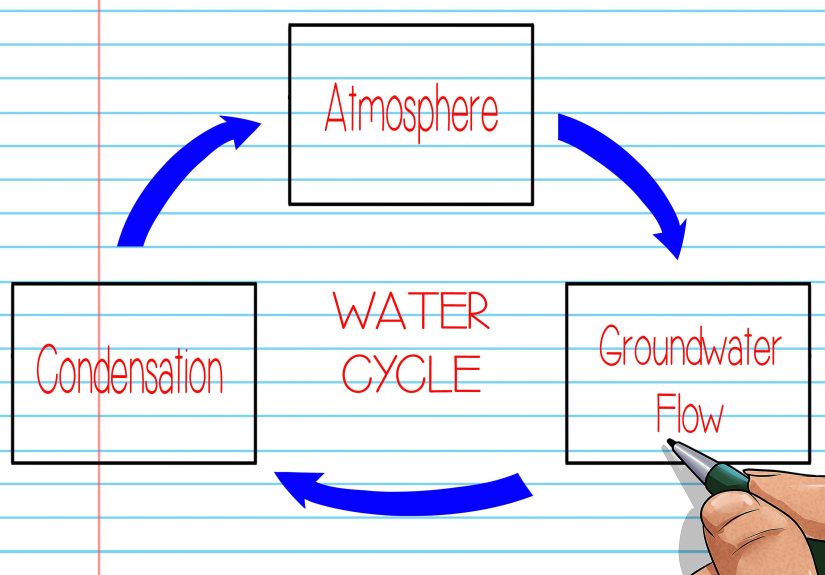
- Concept map: show relationships with labeled links (great for “this leads to that” thinking).
- Flowchart: map a process, decision path, or “if this, then that.”
- Timeline: sequence events in order (history, projects, narratives).
- Main idea + details web: keep reading/research notes from turning into spaghetti.
- Cause-and-effect chain: track triggers, results, and ripple effects.
- Writing organizer: plan an essay, paragraph, or argument with claims and evidence.
Now that you’ve got your “shape,” here are five practical ways to make a graphic organizerranging from
low-tech to super-collaborative.
Way 1: Make a Hand-Drawn Organizer (Fast, Flexible, Zero Login Screens)
The classic: paper + pencil + a willingness to draw a circle that may or may not resemble a potato. Hand-drawn organizers are perfect for quick
planning, informal brainstorming, and situations where you don’t want technology to “help” you by updating and closing your tab.
How to do it
- Write the goal at the top (one line): “Compare solar vs. wind,” “Plan my essay,” “Map the lab procedure.”
- Choose your format: Venn, mind map, flowchart, timeline, T-chart, etc.
- Sketch lightly first so you can resize areas (because you will underestimate how much you have to say).
- Fill in big ideas before details. Think “headlines,” then “supporting facts.”
- Use cues: arrows for cause/effect, brackets for grouping, icons for categories (⭐ = key idea, ❓ = question, 🔍 = research needed).
Example you can steal
Reading organizer (main idea + details): Put the main idea in the center. Around it, add 3–5 “detail bubbles” with evidence:
quotes, statistics, examples, or page numbers. If you’re studying, add a final bubble called “So what?” for the takeaway.
Pro tips (so it doesn’t turn into a doodle festival)
- Leave extra space in every box. Your brain always has “one more thing.”
- Color-code lightly: one color for main ideas, another for evidence, another for questions. Keep it simple.
- Don’t worship perfection. The organizer is a tool, not a museum exhibit.
Way 2: Build One in Google Docs Using the Built-In Drawing Tool
If you live in Google Docs (or your school/work does), this is a smooth way to create a digital graphic organizer without switching
to a separate app. You can insert shapes, connectors, and text boxes right inside your documentthen edit it later.
How to do it (Google Docs)
- Open a Google Doc.
- Go to Insert → Drawing → New.
- Add shapes (circles, rectangles), lines/arrows, and text boxes.
- Use alignment tools so your organizer doesn’t look like it was made during an earthquake.
- Click Save and Close to drop it into the doc.
When this works best
- Writing organizers: outline claim → reasons → evidence → counterclaim.
- Research organizers: topic → subtopics → sources → notes → “what I still need.”
- Small flowcharts: simple processes, decision trees, quick procedures.
Pro tips
- Duplicate shapes to keep sizes consistent (copy/paste is your best friend).
- Label arrows when relationships matter (“causes,” “leads to,” “contrasts with”). It’s a concept-map superpower.
- Make it printable: test-print once. Boxes that look roomy on screen can feel tiny on paper.
Way 3: Use Slides (Google Slides or PowerPoint) for Clean, Print-Ready Layouts
Slides aren’t just for presentations. They’re secretly fantastic for building graphic organizers because you get a big canvas, easy shape tools,
and simple exporting. Plus, it’s easy to make a “template” slide you can reuse again and again.
How to do it
- Create a new slide deck.
- Pick a blank slide layout.
- Insert shapes for boxes/bubbles and connectors for arrows/lines.
- Add short text (keep it scannableyour eyes should glide, not crawl).
- Export as PDF for printing or sharing.
Example formats that shine in Slides
- Timelines: perfect spacing and consistent formatting.
- Cause-and-effect chains: boxes + arrows that don’t wiggle around.
- Story maps: “characters, setting, problem, events, resolution” with clean sections.
Pro tips (a.k.a. “avoid the floating-box tragedy”)
- Use “Align” and “Distribute” tools so spacing looks professional.
- Group elements (box + text + arrow) once they’re positioned.
- Design for the reader: large text, plenty of white space, and a clear path for the eyes.
Way 4: Start With Templates in Dedicated Diagram Tools (Best for Collaboration)
If you want a polished organizer quicklyor you’re working with a groupdedicated diagram and template platforms can be a lifesaver. Many offer
ready-made templates for Venn diagrams, mind maps, concept maps, and flowcharts,
plus real-time collaboration.
The secret to using templates well is simple: don’t just fill blanksadapt the structure to match your purpose. Your goal is clarity,
not “I used every box the template gave me, so… victory?”
How to do it (template-first workflow)
- Search templates by task: “compare and contrast,” “argument map,” “research notes,” “sequence of events.”
- Choose one that fits your objective (not just the prettiest one).
- Rename headings to match your content: “Claim,” “Evidence,” “Source,” “Impact,” “Theme,” etc.
- Delete what you don’t need and enlarge what you do (usually the evidence section).
- Share or export (PDF/PNG) depending on how people will use it.
When this is the best option
- Group projects (everyone can contribute without emailing 47 versions named “Final_FINAL_v9_REALLYFINAL”).
- Complex relationships (concept maps with labeled links, branching processes, layered categories).
- Reusable templates for a class, department, or team.
Pro tips
- Lock the structure once it’s right, then focus on content.
- Use consistent verbs on arrows: “causes,” “influences,” “requires,” “contradicts.”
- Keep text short and attach details elsewhere (notes pane, comments, or a linked doc).
Way 5: Use Printables + “Hybrid” Building (Sticky Notes First, Digital Later)
Some brains think best with hands. If that’s you (or your students, or your team), go hybrid: start with physical piecessticky notes or index cardsthen
turn the result into a clean organizer you can keep and share.
Hybrid method: sticky notes → structure → final organizer
- Brain-dump: write one idea per sticky note (one claim, one fact, one event, one theme).
- Cluster: group notes into categories (themes, reasons, stages, characters, pros/cons).
- Label each cluster with a heading.
- Connect clusters with arrows or lines to show relationships.
- Capture: take a clear photo, then recreate the final version digitally or neatly on paper.
Why this works so well
- It makes revision painless (moving a sticky note is easier than rewriting a paragraph).
- It encourages real thinking before formatting.
- It’s great for writing: you can physically rearrange evidence until the argument “clicks.”
Printable templates as your shortcut
Printable graphic organizers are perfect when you want consistency (classrooms), quick access (homework), or structure that includes prompts.
Many printables also include filled-in examples, which helps users understand what “good” looks like.
Pro tips
- Use bigger paper than you think. A cramped organizer creates cramped thinking.
- Add an “extra ideas” box. That’s where the best insights like to hide.
- Teach the organizer: explain why this format fits this task (Venn for comparison, flowchart for process, etc.).
Common Mistakes (and How to Fix Them Without Crying)
Mistake 1: The organizer becomes a worksheet instead of a thinking tool
If you’re just filling blanks without learning anything, the organizer is doing the educational equivalent of “decorative pillows.”
Fix it by adding prompts that require meaning: “Why does this matter?” “What’s the relationship?” “What evidence supports this?”
Mistake 2: Too much text in every box
Graphic organizers work because they’re visual and scannable. Use short phrases. If details are needed, add a note number and keep fuller notes
in a separate document.
Mistake 3: Wrong format for the goal
Trying to do a timeline in a Venn diagram is like using a spoon to cut a steak. Sure, you can. But you’ll be tired and slightly angry.
Match the organizer to the thinking task.
Mistake 4: No space for revision
Leave breathing room. Or use the hybrid sticky-note method first, then commit to the final layout after your ideas settle down.
Conclusion: Your Organizer Should Make Thinking Easier, Not Prettier
A graphic organizer is successful when it helps you see what you know, what you don’t, and how ideas connectwhether it’s a hand-drawn
web, a Slides template, a Google Docs drawing, or a collaborative diagram tool. Start with the goal, pick the right structure, and build in a way that fits your
situation (and your patience level).
Make it clear. Make it usable. And if you accidentally make it pretty along the way… well, that’s just a bonus.
Experiences & Lessons Learned (The Real-World Stuff People Don’t Tell You)
People often assume graphic organizers are “for kids” or “for school.” Then they try one during a high-stakes momentplanning a proposal,
prepping for an exam, mapping a workflowand suddenly they’re like: “Oh. So this is what calm feels like.”
Here are some common experiences and practical lessons that show up again and again when people build graphic organizers in the real world.
1) The first draft is always uglyand that’s the point
The most useful organizers start out messy. The brain doesn’t deliver polished thoughts in matching fonts; it delivers fragments.
When you begin with a rough sketch (or sticky notes), you give yourself permission to explore. The clean version comes later.
This is especially true for mind maps and concept maps: at the beginning, ideas tend to sprawl like vines. After a few minutes,
patterns emergeclusters, repeated themes, and “Oh wow, these two ideas are basically cousins.”
2) “More boxes” doesn’t mean “more learning”
Many people have tried a printable organizer with 12 tiny boxes and discovered the universal truth: your handwriting does not shrink on command.
Overly complex layouts can turn thinking into cramped transcription. A better approach is to start with fewer sections and expand only where needed.
For example, an argument organizer might need extra space for evidence and counterarguments, but not for the introduction. The organizer should reflect
what matters most in the task, not what looks symmetrical.
3) The best organizers include a “question zone”
One practical habit that improves both studying and research is adding a dedicated spot for questions:
What do I still need? or What’s unclear? or What would prove this wrong?
People who do this consistently tend to move from passive review to active learning. It also prevents the classic problem:
finishing your organizer and realizing you copied information but didn’t actually understand it.
4) Collaboration changes the game (and reveals hidden assumptions)
When groups build a graphic organizer togetherespecially a process flowchart or a project plansomething hilarious and useful happens:
everyone discovers they were imagining a different process the whole time. One person thought “Step 2” meant “email the client.”
Another thought it meant “run QA.” A shared visual organizer forces the team to agree on definitions, sequence, and responsibility.
The organizer becomes a neutral referee: “It’s not me vs. you, it’s the arrow we drew.”
5) Transfer is the real superpower
A big breakthrough happens when people stop seeing graphic organizers as one-off worksheets and start seeing them as reusable thinking tools.
A Venn diagram isn’t “a school thing.” It’s a comparison machine. A flowchart isn’t “for computer science.” It’s a decision machine.
A concept map isn’t “extra work.” It’s a relationship machine. Once you recognize the underlying thinking skill, you can reuse it anywhere:
reading a dense article, planning a persuasive email, studying for a certification, outlining a speech, or mapping a customer journey.
6) The organizer is not the final productit’s the bridge
People sometimes get stuck trying to “finish” the organizer perfectly before moving on. But the organizer’s job is to help you produce the next thing:
a paragraph, a presentation, a study guide, a plan, a solution. A helpful mindset is to treat the organizer like scaffolding:
use it to build confidence and structure, then gradually rely on it less as the skill becomes internal. The goal is stronger thinking,
not a lifetime subscription to drawing boxes.
7) A small tweak can make an organizer dramatically more effective
Tiny changes often matter more than big redesigns. For example:
- Add “Because…” under every reason box to force explanation.
- Add “Evidence type” next to quotes (fact, example, statistic, expert) to deepen credibility checks.
- Add “Impact” after “Cause” so you don’t stop at the obvious first effect.
- Add “So what?” at the end of a timeline to connect events to meaning.
These micro-prompts keep the organizer from becoming a copy-and-paste graveyard and turn it into a thinking engine.
If you take nothing else from this section, take this: start simple, revise freely, and design for clarity.
Your future self will thank youprobably with less stress, better writing, and fewer “Wait, what was I doing?” moments.