Table of Contents >> Show >> Hide
- Why Bedroom Color Schemes Matter
- How to Choose the Right Bedroom Color Scheme
- Best Bedroom Color Schemes to Try
- Bedroom Color Schemes by Room Type
- Common Bedroom Color Mistakes to Avoid
- How to Build a Cohesive Bedroom Palette
- Final Thoughts on Bedroom Color Schemes
- Experiences and Real-Life Lessons With Bedroom Color Schemes
Your bedroom should feel like a deep exhale, not a caffeine shot in wall form. That is why choosing the right bedroom color scheme matters so much. The best palettes do more than look pretty in photos. They shape how the room feels when sunlight lands on the walls in the morning, when lamplight softens everything at night, and when you collapse onto the bed after a long day wondering why your inbox has such big opinions.
Great bedroom color schemes usually balance mood, light, and personality. Some people want a soft retreat filled with creamy neutrals and whispery blues. Others want a cocooning space with mossy green, smoky plum, or dramatic charcoal. Neither approach is wrong. The trick is knowing how color behaves in a real room and how to pair it with bedding, furniture, wood tones, and metal finishes so the whole space feels intentional.
In this guide, we will break down how to choose bedroom paint colors, which palettes work for different styles, how to avoid color mistakes, and how to build a room that feels restful without becoming boring. Because yes, beige can be beautiful. Beige can also look like a waiting room if you are not careful.
Why Bedroom Color Schemes Matter
Bedrooms are different from kitchens, entryways, and home offices. You do not need them to feel energetic every second of the day. Most people want a bedroom to feel calm, cozy, restorative, and personal. That is one reason soft blues, greens, warm whites, greiges, taupes, and other layered neutrals remain so popular. They are easy on the eyes and flexible enough to work with many decorating styles, from modern to farmhouse to traditional.
That said, restful does not have to mean colorless. Deep navy can feel elegant and protective. Clay and terracotta can feel grounded and warm. Dusty mauve can read like a sophisticated neutral. Sage can bring nature indoors without turning your room into a botanical sermon. The point is not to chase one “perfect” shade. It is to choose a palette that supports the way you want to live in the room.
How to Choose the Right Bedroom Color Scheme
1. Start with the mood you want
Before you pick a paint chip, decide how you want the room to feel. Calm and airy? Rich and moody? Warm and cocoon-like? Fresh and minimal? Your answer will instantly narrow the field.
- For a serene retreat: soft blue, muted green, pale gray-green, warm white, light greige
- For cozy warmth: taupe, mushroom, clay, caramel, dusty rose, cocoa brown
- For drama: navy, forest green, charcoal, aubergine, deep teal
- For cheerful softness: blush, buttercream, pale lavender, peachy cream
2. Pay attention to undertones
Undertones are the sneaky little plot twist in every paint color. A white may lean yellow, pink, gray, or green. A gray may feel warm and mushroomy or cool and steely. A beige can read creamy and inviting or oddly peachy once it hits the wall. If your bedroom color scheme feels “off,” undertones are often the culprit.
Look at your flooring, wood furniture, curtains, and even the view outside the windows. Warm oak floors usually play nicely with warm whites, greiges, olive greens, and earthy tones. Cooler finishes often work better with crisp whites, blue-grays, and charcoal shades.
3. Test the color in morning and evening light
Paint does not stay loyal. It changes throughout the day. A color that looks soft and elegant in a bright store can feel gloomy in a dim bedroom. A warm white may glow beautifully at sunset but look too yellow at noon. Always test samples on multiple walls and look at them in both natural and artificial light before committing.
4. Think beyond the walls
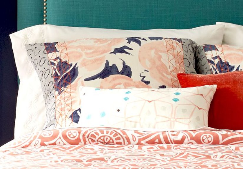
The strongest bedroom color schemes are not built from paint alone. Bedding, rugs, art, curtains, lampshades, and accent pillows all carry color. A soft green wall paired with ivory bedding, natural wood, and black accents feels modern. The same wall with floral linens and brass lamps feels classic and romantic. Same paint, totally different personality.
Best Bedroom Color Schemes to Try
Soft Blue and Warm White
This is a classic for a reason. Blue has long been a favorite for bedrooms because it feels peaceful, clean, and timeless. Pairing a muted blue with warm white trim, cream bedding, and sandy wood tones creates a room that feels fresh without feeling cold. It works beautifully in coastal, transitional, and cottage-inspired spaces.
Try it with: linen curtains, woven baskets, light oak furniture, and a textured ivory rug.
Sage Green and Ivory
Sage green is the friend who shows up calm, stylish, and somehow never overdressed. It adds color without shouting. Paired with ivory, beige, or soft white, it creates a natural, restful palette that suits modern organic, farmhouse, and minimalist bedrooms.
Try it with: matte black hardware, natural linen bedding, warm brass sconces, and walnut furniture.
Greige, Taupe, and Cream
If you love neutrals but do not want a bedroom that feels flat, layering is everything. Start with a greige or taupe wall, then bring in cream bedding, a deeper brown bench, and mixed textures like boucle, linen, velvet, and wood. The result is soft, sophisticated, and very nap-friendly.
Try it with: camel accents, off-white drapes, and a chunky knit throw.
Navy and Taupe
This palette feels tailored and grown-up. Navy brings depth and drama, while taupe keeps it grounded and livable. Use navy on all four walls for a cocoon effect, or try it on one accent wall if you want a gentler entrance into the dark-side club.
Try it with: brass lighting, white bedding, leather accents, and framed black-and-white art.
Clay, Terracotta, and Soft Beige
Warm earthy shades have become increasingly popular because they make a bedroom feel grounded and welcoming. Clay and terracotta have more personality than standard beige, but they still behave like near-neutrals when styled well. They are especially beautiful in rooms with lots of natural texture.
Try it with: cream plaster-like walls, rust pillows, wood nightstands, and woven shades.
Dusty Rose and Mushroom
Pink in a bedroom does not have to feel sugary or childish. Dusty rose, muted mauve, and pink-beige shades can read sophisticated, soft, and surprisingly versatile. Pair them with mushroom, taupe, brown, or black for a mature palette that feels warm and layered.
Try it with: dark wood furniture, champagne-toned metals, and off-white bedding.
Charcoal and Soft White
For people who love a moody bedroom, charcoal is a strong choice. It adds depth, contrast, and a little boutique-hotel drama. The key is balance. Pair it with soft white bedding, warm woods, and tactile fabrics so the room feels intimate rather than cave-like.
Try it with: oversized headboards, velvet pillows, and layered ambient lighting.
Lavender Gray and Cream
This one flies under the radar, but it is lovely. A lilac-gray or dusty violet can feel calming, elegant, and a little romantic without becoming too sweet. It works especially well in bedrooms that need softness but want more personality than white or gray alone.
Try it with: creamy whites, brushed nickel, pale wood, and soft floral artwork.
Bedroom Color Schemes by Room Type
Small Bedrooms
Lighter shades often help a small room feel more open, but do not assume white is your only option. Soft green, pale blue-gray, creamy beige, and blushy neutrals can also brighten the room while adding more character. If the bedroom lacks natural light, lean toward warmer versions of light colors to avoid a chilly look.
Large Bedrooms
Bigger rooms can handle darker and more saturated colors beautifully. Deep olive, navy, chocolate brown, and charcoal can make a large bedroom feel more intimate. If full dark walls feel like too much commitment, use the richer shade on trim, an accent wall, or built-ins.
Guest Bedrooms
A guest room usually benefits from a universally appealing palette. Think warm white and sand, pale blue and ivory, sage and cream, or soft greige with muted black accents. These combinations feel welcoming and easy to style without being too personal.
Kids’ and Teen Bedrooms
It is smart to keep the larger surfaces somewhat flexible. Instead of painting every inch in neon watermelon punch, use a softer base color and add more expressive shades through bedding, art, and accessories. Future-you will be grateful. So will the person holding the paint roller.
Common Bedroom Color Mistakes to Avoid
Choosing a color before checking the lighting
The same paint can look creamy, gray, green, or beige depending on the room. Test first. Regret less.
Ignoring texture
A neutral bedroom without texture can feel unfinished. If the palette is subtle, the materials should do more work. Layer quilts, throws, woven rugs, wood grains, upholstered headboards, and drapery to create depth.
Using too many competing colors
A bedroom is usually more successful when the palette feels edited. Choose one main color, one supporting neutral, and one accent. That structure gives the room movement without visual noise.
Forgetting the ceiling and trim
The ceiling and trim can either support or sabotage your palette. Sometimes the best move is a warm off-white. Sometimes painting the trim the same color as the walls creates a softer, more enveloping effect. A little coordination goes a long way.
How to Build a Cohesive Bedroom Palette
If you feel overwhelmed, use this simple formula:
- Pick one anchor color for the walls.
- Choose one or two supporting neutrals for bedding, curtains, or rugs.
- Add one accent color through pillows, art, or a bench.
- Repeat your warm or cool undertones throughout the room.
- Mix at least three textures so the palette feels rich.
For example, a calming bedroom color scheme might use sage walls, ivory bedding, and camel accents. A moody scheme might use navy walls, taupe curtains, and brass lighting. A romantic one might use dusty rose walls, cream bedding, and walnut furniture. When the palette repeats in different ways, the room feels polished rather than accidental.
Final Thoughts on Bedroom Color Schemes
The best bedroom color schemes are the ones that fit your home, your light, and your version of comfort. Some rooms call for breezy blues and airy whites. Others come alive with olive, clay, cocoa, or charcoal. Trends can offer inspiration, but they should not boss you around. Your bedroom is not a showroom. It is the place where you start and end your day.
So choose colors that make you feel relaxed, grounded, and happy to be there. Test samples. Watch them in different light. Layer in texture. Give your bedding and furniture a seat at the table. And remember: a beautiful bedroom does not require a rainbow explosion or a personality-free beige box. It just needs a thoughtful palette and a little confidence.
Experiences and Real-Life Lessons With Bedroom Color Schemes
One of the most common experiences people have with bedroom color schemes is realizing that the “perfect” paint color on a tiny sample card can behave like a completely different person once it covers four walls. A soft gray that looked elegant in the store suddenly turns icy. A warm white becomes surprisingly yellow at night. A pale blue that seemed dreamy under showroom lights ends up looking like a dentist’s office under cool LED bulbs. It happens all the time, and it is one of the biggest reasons people learn to respect test swatches.
Another real-world lesson is that bedroom color is rarely just about paint. Many homeowners start by choosing a wall color, then realize their existing wood furniture, flooring, curtains, and bedding are already telling a color story. A room with honey oak floors and beige carpeting often feels far better with warm whites, sage greens, or earthy taupes than with crisp blue-grays. On the other hand, a bedroom with black metal accents and cooler light may look sharper with smoky blues, charcoal, or a modern greige. In real spaces, color is a team sport.
People also discover that mood matters more than trends. Someone may love dramatic photos of dark green bedrooms online, then paint their own room and realize they personally prefer something brighter and lighter. Meanwhile, another person who always assumed white walls were safest may try a deep navy or cocoa brown and wonder why they waited so long. Bedrooms are personal in a way that living rooms often are not. The color has to feel good at 6:30 in the morning and at 10:30 at night, not just during a weekend scroll through inspiration photos.
There is also the experience of layering color slowly rather than making one giant leap. Many successful bedroom makeovers begin with a neutral base and build from there. Instead of painting the room bright terracotta immediately, someone might start with warm white walls, add rust pillows, a clay-toned throw, natural wood, and woven accents, then decide whether they want stronger color later. This approach reduces regret and often leads to a more thoughtful result. It is less “paint panic,” more “design wisdom.”
A lot of people learn through trial and error that small bedrooms do not always need plain white walls. In fact, a small room can feel more intentional and cozy with a muted green, dusky blue, or soft taupe. Dark colors can work too, especially when balanced with good lighting and lighter bedding. The experience surprises many homeowners because they expect dark walls to shrink the room, but sometimes the deeper shade blurs the edges and makes the space feel cocooning rather than cramped.
Perhaps the most useful lesson is that the best bedroom color schemes are the ones you enjoy living with every day. The room should reflect your habits, your light, your furniture, and your comfort level. Some people sleep best in cloud-like neutrals. Others feel most relaxed in moody, enveloping tones. The successful rooms are not always the fanciest ones. They are the ones where the color feels intentional, the layers feel comfortable, and the whole space gives off that quiet, settled feeling of “yes, this is exactly where I want to be.”