Table of Contents >> Show >> Hide
- Step 1: Start With What You Can’t (or Won’t) Change
- Step 2: Decide the Mood (Because “Nice” Is Not a Mood)
- Step 3: Learn the Secret HandshakeUndertones
- Step 4: Respect Lighting (It’s a Shape-Shifter)
- Step 5: Use LRV as Your Brightness Compass
- Step 6: Pick a Color Scheme “Recipe” (So You’re Not Guessing)
- Step 7: Make It Work in Real Life With the 60-30-10 Rule
- Step 8: Build a Whole-Home Palette That Flows
- Step 9: Test Like You Mean It (Small Swatches Lie)
- Step 10: Don’t Forget Paint Finish (Sheen = Practical Magic)
- Five Color Scheme Examples You Can Steal (Politely)
- Common Mistakes (So You Don’t Learn Them the Hard Way)
- Conclusion: Your Color Scheme Should Feel Like You
- Experience Notes: What People Usually Learn After Choosing (and Living With) a Color Scheme
Picking colors for your home sounds fun until you’re 47 swatches deep, your living room looks like a paint store exploded, and every “warm white” is suddenly… suspicious. The good news: choosing an interior color scheme isn’t magic. It’s a repeatable processpart science (light, undertones, balance), part art (mood, style, personality), and part emotional support (because yes, “greige fatigue” is real).
This guide walks you through a designer-smart, homeowner-proof method to build a color scheme you’ll love long after the novelty of “new paint smell” wears off. You’ll learn how to pick a palette that works with your home’s fixed features, looks great in real-life lighting, and flows from room to room without feeling like a theme park of random choices.
Step 1: Start With What You Can’t (or Won’t) Change
Before you fall in love with a dreamy sage green online, look around your space. The most successful color schemes don’t fight what’s already therethey negotiate with it.
Identify your “fixed” elements
- Flooring: wood stain, tile color, carpet undertone
- Cabinetry and countertops: especially in kitchens and baths
- Large furniture: sofa, big rug, statement upholstery
- Stone or brick: fireplace, backsplash, exterior light spill
Pro tip: If you have a patterned rug, piece of art, or pillow you adore, use it as your palette “translator.” It already contains colors that play nicely togetheryour job is to pull out a few and assign them roles (main, secondary, accent).
Step 2: Decide the Mood (Because “Nice” Is Not a Mood)
Color is emotional. A room can feel calm, cozy, energized, dramatic, airy, grounded, playful, or “I live in a spa and my email can wait.” Start by choosing the vibe you want for the space.
Quick mood-to-color cheat sheet
- Calm + restful: soft blues, muted greens, warm off-whites
- Cozy + welcoming: warm neutrals, clay tones, creamy whites
- Fresh + bright: crisp whites, light grays, clean pastels
- Dramatic + intimate: deep navy, charcoal, espresso, jewel tones
- Creative + playful: saturated accents, unexpected contrasts
If you’re stuck, try this: describe the room like a movie scene. Is it a quiet Sunday morning? A lively dinner party? A cozy winter night? The colors should support that story.
Step 3: Learn the Secret HandshakeUndertones
Undertones are the reason two “neutral beiges” can look like best friends in the store and sworn enemies on your wall. Most colors lean warm (yellow/red/orange) or cool (blue/green/purple), and that lean shows up differently depending on light and surrounding finishes.
How to spot undertones fast
- Compare, don’t stare: Hold your swatch next to a true white sheet of paper. The hidden tint becomes easier to see.
- Check against your fixed elements: If your floors are warm honey oak, a cool gray wall can feel icy. If your counters are cool marble, a creamy wall may look yellow.
- Stay consistent within a space: Similar undertones across walls, trim, and major textiles make the room feel intentional.
Warm colors tend to feel cozy and energizing, while cool colors often feel fresh and soothing. Even neutrals (white, gray, beige) have undertonesso yes, your “simple white” might secretly be pink, green, or a little bit alien.
Step 4: Respect Lighting (It’s a Shape-Shifter)
Lighting changes everything. A color that looks perfect at 2 p.m. can look like a completely different paint at 8 p.m. under warm bulbs. That’s not you being pickythat’s physics.
Natural light: direction matters
- North-facing rooms: often read cooler and more consistent; warm undertones can help the room feel less chilly.
- South-facing rooms: brighter, warmer light; some warm colors can feel extra golden, while cool tones may balance the warmth.
- East-facing rooms: bright morning light, softer later; colors can shift throughout the day.
- West-facing rooms: warmer afternoon/evening light; neutrals can turn creamy and bold colors can intensify.
Artificial light: check your bulbs
Warm bulbs (lower Kelvin) make colors look cozier; cooler bulbs (higher Kelvin) can make them look crisperand sometimes harsher. Before committing to paint, confirm the lighting plan for the room. Otherwise, you might “fix” a color problem that’s actually a bulb problem.
Step 5: Use LRV as Your Brightness Compass
LRV (Light Reflectance Value) is a number that describes how much light a color reflects. Higher LRV = brighter; lower LRV = deeper and moodier. It’s a handy way to predict how light or dark a color may feel on large surfacesespecially in rooms with limited daylight.
How to use it:
- In a darker room, choose a mid-to-higher LRV for walls if you want the space to feel more open.
- If you want a cozy, enveloping look (library vibes), a lower LRV can be gorgeousjust plan lighting and contrast.
- Remember: the same LRV can feel different depending on undertones and surrounding finishes.
Step 6: Pick a Color Scheme “Recipe” (So You’re Not Guessing)
Instead of picking random colors that you hope will get along, use a proven scheme structure. This is where the color wheel stops being a school poster and becomes a superpower.
Four reliable scheme types
- Monochromatic: one hue in different shades/tones (e.g., pale blue walls + navy accents). Calm and cohesive.
- Analogous: neighbors on the color wheel (e.g., blue + blue-green + green). Smooth and nature-inspired.
- Complementary: opposites on the wheel (e.g., blue + orange). High contrast and energetic when balanced.
- Split-complementary: one main hue plus the two colors next to its opposite (bold, but easier to live with).
If you’re nervous, start with monochromatic or analogous. If you want personality, choose complementarybut keep one color more dominant so the room doesn’t feel like a sports logo.
Step 7: Make It Work in Real Life With the 60-30-10 Rule
The 60-30-10 guideline helps you distribute color so a room feels balanced:
- 60% dominant: walls, big rug, large sofa
- 30% secondary: curtains, chairs, bedding, accent furniture
- 10% accent: pillows, art, throws, small décor, a “wow” piece
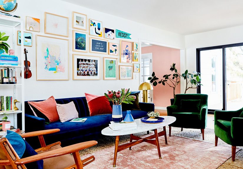
Example: A living room could use warm off-white walls (60%), a tan leather sofa and drapes (30%), and deep teal pillows + art accents (10%). You get interest without chaos.
Step 8: Build a Whole-Home Palette That Flows
If your home is open-concept (or even just connected by hallways), color flow matters. A good whole-home palette doesn’t mean every room is the same color; it means the rooms feel relatedlike cousins who actually like each other.
How to create flow without boredom
- Repeat undertones: choose wall colors that share a warm or cool family.
- Use a “base neutral”: one main neutral that appears in multiple areas (walls, trim, or large textiles).
- Vary intensity by room: use lighter versions in shared spaces and deeper versions in cozy rooms.
- Connect with accents: repeat one accent color (or material like brass/black/wood) across rooms.
Designers often recommend starting with main living areas first, then branching out. The goal is a home that feels cohesive, not like you painted room-by-room using separate internet personalities.
Step 9: Test Like You Mean It (Small Swatches Lie)
A tiny paint chip is not enough. Colors expand visually on walls, and lighting shifts them throughout the day. Testing prevents regretand prevents you from becoming the person who says, “It looked different on my phone.”
Testing checklist
- Paint a large sample (at least poster-size) or use big peel-and-stick samples.
- Test on multiple walls (one near a window, one in shadow).
- Observe in morning, afternoon, and evening light.
- Check it next to trim, flooring, and fabrics.
And yestest next to your brightest, most dramatic item (like a patterned rug). If the wall color survives that relationship, it can survive anything.
Step 10: Don’t Forget Paint Finish (Sheen = Practical Magic)
Even the perfect color can look wrong in the wrong sheen. Finish affects how light bounces, how texture shows, and how easily you can wipe off fingerprints (aka “life”).
Common interior sheen choices
- Flat/Matte: soft look, hides wall imperfections; great for low-traffic rooms and ceilings.
- Eggshell: subtle sheen, popular for living rooms and bedrooms.
- Satin: more durable and washable; common for kitchens, baths, hallways, kids’ rooms.
- Semi-gloss/Gloss: best for trim, doors, cabinetshigh durability and definition.
Translation: put the “scrubbable” finishes where people actually touch things. Your walls should not be a museum exhibit you’re afraid to breathe near.
Five Color Scheme Examples You Can Steal (Politely)
1) Warm Modern Cozy
Main: warm white walls • Secondary: soft greige textiles • Accent: deep navy + brass. Great for living rooms that need warmth without going beige-on-beige crime.
2) Calm “Spa” Bedroom
Main: creamy off-white • Secondary: muted blue-gray • Accent: natural wood + linen. Keep contrast gentle and let texture do the talking.
3) Earthy & Elevated
Main: soft clay or mushroom • Secondary: warm white trim • Accent: olive green + black accents. Works beautifully with terracotta, rattan, and cozy rugs.
4) Classic Blue-and-White With a Twist
Main: crisp (not icy) white • Secondary: mid-tone blue • Accent: butter yellow or coral in small hits. Traditional, but not sleepy.
5) High-Contrast Contemporary
Main: soft white • Secondary: charcoal • Accent: one bold color (emerald, cobalt, or terracotta). Keep the bold color to 10% so it feels intentional, not accidental.
Common Mistakes (So You Don’t Learn Them the Hard Way)
- Ignoring undertones: the fastest route to “Why does this look green?”
- Not testing in your lighting: store lighting is not your living room.
- Using too many “main” colors: pick a lead singer, not a band of competing divas.
- Forgetting contrast: without light/dark balance, rooms can feel flat.
- Choosing paint before textiles: it’s often easier to match paint to a rug than a rug to paint.
Conclusion: Your Color Scheme Should Feel Like You
The best interior color schemes are the ones that make your home feel more like homenot like a showroom, not like a trend mood board, and definitely not like you panic-picked “Agreeable Something” at 8:57 p.m. The winning formula is simple: start with fixed elements, choose a mood, respect undertones and light, use a scheme structure, balance with 60-30-10, and test before you commit.
If you do those things, you won’t just choose colors you likeyou’ll choose colors you’ll still love when the paint can is gone, the furniture moves in, and real life shows up with snacks, pets, kids, and fingerprints.
Experience Notes: What People Usually Learn After Choosing (and Living With) a Color Scheme
Ask almost any homeowner about picking paint colors and you’ll hear the same storyline: it starts with excitement, drifts into confusion, and ends with someone standing in a doorway whispering, “Is this… pink?” Even when people follow solid advice, there are a few real-world lessons that only show up after the furniture is back in place and the room starts being used.
First: people learn that color is rarely the problemlighting is. A neutral that looked calm and creamy in the afternoon can feel yellow at night under warm bulbs, or cold and flat on a rainy day. Many folks end up swapping light bulbs (or adding layered lighting like floor lamps and sconces) and suddenly the paint “works” again. It’s a common experience to realize the room needed better lighting design, not a different gallon of paint.
Second: most people underestimate how much texture affects a color scheme. The same wall color can look warm and rich next to wood, woven shades, and linen curtainsbut stark next to shiny tile and chrome. After living in a space, people often add softness (rugs, drapery, throws) and discover their palette feels more balanced without changing paint at all. This is especially true in open-concept spaces, where a few repeated textures can do as much for cohesion as repeating the same wall color.
Third: homeowners often discover that contrast is the missing ingredient. When everything is “safe” (light walls, light sofa, light rug), a room can feel washed out even if the colors technically match. Adding one darker anchorlike a deeper accent wall, a charcoal console, or black picture framescan make the entire palette look intentional. People who were afraid of bold choices often end up loving a strong accent because it gives the room a focal point and helps lighter colors feel crisp.
Fourth: there’s a learning curve with whites. Many people assume white is the simplest choice, then spend weeks realizing there are roughly 9,000 whites and each one has an opinion. A frequent real-life experience is choosing a white for walls, then noticing trim, cabinets, and ceilings don’t matchand the “clean” look becomes visually messy. That’s why people who love their results often choose one white family (warm or cool) and stick with it across adjacent spaces, even if they vary the intensity from room to room.
Finally: people learn that the color scheme they love most is usually the one that supports their daily routines. A bright, high-energy palette might feel fun at first, but a calmer palette may be easier to live with if the room is used for winding down. On the flip side, a moody color can be amazing in a dining room, hallway, or office where you want drama and focus. Over time, homeowners tend to appreciate palettes that match how they actually use the spacenot how they imagined using it on a perfectly styled Saturday.
The big takeaway from these experiences is reassuring: you don’t need perfection. You need a plan, a few smart tests, and the flexibility to adjust with lighting, textiles, and accents. Paint is powerfulbut it’s also one part of a whole room. When people treat the palette like a system (not a single “perfect” color), they usually end up loving the results.