Table of Contents >> Show >> Hide
- 1. Turn a Hardworking Kitchen Corner Into a Café Moment
- 2. Use Furniture-Like Pieces Instead of Wall-to-Wall Built-Ins
- 3. Stop Playing It Safe and Commit to Color
- 4. Make Storage Part of the Decor
- 5. Mix Materials and Metals Like You Mean It
- 6. Give the Prep Zone Its Own Identity
- 7. Hide the Ugly, Showcase the Beautiful
- Why These deVOL Ideas Work So Well in Real Homes
- Extra Takeaways: Real-Life Experiences and What It Feels Like to Live With These Ideas
- Conclusion
If you have ever wandered into a beautifully designed kitchen and suddenly felt the urge to become the kind of person who casually bakes galettes on a Wednesday, deVOL’s latest showroom may have that effect on you. The British kitchen brand’s newest space feels like an English country house took a glamorous West Coast vacation and came back with better light, better posture, and a faint smell of espresso.
What makes this showroom so compelling is not just that it looks good in photographs. Plenty of kitchens do that. The real magic is that the room ideas are surprisingly transferable. Under the polished finishes, vintage references, and quietly confident color choices, there are lessons regular homeowners can borrow without needing a manor house, a trust fund, or a butler named Rupert. Thank goodness.
This kitchen is a master class in furniture-like cabinetry, layered texture, practical storage, and cozy social zones. It embraces the growing American appetite for kitchens with personality: colorful cabinetry, display storage, warm wood, breakfast nooks, and design details that feel collected instead of copied. If you want a kitchen that works hard but still knows how to make an entrance, here are seven design ideas worth stealing from deVOL’s latest showroom.
1. Turn a Hardworking Kitchen Corner Into a Café Moment
One of the smartest ideas in the showroom is also one of the most charming: treat part of the kitchen like a mini café rather than a nonstop prep station. deVOL leans into the idea of a sit-down corner, and that matters because modern kitchens are doing more than ever. They are command centers, homework hubs, snack bars, and the unofficial waiting room for everyone in the house.
Instead of forcing the entire room to behave like a workshop, carve out one area for lingering. A bench seat, a small round table, bentwood chairs, or a tucked-away breakfast nook can transform dead space into the most beloved seat in the house. This is especially effective near a window, where morning light makes everything feel slightly more cinematic and significantly more expensive.
The beauty of the café approach is emotional as much as visual. It tells people, “Sit down, stay a while, and yes, the coffee is strong.” In practical terms, it also makes a kitchen feel more custom. You are no longer just arranging appliances and cabinets. You are designing a lifestyle zone.
To recreate the look, use a compact pedestal table, a cushioned bench, and softer lighting than you think you need. Add café curtains or a relaxed Roman shade if the window feels bare. The point is not to create a formal dining room in miniature. The point is to make space for toast, gossip, homework, and the occasional dramatic stare into the middle distance while waiting for the pasta water to boil.
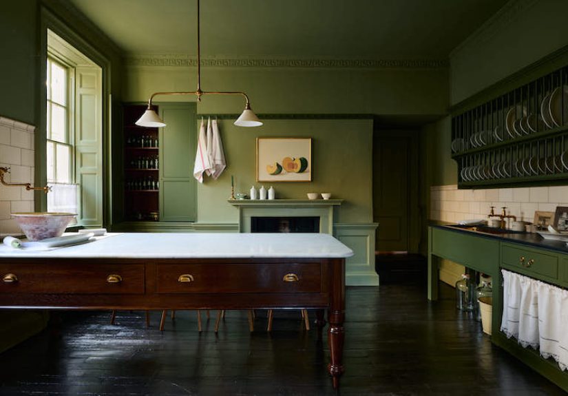
2. Use Furniture-Like Pieces Instead of Wall-to-Wall Built-Ins
deVOL has long understood something many American remodels forget: a kitchen looks better when at least part of it behaves like furniture. In the showroom, freestanding pieces and dresser-style storage make the space feel evolved rather than overfitted. That difference is huge.
When every inch is packed with built-ins, the kitchen can start to feel like a very efficient airport lounge. Furniture-style elements break that effect. A prep table, a pantry cupboard, a plate rack, or a hutch-style cabinet introduces rhythm and softness. It also makes the room feel as though it came together over time rather than being ordered in one giant, soul-flattening package.
This is one of the biggest takeaways from the showroom’s front display, where a Dairy Table and painted plate racks create a strong focal point without feeling bulky. The arrangement feels collected, practical, and visually breathable. That is a hard trio to pull off, yet deVOL makes it look easy.
If you want this effect at home, start with one anchor piece. A freestanding island, a vintage sideboard, a slim hutch, or a pantry cabinet can add storage while also giving the room a more relaxed architecture. Painted wood, antique brass hardware, and visible legs all help reinforce the furniture feeling. Your kitchen does not need to look like a fitted box. It can have elbows.
3. Stop Playing It Safe and Commit to Color
If beige is your love language, I respect your journey. But this showroom makes a convincing case for more confident color. Not color used like a nervous accent, but color used with commitment.
deVOL’s Los Angeles displays feature shades such as Trinity Blue, Princelet Pink, Quaker Cream, and Folgate Green, and the effect is memorable because the colors are integrated into the architecture of the room. They are not random pops. They shape the mood.
This is where the idea of color drenching becomes especially useful. Instead of treating cabinets, trim, walls, and millwork as unrelated decisions, think of them as a coordinated set. A single dominant tone can make a kitchen feel calmer, richer, and more intentional. It also helps visually absorb everyday clutter. When the backdrop is cohesive, all the normal kitchen chaos, from cookbooks to fruit bowls to someone’s mysteriously abandoned school form, feels less jarring.
The trick is choosing colors with depth rather than novelty. Muted greens, dusty pinks, inky blues, creamy neutrals, and earthy tones tend to age better than shouty shades that look exciting for six weeks and exhausting forever. Then layer in contrast with stone, wood, metal, and upholstery so the room still has movement.
If going all in feels risky, begin with the back run of cabinetry, a pantry wall, or a freestanding piece. Once you see how much warmth and definition color adds, you may never want to go back to anonymous white. Or you may. But at least now it will be a choice, not a reflex.
4. Make Storage Part of the Decor
One reason deVOL kitchens photograph so well is that the storage is not hidden from the design story. Plate racks, open cupboards, shelves, and display-led storage are treated as visual assets, not backup singers.
In the LA showroom, plate racks painted in Trinity Blue frame the front display and help turn everyday dish storage into a focal point. That is a powerful reminder that useful things can also be beautiful. Plates, bowls, glassware, cookbooks, linens, and pantry jars do not always need to disappear behind closed doors. Sometimes they should absolutely come out and show a little personality.
The key is editing. Open storage looks romantic in magazines because someone thought carefully about what stays visible. If your shelf currently holds a chipped promotional mug, three soy sauce packets, and a birthday candle shaped like the number 8, the shelf is not the problem. Curation is.
Group similar objects together. Repeat materials or colors. Stack plates in tidy groups. Lean larger platters at the back for height. Use jars or baskets for ingredients that tend to look messy. The goal is not perfection. It is organized charm.
This approach also works beautifully on kitchen walls. A plate wall, a row of hooks, or a simple shelf above a counter can add texture and warmth while freeing cabinet space. Display storage is especially helpful in smaller kitchens, where every square inch should either work hard or look gorgeous. Preferably both.
5. Mix Materials and Metals Like You Mean It
deVOL’s latest showroom does not subscribe to the idea that every finish must match like a nervous bridesmaid lineup. Instead, it embraces layered materials: painted cabinetry, warm wood, terracotta tones, wallpaper, stone, tile, and mixed metals. The result feels personal and lived in rather than sterile.
One standout moment is the use of a polished brass worktop in the moody Haberdasher’s bar and the combination of a copper canopy with other finishes nearby. Elsewhere, honed black granite, painted cupboards, subway tile, wallpaper, and marble all coexist without throwing a design tantrum.
This is a useful lesson for American kitchens, which too often get trapped in all-black, all-brass, or all-stainless formulas. Real rooms are richer when finishes have some contrast. Wood adds warmth. Stone adds permanence. Metal adds sparkle and definition. Handmade tile adds texture. Wallpaper softens the room and adds pattern without requiring a full circus.
The secret is consistency of mood, not sameness of finish. If the room feels quiet and tailored, the materials can be varied. If every single thing is trying to be the star, then the kitchen starts to resemble an audition. Pick one dominant material, one secondary texture, and one metal that leads. Then let the supporting cast do its job.
When done well, mixed materials create a kitchen that reveals itself gradually. That is the sweet spot: interesting on day one, still interesting on year ten.
6. Give the Prep Zone Its Own Identity
Many kitchens treat prep space as leftover counter. deVOL treats it like an event. The showroom includes a Quaker Cream prep table, a Dairy Table, and layouts that make food preparation feel central rather than squeezed between the sink and the toaster.
This matters because prep is where real kitchen life happens. Chopping vegetables, rolling dough, unloading groceries, assembling lunch, decorating cupcakes badly but enthusiastically with children, all of that needs surface area, lighting, and a sense of ease.
A freestanding prep table is especially smart because it reads as furniture while still improving function. It can create a softer alternative to a giant blocky island, and it often improves circulation because it feels lighter in the room. Pair it with stools, open shelving below, or nearby plate storage and suddenly the kitchen becomes more social.
Good prep areas also benefit from adjacency. Keep knives, mixing bowls, oils, boards, and produce storage close at hand. If the layout allows, a secondary sink or water source nearby can make the zone even more useful. Even without that, just giving prep its own visual identity makes the kitchen feel more intentional.
Think of it this way: the island should not just be a slab that collects mail and guilt. It should earn its keep. A distinct prep zone with a furniture-style table can make your kitchen more efficient, more welcoming, and much less likely to become a dumping ground for everyone’s random stuff.
7. Hide the Ugly, Showcase the Beautiful
Perhaps the most grown-up lesson from deVOL’s latest showroom is the balance between display and concealment. Yes, there are open shelves, plate racks, and styled surfaces. But there are also floor-to-ceiling pantry cupboards, integrated appliances, and a walk-in pantry. That balance is what keeps the room from tipping into chaos.
This is where many kitchen renovations go wrong. People fall in love with open shelving and forget that cereal boxes, air fryers, paper towels, and the fifty-seven plastic containers missing their lids are not design features. Beautiful kitchens need places to hide the unglamorous parts of real life.
deVOL’s Shaker walk-in pantry and tall storage pieces show how to do this gracefully. Closed storage lets the main room stay calm while still supporting serious cooking. It also makes entertaining easier because the mess can migrate somewhere else while the pretty part of the kitchen remains presentable. A deeply underrated luxury.
If a full walk-in pantry is not realistic, borrow the principle. Add one tall pantry cabinet. Integrate the refrigerator more thoughtfully. Use under-bench storage. Choose a hutch with both open and closed sections. Let the attractive things be seen and the utilitarian things be quietly excellent out of sight.
That is the real genius of this showroom. It does not ask the kitchen to be either functional or beautiful. It insists on both, with enough charm to keep the room from feeling bossy about it.
Why These deVOL Ideas Work So Well in Real Homes
The reason these ideas resonate is simple: they are decorative, but they are not frivolous. A bench seat gives you a place to gather. A prep table improves workflow. A pantry wall calms visual clutter. Plate racks and hutches turn everyday storage into part of the room’s character. Color gives the kitchen identity. Mixed materials make it feel layered and human.
In other words, these are not design stunts. They are quality-of-life upgrades wearing very nice outfits.
That may be why this showroom feels so inspiring. It is aspirational, yes, but it is also oddly practical. You can imagine living here. You can imagine setting groceries on the table, dropping into the nook with a cup of coffee, reaching for a favorite bowl from the plate rack, and quietly admiring your own excellent taste. As you should.
Extra Takeaways: Real-Life Experiences and What It Feels Like to Live With These Ideas
What people often forget about kitchen design is that the best ideas reveal themselves slowly. At first, you notice the color or the pretty hardware. Then, after a few weeks of daily life, you notice something more important: the room feels easier to use. That is the kind of experience deVOL’s showroom suggests, and it is why the ideas are worth adapting.
A café-style corner changes the emotional rhythm of a morning. Instead of everyone hovering awkwardly near the refrigerator door, there is a natural place to land. A bench seat becomes the spot where kids do homework, a partner answers emails, or a friend sits with a glass of wine while you finish dinner. It gives the kitchen a pulse beyond cooking.
Furniture-style pieces have a similar effect. They make the room feel less engineered and more inhabited. A freestanding prep table or painted pantry cabinet tends to age gracefully because it does not feel too fixed in one design era. If you ever change wall color, lighting, or hardware, those pieces usually continue to make sense. They are flexible in a way hyper-built-in kitchens are not.
Color also changes the daily experience more than many homeowners expect. A soft green back run, a creamy prep table, or a dusty pink cupboard can make the room feel warm before you have added a single accessory. On gray mornings, color keeps the kitchen from feeling flat. On bright days, it gives sunlight something lovely to bounce off. The room starts to feel atmospheric, not just functional.
Display storage has a psychological benefit, too. When favorite dishes, platters, or cookbooks are visible, you use them more. The kitchen becomes less about storing things and more about enjoying them. That does require some discipline, of course. You cannot toss visual chaos onto an open shelf and call it styling. But when edited well, visible storage feels generous and alive.
Perhaps the most useful lived-in lesson is the value of concealed mess. A walk-in pantry, tall cupboard, or bench with hidden storage will never trend on social media the way a brass faucet does, but these features often make homeowners happiest over time. They absorb clutter, support routines, and preserve the calm of the main room. In a busy household, that kind of order feels almost luxurious.
So yes, deVOL’s latest showroom is beautiful. But the real reason to steal from it is that its ideas support everyday life while still making the kitchen feel special. That is the sweet spot every remodel should chase: a room that is elegant enough for guests, practical enough for Tuesday, and charming enough to make even leftovers feel a little glamorous.
Conclusion
deVOL’s newest showroom proves that the most memorable kitchens are not the ones packed with trends. They are the ones with character, clarity, and a little nerve. Borrow the café nook, the furniture-style storage, the richer color, the open display, the layered materials, the hardworking prep zone, and the concealed clutter control. Steal wisely, and your kitchen may not just look better. It may actually live better, too.