Table of Contents >> Show >> Hide
- Why I Chose a Peony for a Chalk Pastel Drawing
- Why Chalk Pastel Was the Right Medium
- Understanding the Peony Before Drawing It
- Building the Composition
- Color Choices: More Than Just Pink
- Layering and Mark-Making in the Drawing Process
- Preserving a Chalk Pastel Drawing
- What the Finished Drawing Says
- Extended Reflections: My Experience Drawing “Peony”
- Conclusion
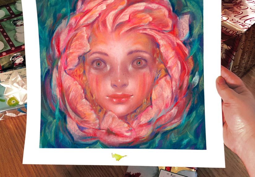
Some flowers politely sit in a vase and wait to be painted. A peony does not. A peony arrives like it has its own soundtrack, its own fan club, and at least three opinions about lighting. That drama is exactly why I wanted to make a chalk pastel drawing of one. A peony has softness, structure, wild folds, and a color story that seems to change every five minutes. One second it looks blush pink, the next it flashes coral, cream, raspberry, and a whisper of gold. For an artist, that is not a problem. That is a very good afternoon.
My drawing, titled “Peony”, became more than a flower study. It turned into a lesson in patience, layering, observation, and restraint. Chalk pastel is perfect for that kind of work because it can be velvety, luminous, dusty, bold, and delicate all at once. It lets you build color slowly, then suddenly make one petal glow like it just heard a compliment. In this piece, I wanted to capture not only what the flower looked like, but also how it felt: lush, fleeting, romantic, and just a little bit over-the-top in the best possible way.
This article walks through the ideas behind my chalk pastel drawing of a peony, the artistic choices that shaped it, the techniques that helped the flower come alive, and the practical lessons I learned along the way. If you love flower drawing, pastel art, botanical subjects, or simply enjoy seeing how a single bloom can take over an entire composition, welcome in. The peony has plenty to say.
Why I Chose a Peony for a Chalk Pastel Drawing
Peonies are irresistible drawing subjects because they combine order and chaos. Botanically, they have a clear structure: large outer guard petals and a center filled with stamens or modified inner petal forms. Visually, though, they feel gloriously unruly. Some peonies look open and simple. Others look as if a cloud decided to become a flower. That range makes them fascinating to study and even more satisfying to draw.
What hooked me was the contrast between the flower’s softness and its complexity. A rose can be elegant. A tulip can be clean. A peony is dramatic. It has volume, ruffles, shadows, curled edges, and a center that invites close observation. In the garden, peonies are known for their large, often fragrant blooms, and in art they offer a built-in focal point because they naturally command attention. You do not have to beg a peony to become the star of the page. It already knows.
Another reason I chose a peony is color. Many varieties move through a subtle range of hues rather than one flat pink or white. Even a pale bloom can contain warm peach, cool lavender, creamy highlights, blue-gray shadows, and yellow accents near the center. That makes a pastel drawing feel alive. Instead of coloring a flower pink and calling it a day, I could work with temperature shifts, value changes, and complementary contrast to create depth.
Why Chalk Pastel Was the Right Medium
Pastel has a reputation for being both forgiving and temperamental, which is honestly relatable. It is made from pigment with filler and a small amount of binder, so the color stays rich and immediate on the surface. Unlike wetter media, pastel does not ask you to wait around while layers dry. It lets you respond quickly to what you see. That speed matters when drawing flowers, because flowers are tiny masters of change. Light shifts, petals relax, edges curl, and suddenly your reference looks like it took a personality test and got a different result.
For a peony, chalk pastel offers several advantages. First, it handles softness beautifully. You can blend large petal passages into airy gradients, then sharpen an edge or drop in a decisive mark for a fold. Second, it loves textured paper. A surface with enough tooth grabs the pastel and holds repeated layers, which helps create the dense, velvety look that flower petals often need. Third, pastel excels at luminous color. Since light reflects off the fine particles on the paper, the final drawing can feel bright and fresh rather than muddy.
That said, pastel also demands respect. It is fragile, easy to smudge, and not especially interested in your perfectionism. Overblending can flatten the life out of a flower. Too many layers can clog the surface. Heavy fixative can darken color and reduce the powdery brilliance that makes pastel special. So the medium is wonderful, but it comes with a tiny speech that sounds a lot like, “Handle with care, darling.”
Understanding the Peony Before Drawing It
Before I made the final drawing, I spent time simply looking. Not “looking” in the lazy, scrolling, half-distracted sense. I mean actual observation. I studied how the outer petals opened wide like a stage curtain, while the inner petals folded over one another in tighter rhythms. I paid attention to where the bloom felt airy and where it felt dense. I noticed that the center was not a random blur but a structured mass, often warmer and more detailed than the outer ring.
This matters because flower drawing is not just decoration. It is translation. If you understand the flower’s anatomy and growth pattern, your drawing becomes more convincing even when it is expressive rather than strictly scientific. Peonies can appear in several forms, including single, Japanese, anemone, semi-double, bomb, and full double. That variety affects silhouette, center detail, and how the petals stack. In my drawing, I leaned into the full, layered character that people often associate with peonies because it gave me more opportunity for shadow, movement, and drama.
I also simplified the flower into large shapes before getting lost in the frills. That step saved me. Every artist knows the danger of drawing one beautiful petal for ten minutes and then realizing it belongs to a flower that no longer fits on the page. By blocking in the overall shape first, I gave the bloom a clear foundation. Once the big structure was in place, the smaller lyrical details had somewhere to live.
Building the Composition
A good flower drawing is not only about the flower. It is also about placement, negative space, and visual movement. In “Peony”, I wanted the bloom to dominate the composition, but not sit there like a giant decorative sticker. So I positioned it with intention, leaving enough breathing room around the outer petals while letting the overall mass feel close and intimate.
Composition depends on balance, emphasis, contrast, and rhythm. The focal point in this drawing is the illuminated upper center of the bloom, where the petals open and catch the most light. From there, the eye moves outward through repeated curved shapes, then returns through darker inner folds and subtle color echoes. Repetition creates unity; variation prevents boredom. That is the visual equivalent of playing the same melody with better outfits.
Negative space also played a major role. If every inch of the page is busy, the flower loses impact. By keeping the background restrained, I gave the peony room to breathe. This does not mean the background was ignored. On the contrary, it was carefully adjusted to support the bloom. A muted backdrop helped the lighter petals appear brighter and allowed the softer edges to dissolve gracefully. In flower art, background decisions are often the difference between “beautiful” and “why does this blossom look like it was pasted onto a wall?”
Color Choices: More Than Just Pink
If someone says, “Just make it pink,” I immediately become suspicious. Flowers rarely operate in one-note color. My peony drawing used pink, yes, but also cream, ivory, pale gold, coral, mauve, cool violet, and soft green reflected from nearby foliage. That range is what gave the drawing depth.
Color has hue, intensity, and value. Value, especially, is crucial in pastel work because it describes form. A petal turns because its value shifts. A fold deepens because the interior darkens. A highlight sings because it is placed against a slightly lower surrounding value, not because it is randomly brighter. When artists ignore value, flowers become flat. When they respect it, petals begin to curl, lift, and breathe.
I also thought about simultaneous contrast, the way neighboring colors affect how we perceive each other. A cool violet shadow can make a warm pink highlight seem more luminous. A soft green note near the stem can make nearby blush petals feel richer. These interactions are subtle, but they are the secret sauce of pastel flower art. Not barbecue sauce. Better.
Using Warm and Cool Shifts
One of my favorite moves in this drawing was letting warm and cool tones coexist within the same petal. The light-facing planes leaned creamy and warm, while receding areas turned cooler and slightly grayer. That temperature shift created volume without forcing harsh outlines. It also kept the flower from looking sugary or artificial. A peony should feel alive, not like frosting from a very ambitious bakery.
Layering and Mark-Making in the Drawing Process
I began with a light sketch and broad areas of local color, keeping the touch gentle so the paper could accept later layers. Then I built the form gradually. Some passages were blended with a finger or soft tool, while others were left as visible strokes to preserve energy. That contrast between smooth and broken marks helped describe different petal textures.
In the outer petals, I used wider, softer applications to communicate openness. In the center, I switched to shorter, more directional marks to suggest density and intricate folds. I did not want every petal edge to be equally sharp. Real flowers have lost edges, turning planes, and areas that merge softly into shadow. Softening selected contours made the bloom feel more natural and helped guide attention toward the most important details.
Pastel also rewards restraint. It is tempting to keep adding and adding because the colors are beautiful and the sticks are sitting there looking encouraging. But some of the best moments in a pastel drawing happen when you stop just before overworking it. I had to remind myself that not every petal needed a full biography. A few confident notes can say more than endless fussing.
Texture Without Chaos
The peony’s appeal comes from texture, but texture must be organized. Too much detail everywhere becomes visual noise. I tried to reserve the most complex textures for the center and let the outer petals soften as they moved away from the focal point. That created hierarchy. The drawing remained rich, but it did not feel cluttered. In other words, I let the peony be glamorous, not messy.
Preserving a Chalk Pastel Drawing
Because pastel sits on the surface of the paper, preservation is part of the art process, not an afterthought. I treated the finished drawing carefully, avoided unnecessary touching, and thought seriously about presentation. Pastel works on paper are best protected with proper matting or spacing so the surface does not press against the glazing. Anti-static acrylic can be a smart option for powdery media, and light exposure should always be limited because even filtered light can still cause damage over time.
Fixative is one of those topics that can start a small civil war among artists. Used lightly and thoughtfully, it can help stabilize certain layers. Used heavily, it can deepen darks, dull highlights, and change the surface quality. For this drawing, I preferred a conservative approach. The freshness of pastel color is one of the main reasons to use the medium in the first place, so I did not want to muffle that effect.
What the Finished Drawing Says
What I love most about “Peony” is that it feels both delicate and confident. The flower is soft, but it is not timid. It opens fully, takes up space, and refuses to apologize for being extravagant. That attitude translated beautifully into chalk pastel, which is itself a medium of bold softness. The drawing became a study in contrast: structure and looseness, control and spontaneity, observation and emotion.
There is also something wonderfully human about a peony. It blooms with great enthusiasm, reaches its peak, and then fades quickly. Drawing it felt like a way of honoring that temporary burst of beauty. Art cannot stop time, but it can hold attention long enough for us to notice what time is doing. A peony reminds us to look closely. Pastel lets us answer, “Gladly.”
Extended Reflections: My Experience Drawing “Peony”
By the time I reached the final stages of this chalk pastel drawing, I realized the piece had quietly changed my working habits. I started the project thinking I was making a flower portrait. I ended it realizing I had been practicing attention. A peony is not a casual subject. It demands close looking, and close looking has a funny way of slowing your mind down. At first I saw a pretty bloom. Then I saw grouped petals. Then I saw directional changes in each petal. Then I saw reflected color from one fold affecting the next. Eventually, I was not drawing “a flower” at all. I was drawing relationships: light against shadow, warm against cool, soft edge against crisp edge, confidence against fragility.
That shift was probably the most valuable part of the experience. When artists talk about learning to see, this is what they mean. You stop naming objects and start noticing visual facts. The top petal was not just pink; it was creamy peach in one corner, cool rose in the middle, and nearly lavender where it turned away from the light. The shadow under the inner fold was not simply dark; it was muted violet with a trace of warm red beneath it. Those discoveries made the drawing stronger, but they also made the process more enjoyable. The work became less about “getting it right” and more about staying curious.
I also learned how much mood comes from pacing. On the first day, I wanted instant elegance. The peony, however, had other plans. I put down a few layers, stepped back, and thought, “Well, that looks like a cabbage with feelings.” Not ideal. But pastel often improves through patient revision. As I adjusted values, softened some edges, and clarified the center, the drawing slowly crossed that mysterious line between awkward beginning and believable bloom. That moment is one of the quiet thrills of art-making. Nothing magical happened, yet suddenly the image began to breathe.
There was a personal lesson in restraint too. I tend to admire detail, which is wonderful right up until detail starts running the whole household. In this piece, I had to decide where precision mattered and where suggestion was more powerful. The center of the peony earned complexity. The far edges did not need a full legal document. Letting some areas remain soft gave the drawing atmosphere and saved it from stiffness. It also made the focal point feel intentional rather than accidental.
Most of all, drawing “Peony” reminded me why flowers continue to matter in art. They are familiar, but never simple. They invite beauty, but they also reward analysis. They can be decorative, symbolic, intimate, or almost architectural depending on how you approach them. This particular pastel drawing became a record of observation, yes, but also of feeling. It holds admiration, concentration, a few moments of frustration, and the deep satisfaction that comes from staying with a subject long enough to understand it better. If I draw another peony tomorrow, it will not look exactly the same, and that is part of the joy. The flower changes. I change. The medium changes under my hand. And somewhere in that shifting conversation, a drawing appears that feels honest.
Conclusion
My chalk pastel drawing of “Peony” was ultimately about more than one beautiful flower. It was about learning how to observe complexity without getting overwhelmed, how to use color and value to create softness and structure, and how to let a fragile medium speak in a confident voice. The peony offered spectacle. Chalk pastel offered light, texture, and immediacy. Together, they created a piece that feels lush, intimate, and alive.
For anyone interested in pastel flower drawing, botanical art, or expressive still-life work, the peony is a brilliant subject. It teaches composition, patience, layering, and the importance of looking carefully before making a mark. And if the process occasionally makes you question all your life choices, congratulations: you are probably making art.