Table of Contents >> Show >> Hide
- How to Make an “Underrated” Color Look Designer-Approved
- 15 Underrated Paint Colors Designers Love to Use
- 1) Benjamin Moore Crème Caramel (910)
- 2) Sherwin-Williams French Roast (SW 6069)
- 3) Benjamin Moore Athena (858)
- 4) Benjamin Moore Hamilton Blue (HC-191)
- 5) Pratt & Lambert Sicilian Umber
- 6) Sherwin-Williams Repose Gray (SW 7015)
- 7) Farrow & Ball Calamine (No. 230)
- 8) Sherwin-Williams Icelandic (SW 6526)
- 9) Sherwin-Williams Delft (SW 9134)
- 10) Benjamin Moore Bunny Gray (2124-50)
- 11) Benjamin Moore Horizon (OC-53)
- 12) Sherwin-Williams Shiitake (SW 9173)
- 13) Benjamin Moore Symphony Blue (2060-10)
- 14) Sherwin-Williams Inkwell (SW 6992)
- 15) Benjamin Moore Essex Green (HC-188)
- Quick Pairing Cheat Sheet
- Conclusion: The Best “Underrated” Color Is the One That Behaves in Your Light
- Real-World Experiences: What Happens When You Actually Use These Colors (The Fun Part)
Some paint colors are like that friend who shows up early, helps clean up, and somehow still doesn’t get tagged in the Instagram post. They’re not flashy. They’re not trending on every “Top 10” list. But designers keep reaching for them because they workin real homes, in weird lighting, with the furniture you already own, and with the inevitable chaos of daily life.
This list is for anyone who’s tired of seeing the same five whites, the same one “perfect greige,” and the same navy that’s currently living in everyone’s kitchen like it pays rent. These are underrated paint colors designers love to use because they’re nuanced, forgiving, and surprisingly versatile. Think: soft peaches that read like neutrals, cozy browns that feel modern, dusty blues that calm down a room without turning it into a beach-themed souvenir shop, and moody darks that make everything around them look more expensive.
Below, you’ll find 15 designer-loved, under-the-radar shadeswith where they shine, what they pair best with, and the small moves that make them look intentional (not accidental).
How to Make an “Underrated” Color Look Designer-Approved
Before we get to the colors, here’s the secret: the magic isn’t just the shade. It’s the context. Designers make “quiet” colors feel high-end by controlling undertones, contrast, and finishthen letting texture do the heavy lifting.
1) Treat undertones like gossip: they will come out in the light
A “simple” gray might lean blue in the morning, green at lunch, and purple by dinnerespecially in north-facing rooms. The fix isn’t panic; it’s planning. Pair cool-leaning colors with clean whites and metals like chrome or nickel. Pair warm-leaning colors with creamy whites, wood tones, and brass.
2) Sample bigger than your courage
Tiny chips lie. (It’s not personal. They just do.) Paint a large swatch or use a big peel-and-stick sample so you can see the color across different times of day. Watch how it behaves near trim, flooring, and upholsterybecause the room is the real color filter.
3) Pick a sheen that matches your lifestyle, not your fantasy life
Love the idea of matte walls? Same. Love wiping fingerprints off a matte wall? That’s where the relationship gets tested. In most living spaces, eggshell is a sweet spot for walls (soft look, easier cleanup). Satin is great for busier rooms. Save semi-gloss for trim and doors if you want crisp contrast and durability.
4) Use contrast like eyeliner: a little goes a long way
If your wall color is subtle, make your trim (and ceiling) choice deliberate. Crisp white trim can sharpen a soft color. A warmer off-white can make it feel cozy. And color-drenching (walls + trim in the same shade) can make an “underrated” color look confidently editorial.
15 Underrated Paint Colors Designers Love to Use
Each of these is a real, named paint color (with brand and code where applicable). Use them as-is, or treat them as a starting point for finding a close match in your preferred paint line.
1) Benjamin Moore Crème Caramel (910)
Vibe: A creamy peach that’s soft enough to act like a neutralaka “sunlight in a can,” minus the motivational quotes.
Best for: Bedrooms, living rooms, nurseries, and any space that needs warmth without turning beige.
Pairs well with: Warm whites, natural oak, linen textures, and muted greens (sage, olive).
Pro move: Use it in an eggshell finish and add off-white trim for a modern, calm look that still feels inviting.
2) Sherwin-Williams French Roast (SW 6069)
Vibe: A deep, dramatic red-brown that reads sophisticatedlike espresso with excellent boundaries.
Best for: Front doors, built-ins, powder rooms, libraries, and accent walls that want “wow” without neon energy.
Pairs well with: Creamy whites, brass hardware, dark woods, and black accents.
Pro move: Try it on a single focal surface (like a mantel wall) and keep the rest of the room in warm neutrals to let it star.
3) Benjamin Moore Athena (858)
Vibe: A versatile neutral with warm gray undertonessoft, modern, and quietly polished.
Best for: Open-plan spaces where you want one color that behaves across rooms.
Pairs well with: White oak, creamy trim, soft blacks, and warm metals.
Pro move: If your room is north-facing, Athena can prevent that chilly “waiting room” vibe without going full yellow.
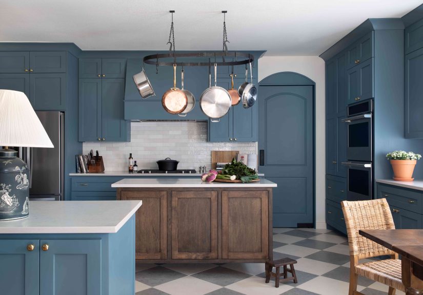
4) Benjamin Moore Hamilton Blue (HC-191)
Vibe: A dark, stony blue that feels historic but not dustylike a tailored blazer for your walls.
Best for: Dining rooms, studies, bedrooms, and kitchen islands.
Pairs well with: Crisp whites, medium woods, leather, and antique brass.
Pro move: Use it on cabinetry with a satin finish for depth, then keep walls lighter so the room doesn’t feel heavy.
5) Pratt & Lambert Sicilian Umber
Vibe: A rich umber brown that’s earthy and modernproof that brown can be cool again (and not in a 2003 way).
Best for: Accent walls, libraries, dens, and grounding a space with lots of light furniture.
Pairs well with: Warm whites, terracotta accents, camel leather, and woven textures.
Pro move: Add contrast with lighter art mats and frames so the wall color feels curated, not cave-like.
6) Sherwin-Williams Repose Gray (SW 7015)
Vibe: A calm, adaptable neutral that designers treat like a reliable supporting actorless hype than other grays, more real-life compatibility.
Best for: Hallways, living rooms, and open layouts where you need a consistent backdrop.
Pairs well with: Bright white trim, light woods, black accents, and soft blues/greens.
Pro move: If you’re scared of color but bored of white, this is the “training wheels” neutral that still looks intentional.
7) Farrow & Ball Calamine (No. 230)
Vibe: A delicate pink with a touch of grayfresh, not sugary, and surprisingly grown-up.
Best for: Bedrooms, powder rooms, dressing areas, and “soft statement” ceilings.
Pairs well with: Warm whites, pale grays, light woods, and brushed brass.
Pro move: Use Calamine on walls and keep furnishings neutral; let the color be the mood, not the theme.
8) Sherwin-Williams Icelandic (SW 6526)
Vibe: A cool, frosty pastel that reads airylike a deep breath for rooms that feel busy.
Best for: Bathrooms, bedrooms, laundry rooms, and small spaces that need visual “lift.”
Pairs well with: Clean whites, pale gray stone, chrome fixtures, and soft navy accents.
Pro move: If your bulbs are very warm, test firstwarm lighting can soften the crispness and shift the feel.
9) Sherwin-Williams Delft (SW 9134)
Vibe: A cool, relaxed blue with depthmoody without being gloomy.
Best for: Bedrooms, offices, built-ins, and accent walls behind a bed or sofa.
Pairs well with: Cool whites, charcoal, natural wood, and matte black hardware.
Pro move: Delft looks especially good when you repeat it subtly (a pillow, a vase, a rug detail) so it feels “designed,” not random.
10) Benjamin Moore Bunny Gray (2124-50)
Vibe: A feathery soft gray with a wink of bluelight, clean, and quietly elegant.
Best for: Living rooms, kitchens, and any space where you want a cool-leaning neutral that still feels gentle.
Pairs well with: Crisp white trim, pale woods, cool marbles, and steel or chrome finishes.
Pro move: Use Bunny Gray in rooms with plenty of daylight; it stays fresh and avoids that “muddy gray” trap.
11) Benjamin Moore Horizon (OC-53)
Vibe: A pale gray with subtle blue undertoneslike a clean slate that doesn’t feel sterile.
Best for: Whole-home color schemes, ceilings (yes, ceilings), and airy bedrooms.
Pairs well with: White trim, soft blues, pale greens, and natural textures.
Pro move: Want a “white” room with more depth? Horizon can be the answer when pure white feels too stark.
12) Sherwin-Williams Shiitake (SW 9173)
Vibe: A mushroom-toned neutralwarm, grounded, and quietly modern.
Best for: Family rooms, bedrooms, transitional spaces, and anywhere you want cozy without heavy color.
Pairs well with: Creamy whites, warm woods, woven textures, and soft olive accents.
Pro move: Shiitake can make a room feel more inviting than cool grays, especially in lower-light spaces.
13) Benjamin Moore Symphony Blue (2060-10)
Vibe: A classic navy with presencebold, timeless, and a little dramatic in the best way.
Best for: Accent walls, built-ins, kitchen islands, mudroom cabinetry, and doors.
Pairs well with: Bright white trim, brass, walnut, and creamy upholstery.
Pro move: Use it where you want structurelike shelving or millworkso the color reads architectural, not overwhelming.
14) Sherwin-Williams Inkwell (SW 6992)
Vibe: An enchanting near-black with a hint of bluechic, modern, and surprisingly flexible.
Best for: Accent walls, bathrooms, doors, cabinetry, and “color drenching” for the brave (and the well-sampled).
Pairs well with: Warm whites, natural wood, brushed brass, and creamy textiles.
Pro move: If full black feels harsh, Inkwell delivers the drama with a softer edge.
15) Benjamin Moore Essex Green (HC-188)
Vibe: A nearly black green that feels historic and modern at the same timemoody, elegant, and endlessly photogenic.
Best for: Front doors, cabinetry, dining rooms, libraries, and statement trim.
Pairs well with: Creamy whites, antique brass, deep woods, and warm leather.
Pro move: Essex Green looks incredible with layered lightingadd sconces or a table lamp so it glows instead of swallowing the room.
Quick Pairing Cheat Sheet
- Warm + cozy: Crème Caramel (910), Athena (858), Shiitake (SW 9173), Sicilian Umber
- Cool + airy: Bunny Gray (2124-50), Horizon (OC-53), Icelandic (SW 6526)
- Moody + luxe: Hamilton Blue (HC-191), Delft (SW 9134), Symphony Blue (2060-10), Inkwell (SW 6992), Essex Green (HC-188), French Roast (SW 6069)
- Soft statement: Calamine (No. 230), Crème Caramel (910)
Conclusion: The Best “Underrated” Color Is the One That Behaves in Your Light
Designers don’t love underrated paint colors because they’re obscurethey love them because they’re useful. These shades play well with real flooring, real furniture, and real-life lighting. They give you depth without demanding constant attention, and they’re often the difference between a room that looks “fine” and a room that looks finished.
If you take only one thing from this list, make it this: sample bigger than you think you need, watch the color across the day, and choose a finish that matches how you actually live. Do that, and even the most under-the-radar color will look like you hired someone with a measuring tape and a mood board.
Real-World Experiences: What Happens When You Actually Use These Colors (The Fun Part)
Reading about designer-approved paint colors is one thing. Living with them is where the plot thickensusually around 4:37 p.m., when the sun shifts and your “perfect neutral” suddenly looks like it’s having an identity crisis. Here are some common, very real experiences homeowners (and designers) run into with underrated shadesand how they turn those moments into wins.
The “My Sample Looked Different Yesterday” Phase
It’s normal to love a color in the morning and question every life choice by evening. Undertones show up differently depending on daylight direction, bulb temperature, and what’s nearby (a red rug can warm a wall; a blue couch can cool it). That’s why colors like Bunny Gray (2124-50) and Horizon (OC-53) feel “designer-safe”: they tend to stay soft and composed instead of going neon on you at sunset. The best habit is checking your sample at multiple timesmorning, midday, and nightthen taking quick photos. Your eyes adjust fast; photos help you compare without the emotional rollercoaster.
The “Wait… This Dark Color Makes the Room Look Bigger?” Surprise
Moody shades get blamed for making rooms feel smaller, but many people experience the opposite when they use them strategically. Deep colors like Essex Green (HC-188), Inkwell (SW 6992), or Hamilton Blue (HC-191) can blur corners and add visual depthespecially with layered lighting. The trick is to avoid one harsh overhead light. Add a lamp, a sconce, or even warm LED strips on shelves. Suddenly the dark wall reads rich and intentional instead of “I painted and now I’m scared.”
The “I Wanted Neutral, But Not Boring” Breakthrough
Warm neutrals often win people over because they feel calmer than stark whites and more flattering than icy grays. Athena (858) and Shiitake (SW 9173) are classic examples: they don’t scream “color,” but they make a room feel finishedespecially next to natural wood, woven textures, and off-white trim. A common experience is realizing that “neutral” doesn’t mean “blank.” It means “supportive.” The right neutral makes your art look sharper, your fabrics look more expensive, and your space feel less like an empty rental listing.
The “Accent Color That Suddenly Runs the House” Moment
Some shades are so good that once you use them once, you start finding excuses to use them again. Symphony Blue (2060-10) and Delft (SW 9134) do this a lot. You paint an island or built-in, then you notice your throw pillows look a little sad, so you add a navy stripe. Then you swap a lampshade. Thenoopsyour hallway bench is getting repainted. This is normal. It’s how cohesive homes happen: one strong color becomes a “thread” that quietly ties rooms together.
The “Soft Pink Isn’t Just for Nurseries” Plot Twist
People often approach Calamine (No. 230) or Crème Caramel (910) thinking it will be too sweet. Then they see it with warm whites, brass hardware, and a few earthy texturesand it reads like modern warmth, not bubblegum. A common real-life takeaway: muted pinks and peaches can behave like neutrals, especially when the shade is tempered with gray or cream. Used on walls, they can flatter skin tones and soften harsh light, which is why they’re loved in bedrooms and powder rooms.
In short: underrated colors tend to reward patience. They’re the shades that don’t try to impress you in five secondsthey get better the longer you live with them. And that’s exactly why designers keep them in rotation.