Table of Contents >> Show >> Hide
- Before You Open the Paint Can: 4 Smart Moves
- 21 Wall Painting Ideas to Transform Any Space
- 1. Classic Accent Wall (But Make It Intentional)
- 2. Color Drenching for a Cozy, High-End Look
- 3. Two-Tone Horizontal Walls
- 4. Two-Tone Vertical Color Blocking
- 5. Tone-on-Tone Pairing (Same Color Family, Different Depths)
- 6. Painted Arch Behind Furniture
- 7. Geometric Shapes for a Modern Graphic Look
- 8. Painted Stripes (Vertical or Horizontal)
- 9. Ombre Wall for a Soft Gradient Effect
- 10. Abstract Mural Wall
- 11. Faux Headboard with Paint
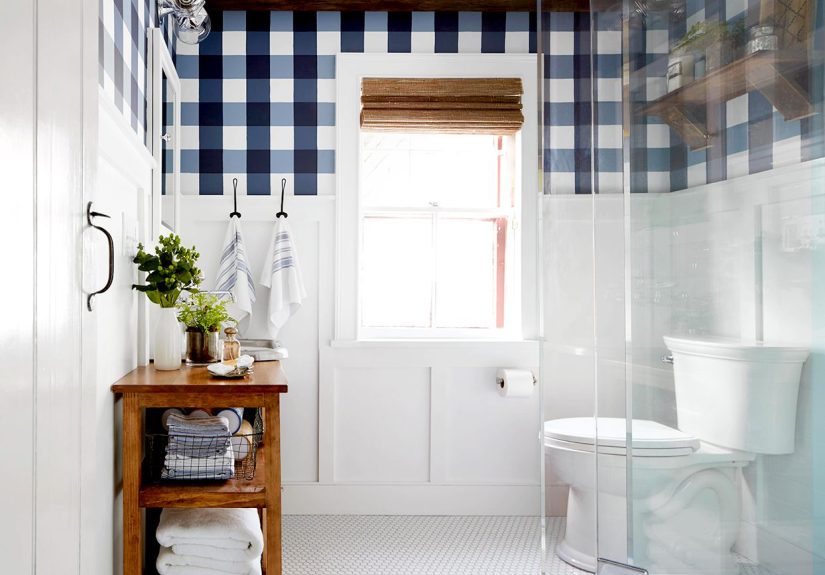
- 12. Checkerboard or Grid Accent Wall
- 13. Painted “Wallpaper” Pattern
- 14. Marbled Paint Finish for Subtle Texture
- 15. Dark Moody Wall for Depth and Drama
- 16. Soft Pastel Walls for a Brighter, Airier Feel
- 17. Ceiling + Wall Combo (The Fifth Wall Counts)
- 18. Painted Trim and Molding in a Contrasting Color
- 19. Niche, Alcove, or Built-In Highlight
- 20. Half-Wall Paint with a Crisp Line (Modern Wainscoting Effect)
- 21. Monochrome Room with Mixed Finishes
- How to Choose the Best Wall Painting Idea for Your Space
- Common Wall Painting Mistakes to Avoid
- Conclusion
- Experience Notes: What People Usually Learn After Trying Wall Painting Ideas (Extended Section)
If your room feels a little “meh” but your budget says “absolutely not,” paint is your best friend. It’s the makeover hero of home design: affordable, dramatic, and strangely satisfying (especially when you peel painter’s tape and nothing bleeds… a rare but beautiful moment).
This guide rounds up 21 wall painting ideas you can use in bedrooms, living rooms, kitchens, hallways, offices, kids’ rooms, and even awkward little corners that currently exist only to hold laundry baskets. You’ll also get practical tips on choosing colors, finishes, and layouts so your wall paint ideas look intentionalnot like a weekend experiment that got out of hand.
Before You Open the Paint Can: 4 Smart Moves
1) Match color to the size of the room
Light colors can make smaller rooms feel more open, while darker colors can make large rooms feel cozier and more intimate. If a room is long and narrow, a classic trick is using a slightly darker shade on the shorter walls and a lighter one on the longer walls to balance the proportions.
2) Pay attention to natural light and room direction
A color that looks dreamy at noon can look gloomy at 7 p.m. North-facing rooms usually read cooler, so warm undertones often help balance the light. South-facing rooms tend to get warmer light, so you can usually go broader with your palette.
3) Test paint samples like a grown-up (even if your inner chaos goblin disagrees)
Paint large sample patches or poster boards and check them in both daylight and lamp light. View them morning, afternoon, and evening. This one step saves money, time, and emotional damage.
4) Choose the right finish
Paint sheen affects durability, cleanability, and how color appears. As a general rule: flatter finishes hide imperfections, while higher sheens reflect more light and show more detail. For many homes, matte or eggshell works well on walls, and satin/semi-gloss is often used on trim and doors.
21 Wall Painting Ideas to Transform Any Space
1. Classic Accent Wall (But Make It Intentional)
A single accent wall still workswhen it connects to the room. Pick a color that ties into your rug, art, bedding, or sofa instead of choosing a random “statement” shade. This keeps the look designed rather than accidental. Great for bedrooms behind the headboard, living rooms behind built-ins, or entryways that need a focal point.
2. Color Drenching for a Cozy, High-End Look
Color drenching means painting walls, trim, doors, and sometimes the ceiling in one color family. It creates an immersive mood and makes a room feel polished. It’s especially effective in small spaces like powder rooms, reading nooks, or home offices where a bold choice feels exciting instead of overwhelming.
3. Two-Tone Horizontal Walls
Split the wall horizontally using two colorsoften a darker shade on the bottom and lighter on top. This adds structure and can visually change the room’s proportions. It’s a great way to fake architectural detail in plain rooms, especially if you don’t want to install paneling or trim.
4. Two-Tone Vertical Color Blocking
Vertical color blocks are excellent for defining zones in open spaces. Use one color behind a desk, reading chair, crib, or dining nook to create a “room within a room.” This idea is stylish, practical, and surprisingly renter-friendly if you keep the shapes simple and repaint later.
5. Tone-on-Tone Pairing (Same Color Family, Different Depths)
If bold contrast scares you, go with tone-on-tone. Use a lighter and darker version of the same hue (like dusty blue + navy, or sage + olive) for a layered look. It feels sophisticated, calming, and far less risky than pairing unrelated colors that may start fighting by Tuesday.
6. Painted Arch Behind Furniture
A painted arch is a favorite for good reason: it adds personality without repainting the whole room. Paint an arch behind a bed, bench, vanity, or bookshelf to frame it visually. It works beautifully in bedrooms, entryways, and kids’ roomsand it’s much easier than painting an entire mural.
7. Geometric Shapes for a Modern Graphic Look
Use triangles, circles, rectangles, or abstract blocks in complementary colors to create a modern feature wall. Geometric wall paint works especially well when you want to highlight a sconce, artwork, or bed. Painter’s tape, careful measuring, and patience are your power trio here.
8. Painted Stripes (Vertical or Horizontal)
Stripes are timeless and incredibly flexible. Vertical stripes can make ceilings feel taller, while horizontal stripes can visually widen a wall. Keep contrast soft for a subtle look (like greige + cream) or go bold for a playful statement (navy + white, terracotta + blush, olive + sand).
9. Ombre Wall for a Soft Gradient Effect
An ombre wall blends from light to dark (or one hue to another) for a dreamy, artistic effect. It’s gorgeous in bedrooms, nurseries, and bathrooms. The trick is choosing colors that sit close together on the paint strip and blending while the paint is still workable.
10. Abstract Mural Wall
You do not need to be Michelangelo to paint a mural. Abstract murals with squiggles, organic shapes, and loose lines look modern and forgiving. Sketch first, use chalk for planning, and keep your palette tight (2–4 colors) so it looks curated instead of chaotic.
11. Faux Headboard with Paint
No headboard? No problem. Paint a wide rectangle, arch, or rounded shape behind the bed to create a faux headboard. This is a brilliant budget bedroom idea, and it lets you add color without crowding the room with more furniture. Bonus: it looks custom in photos.
12. Checkerboard or Grid Accent Wall
Checkerboard walls are playful, retro, and surprisingly chic when done in muted tones (think clay + cream, sage + putty, or charcoal + mushroom). A grid-based pattern works well in offices, playrooms, or creative studios where you want energy without losing control.
13. Painted “Wallpaper” Pattern
If you love patterned wallpaper but not the price (or commitment), use paint and a stencil to create a repeating pattern. Florals, dots, scallops, or simple brush motifs can bring texture and movement to a wall. It’s slower than rolling on one colorbut the result looks high-effort in the best way.
14. Marbled Paint Finish for Subtle Texture
Marbling techniques can add a soft textured look to a wall, especially for accent areas. To keep it from looking dated, stick with layered neutrals and subtle contrast. This is a smart choice for a powder room, entry niche, or feature wall where you want visual interest without loud color.
15. Dark Moody Wall for Depth and Drama
Deep colors like charcoal, inky blue, forest green, and espresso can make a room feel rich and grounded. Use them on a feature wall or in a full room if you want a cocoon effect. Balance the depth with lighter furniture, warm metals, or wood tones so the room feels intentional rather than cave-adjacent.
16. Soft Pastel Walls for a Brighter, Airier Feel
Pastels aren’t just for nurseries. Lavender-gray, blush, mint, pale blue-green, and soft peach can add color while keeping a room light and relaxed. They work especially well in bedrooms, bathrooms, and home offices where you want calm energy and brightness without plain white walls.
17. Ceiling + Wall Combo (The Fifth Wall Counts)
Painting the ceiling can completely change the mood of a room. Try matching the ceiling to the wall color for a seamless, enveloping look, or use a related hue to create contrast. This works beautifully in small rooms where the ceiling can become part of the design instead of an afterthought.
18. Painted Trim and Molding in a Contrasting Color
Who said trim must be white forever? Painting molding, window trim, or baseboards a fun contrasting shade adds charm and personality. It’s especially effective in kids’ rooms, eclectic spaces, or homes with simple builder-grade trim that needs a little main-character energy.
19. Niche, Alcove, or Built-In Highlight
Use paint to emphasize niches, shelves, or built-ins. A darker or brighter color inside a bookshelf or recessed wall adds depth and makes décor pop. This is a low-commitment way to test a bold color before painting a larger surfaceand it looks designer-level with very little paint.
20. Half-Wall Paint with a Crisp Line (Modern Wainscoting Effect)
Paint the lower half of the wall in one color and the upper half in another to mimic the feel of wainscoting without carpentry. This is great for dining rooms, hallways, and kids’ spaces because the lower section can be darker and more forgiving of scuffs and everyday life.
21. Monochrome Room with Mixed Finishes
Want subtle drama? Use the same color across walls and trim, but vary the sheenmatte or eggshell on walls, satin on trim, for example. The light will catch each surface differently, creating depth without changing colors. It’s elegant, modern, and quietly impressive (the best kind of impressive).
How to Choose the Best Wall Painting Idea for Your Space
For small rooms
Try pastels, tone-on-tone paint, painted arches, or selective two-tone walls. These ideas add style without making the room feel crowded.
For open-concept spaces
Use dark feature walls, vertical color blocking, or highlight zones with paint to create definition between living, dining, and work areas.
For low-risk DIY projects
Start with painted trim, a faux headboard, a niche highlight, or a simple accent wall. They deliver a lot of visual payoff with less time and fewer opportunities for tape-related heartbreak.
For bold design lovers
Try color drenching, geometric walls, checkerboard patterns, or a mural. Just test your palette first and keep your finishes consistent where needed.
Common Wall Painting Mistakes to Avoid
- Skipping samples: Paint looks different in morning sun, evening lamp light, and on your specific wall texture.
- Ignoring undertones: “White” can lean pink, yellow, green, gray, or blue. Yes, white is dramatic.
- Using the wrong sheen: High gloss can highlight every wall flaw; flat finishes may not be ideal for heavy-traffic zones.
- Overcomplicating patterns: Start simple. A clean stripe beats a half-finished masterpiece.
- Forgetting the room’s purpose: A meditation nook and a playroom probably need different energy levels.
Conclusion
The best wall painting ideas do more than add colorthey shape mood, define function, and make a space feel like yours. Whether you choose a subtle pastel refresh, a dramatic dark wall, or a full-on color-drenched room, the secret is matching the paint treatment to your space, lighting, and lifestyle. Test first, paint with confidence, and remember: if a color misses the mark, paint is also wonderfully redo-able. (Unlike regrettable kitchen tile choices.)
Experience Notes: What People Usually Learn After Trying Wall Painting Ideas (Extended Section)
One of the most common experiences homeowners and renters share after trying new wall painting ideas is this: the planning feels longer than the actual painting, but the planning is exactly what makes the result look good. People often start with one idea“I’ll just paint one wall”and then discover that lighting, trim color, furniture, and flooring all affect the final look. A color that seemed perfect on a tiny swatch can look completely different once it covers a full wall. That’s why sample testing ends up being the unsung hero in almost every successful paint project.
Another frequent experience is how much confidence grows after a small win. Someone might begin with a painted arch in a bedroom corner or a faux headboard shape because it feels low-risk. After seeing how much personality that one painted shape adds, they suddenly feel ready to try two-tone walls in the hallway or a darker shade in the dining room. Paint has a way of turning “I’m not very crafty” into “I now own three sizes of angled brushes and an opinion about undertones.” It escalates quicklyin a good way.
People also report that the most satisfying paint projects are often the ones that solve a problem, not just decorate a wall. A vertical color block can create a clear home office zone in a studio apartment. A darker lower wall can hide scuffs in a busy family hallway. Painting built-ins or niches can make storage look custom instead of clunky. In other words, the best wall painting ideas are not only prettythey’re practical. When paint improves how a room functions, the project feels worth every roll, touch-up, and awkward ladder angle.
There’s also a recurring lesson about going bold: many people regret colors they played too safe more often than colors they tested thoughtfully and committed to. A rich green, deep blue, or warm terracotta can feel intimidating before the first coat, but once paired with the right lighting and furnishings, it often becomes the favorite part of the room. On the flip side, a neutral chosen without considering undertones can end up feeling “off” even if it looked safe on paper. The takeaway is simple: bold can work beautifully when it’s balanced.
Finally, nearly everyone learns that great paint results come from patience more than perfection. Clean lines take time. Patterns take breaks. Ombre blending takes a little experimentation. And yes, sometimes a project pauses halfway because life happens. That’s normal. The good news is that wall painting is one of the few home upgrades where you can adjust, repaint, and improve without replacing an entire fixture or blowing the budget. A room doesn’t need to be magazine-perfect to feel transformed. If the color makes you smile when you walk in, that project is a success.
![18 Best Types of Charts and Graphs for Data Visualization [+ How to Choose]](https://corkopencoffee.org/wp-content/uploads/2026/05/18-best-types-of-charts-and-graphs-for-data-visualization-how-to-choose-qKM1PBYG-thumb.jpg)