Table of Contents >> Show >> Hide
- Why Farrow & Ball Works So Well in Cape Cod Bedrooms
- The Best Farrow & Ball Color Families for a Cape Cod Summer Bedroom
- Choosing the Right Farrow & Ball Finish
- Room-by-Room Color Ideas for Cape Cod Summer Bedrooms
- How to Style the Bedroom Around the Paint
- Practical Painting Tips for a Cape Cod Summer Refresh
- Common Mistakes to Avoid
- Experience Notes: What a Farrow & Ball Cape Cod Bedroom Refresh Feels Like
- Conclusion: A Summer Bedroom That Feels Like the Cape
A Cape Cod summer bedroom should feel like waking up inside a sea breeze: light, calm, slightly salty, and politely refusing to take itself too seriously. It is not a room that needs crystal chandeliers, drama, or a throw pillow shaped like an anchor shouting, “Ahoy!” from the bed. The best Cape Cod bedrooms are simpler than that. They rely on clean architectural lines, sun-washed color, painted woodwork, natural texture, and a palette that knows how to whisper.
That is where Farrow & Ball paint earns its place in the summer refresh conversation. Known for deeply pigmented colors, nuanced undertones, and elegant matte finishes, Farrow & Ball can turn a bedroom from “perfectly fine guest room where the extra towels live” into a breezy coastal retreat. In a Cape Cod homewhere sloped ceilings, dormer windows, shiplap, beadboard, old trim, and uneven natural light often come as part of the charm packagethe right paint color does more than decorate. It corrects proportions, softens shadows, and makes the room feel intentional.
This guide explores how to refresh Cape Cod summer bedrooms with Farrow & Ball paint, including color ideas, finish choices, trim strategies, design pairings, and practical painting tips. Think of it as your coastal bedroom playbookminus the seashell overload and with far fewer nautical puns than the topic deserves.
Why Farrow & Ball Works So Well in Cape Cod Bedrooms
Cape Cod homes have a very specific personality. They are cozy, practical, symmetrical, and rooted in New England tradition. Classic Cape architecture often includes steep rooflines, modest rooms, central chimneys, cedar shingles, dormers, small upstairs bedrooms, and plenty of white trim. These details are beautiful, but they can also create design challenges. A charming attic bedroom may come with knee walls. A guest room may have limited sunlight. A low ceiling may feel more “historic cottage” than “airy summer escape.”
Paint is one of the easiest ways to solve those problems without tearing down walls, raising ceilings, or explaining to your contractor why you suddenly need five skylights “for emotional reasons.” Farrow & Ball colors are especially useful because they respond dramatically to changing light. A pale blue may feel crisp in morning sun, silvery in afternoon shade, and soft by lamplight. A muted green-gray can look fresh in summer but still cozy when the weather turns.
For Cape Cod summer bedrooms, this flexibility matters. The goal is not to create a beach-themed room that looks like a souvenir shop got overexcited. The goal is to create a bedroom that feels connected to the Cape: weathered shingles, dune grass, foggy mornings, blue harbors, cotton sheets, wicker chairs, and the quiet luxury of a room that looks good with the windows open.
The Best Farrow & Ball Color Families for a Cape Cod Summer Bedroom
Soft Blues: The Classic Coastal Starting Point
Blue is the obvious choice for a coastal bedroom, but obvious does not mean boring. In a Cape Cod setting, soft blues can make a room feel larger, cooler, and calmer. Farrow & Ball shades such as Borrowed Light, Light Blue, Skylight, and Pavilion Blue are excellent candidates for summer bedrooms because they suggest sky and water without turning the walls into a cartoon ocean.
Borrowed Light is especially lovely for bedrooms that need softness. It has a barely-there quality, making it ideal for walls in a small guest room or a dormer bedroom. Pair it with white-painted trim, pale linen bedding, and a natural fiber rug for a look that feels fresh but not sterile.
Light Blue leans silvery, which makes it useful in rooms with shifting daylight. In a shaded bedroom, it can read cool and refined; in a bright room, it feels peaceful and open. This is a strong choice for Cape Cod bedrooms with old wood floors, antique side tables, or brass reading lamps. It brings a little polish while keeping the mood relaxed.
Green-Grays: Inspired by Dune Grass and Sea Mist
Not every coastal bedroom needs blue. In fact, some of the most sophisticated Cape Cod summer bedrooms use green-gray tones that echo dune grass, weathered marshes, and fog rolling over the water. Farrow & Ball colors like Cromarty, Mizzle, Pigeon, and Blue Gray can create a restful, nature-inspired palette.
Cromarty is a beautiful option when you want color without committing to anything loud. It sits between green and gray, which makes it easy to pair with white trim, pale oak, rattan, and washed linen. In a bedroom, it can feel quiet and slightly atmospheric, like a summer morning before the sun fully burns through the mist.
Pigeon is deeper and more grounded. It works beautifully on built-ins, wardrobes, bedside tables, or a painted headboard wall. In a Cape Cod bedroom with slanted ceilings, using Pigeon on lower cabinetry or furniture can visually anchor the room while lighter walls keep the space from feeling heavy.
Warm Whites and Soft Neutrals: The Secret to Effortless Summer Style
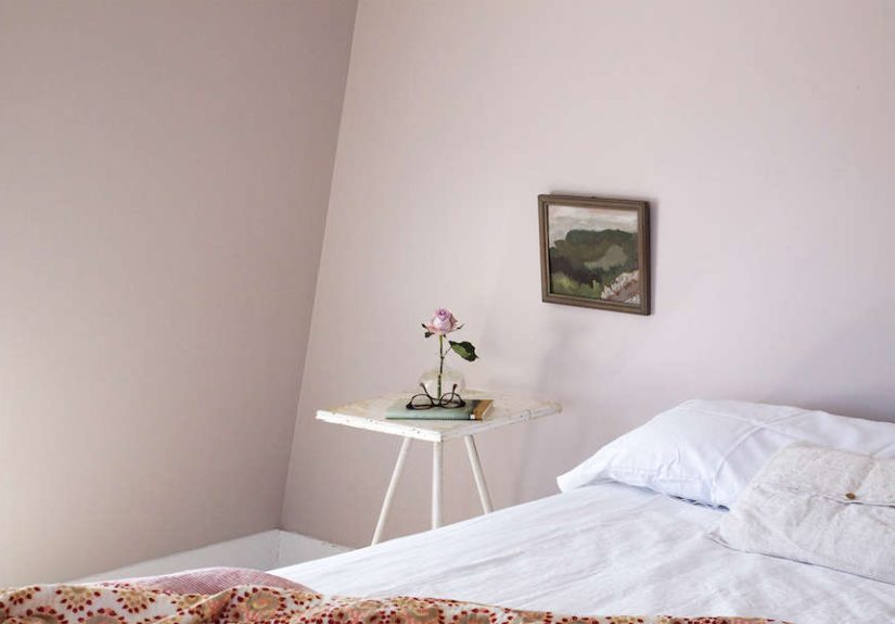
White paint is practically part of the Cape Cod design vocabulary, but the wrong white can make a bedroom feel cold, flat, or a bit too much like a freshly disinfected rental. Farrow & Ball offers whites and neutrals with more personality than plain builder white, including School House White, Wimborne White, Pointing, Slipper Satin, and Drop Cloth.
School House White is a soft off-white that works beautifully in bedrooms with limited light. It feels traditional without looking yellow, making it a natural partner for old trim, painted furniture, and classic Cape details. Use it on walls for a calm background, or on trim alongside muted blues and greens.
Wimborne White is crisp but not icy, which makes it an excellent trim color. If your bedroom has beadboard, crown molding, window casings, or built-in shelves, Wimborne White can highlight those details without screaming for attention. It also pairs well with pale blues, sandy neutrals, and bolder accent colors.
Drop Cloth is a smart choice when you want warmth. It sits in that useful space between beige, gray, and taupe, making it ideal for a bedroom that needs coziness but still wants to feel summer-light. Add white bedding, striped pillows, and a jute rug, and suddenly the room looks collected rather than decorated in one frantic online shopping session.
Deep Blues as Accents: A Little Harbor Drama
Deep blue paint can be stunning in a Cape Cod bedroom, especially when used strategically. Farrow & Ball shades like Hague Blue, Stiffkey Blue, Inchyra Blue, and De Nimes can add depth to a headboard wall, built-in wardrobe, window seat, or interior door.
The trick is restraint. A small Cape Cod bedroom covered entirely in dark blue can feel cozy and elegant, but it can also feel like you accidentally fell asleep inside a navy blazer. For summer, deep blues often work best as accents against pale walls. Try Hague Blue on a vintage dresser, De Nimes on a built-in bunk bed, or Inchyra Blue on a door with warm brass hardware.
Choosing the Right Farrow & Ball Finish
Color gets the applause, but finish does the heavy lifting. Farrow & Ball offers several finishes, and choosing the right one matters in a summer bedroom, especially in humid coastal climates where windows are open, sandy feet appear without warning, and children treat walls as if they are part of an interactive exhibit.
Estate Emulsion for a Soft, Classic Look
Estate Emulsion is known for its very matte, chalky finish. It creates beautiful depth and can help minimize minor wall imperfections, which is helpful in older Cape homes where perfectly smooth drywall is more of a concept than a reality. This finish is best for low-traffic adult bedrooms, guest rooms, and spaces where walls are unlikely to meet sticky fingers, wet beach bags, or rogue sunscreen.
Modern Emulsion for Washability
Modern Emulsion is a more practical choice for busy bedrooms, bunk rooms, rental properties, kids’ rooms, and guest spaces that see a lot of summer use. It has a washable, durable finish while still maintaining a refined matte look. If your Cape Cod summer bedroom doubles as a suitcase landing zone, snack station, and post-beach recovery room, Modern Emulsion is probably the sensible choice.
Dead Flat for Color Drenching
Dead Flat is useful when you want a seamless, ultra-matte look across walls, trim, and woodwork. Color drenchingpainting walls, trim, doors, and sometimes ceilings in the same shadecan work surprisingly well in small Cape Cod bedrooms. It reduces visual interruption and can make awkward angles feel deliberate. A dormer room painted in a soft shade like Cromarty or School House White can feel calm, cocooning, and beautifully finished.
Modern Eggshell for Trim, Furniture, and Floors
For woodwork, furniture, doors, and floors, Modern Eggshell is a durable option. A painted bed frame in De Nimes, a vintage dresser in Pigeon, or a small writing desk in Light Blue can give the room character without overwhelming it. Painting furniture is also a clever way to use Farrow & Ball color if you love a bold shade but do not want it on all four walls.
Room-by-Room Color Ideas for Cape Cod Summer Bedrooms
The Primary Bedroom: Calm, Breezy, and Grown-Up
For a primary bedroom, focus on quiet luxury. Use Light Blue or Cromarty on the walls, Wimborne White on trim, and natural linen bedding in white, oatmeal, or pale blue. Add woven shades, a simple upholstered headboard, and bedside lamps with ceramic or brass bases. The result feels coastal but not themed. It says “summer retreat,” not “I bought every shell-shaped object in the county.”
The Guest Bedroom: Welcoming Without Being Generic
Guest bedrooms are perfect places to experiment with soft personality. Borrowed Light on the walls creates an airy welcome, while School House White trim keeps the room warm. Add striped pillowcases, a lightweight quilt, a small wicker chair, and a carafe on the nightstand. If the room has an old painted floor, consider a soft neutral or pale blue finish to keep everything feeling cottage-fresh.
The Bunk Room: Practical, Playful, and Durable
Cape Cod bunk rooms should be cheerful, tough, and easy to clean. Choose Modern Emulsion for the walls and consider a stronger color like De Nimes, Pigeon, or Green Blue on built-in bunks. Keep bedding simple: white sheets, striped duvets, and maybe one playful accent color like coral, red, or sunny yellow. A bunk room can handle more color than a primary bedroom because it is already halfway to summer camp in the best possible way.
The Attic Bedroom: Making Sloped Ceilings Feel Intentional
Attic bedrooms can be magical, but they need careful color planning. If the ceiling is low or angled, avoid chopping the room into too many color blocks. Paint the walls, trim, and ceiling in the same pale shade, such as School House White, Borrowed Light, or Cromarty. This helps soften the geometry and makes the room feel more expansive. Add wall-mounted sconces instead of bulky lamps and use low-profile furniture to keep proportions balanced.
How to Style the Bedroom Around the Paint
Once the paint is chosen, the rest of the room should support it. Cape Cod summer style works best when it layers texture rather than clutter. Use linen, cotton, rattan, wicker, jute, cane, weathered wood, and simple ceramics. These materials create depth without making the room feel heavy.
For bedding, choose breathable layers. A white cotton sheet, a linen duvet, and a lightweight quilt at the foot of the bed will feel more summery than a thick comforter. Patterns should be classic and restrained: ticking stripes, gingham, small florals, block prints, or subtle checks. A single striped bolster can do more for a coastal bedroom than ten novelty pillows shaped like lobsters, though admittedly the lobster pillows are trying their best.
Lighting also matters. Cape Cod bedrooms often have compact layouts, so wall sconces, small table lamps, and woven pendant shades can save space while adding charm. Warm bulbs keep pale blue and green walls from feeling chilly at night. If the bedroom has a view, keep window treatments simple. White linen curtains, woven shades, or café curtains can soften the room without blocking summer light.
Practical Painting Tips for a Cape Cod Summer Refresh
Before committing to any color, test it on more than one wall. Cape Cod light changes quickly, and a color that looks perfect at noon may feel completely different at dusk. Paint large sample patches and look at them in the morning, afternoon, and evening. If possible, view them beside your bedding, flooring, and trim color.
Prep is especially important in older homes. Wash walls, sand rough patches, fill nail holes, caulk gaps, and prime where needed. Coastal humidity can affect drying, so choose a day with good ventilation and avoid painting when the room feels damp. If you are painting trim or furniture, clean and lightly sand the surface first so the finish adheres properly.
Do not underestimate the ceiling. In a small Cape Cod bedroom, a freshly painted ceiling can make the whole room feel cleaner and brighter. For a classic look, use a soft white. For a more designer approach, continue the wall color onto the ceiling, especially in rooms with sloped architecture. This creates a wrapped, restful effect that is perfect for sleeping.
Common Mistakes to Avoid
The first mistake is choosing a white that is too stark. In bright coastal light, pure white can feel harsh. Softer whites often look more natural and pair better with wood floors, vintage furniture, and woven textures.
The second mistake is overdecorating the theme. Cape Cod style does not require anchors, oars, buoys, and framed signs that say “Beach.” A room can feel coastal through color, texture, light, and proportion. Let the paint do the storytelling.
The third mistake is ignoring durability. A beautiful matte finish may be perfect for a quiet adult room, but a high-use guest bedroom or bunk room needs something more washable. Matching the finish to the room’s real life is the difference between long-lasting beauty and a wall that looks exhausted by Labor Day.
Experience Notes: What a Farrow & Ball Cape Cod Bedroom Refresh Feels Like
Refreshing a Cape Cod summer bedroom with Farrow & Ball paint is one of those projects that looks simple on paper and becomes surprisingly emotional in person. At first, it is just paint. You move the furniture, tape the trim, open the windows, and tell yourself this will be a calm, civilized weekend project. Then the first brushstroke goes on the wall, and suddenly the whole room starts changing its mind.
A pale blue bedroom, for example, can feel almost too subtle when the paint is wet. You may stand there wondering if you have chosen a color or merely a rumor of a color. But as it dries, the undertones begin to settle. The old wall disappears. The trim looks cleaner. The wood floor seems warmer. Morning light starts bouncing around the room differently. By the second coat, the bedroom feels less like a storage place for mismatched sheets and more like the room everyone will quietly fight over during a summer visit.
One of the best parts of this kind of refresh is how well it works with imperfect houses. Cape Cod bedrooms are rarely blank modern boxes. They have slanted ceilings, little dormer windows, old baseboards, tight corners, and sometimes a closet door that has clearly been negotiating with gravity for decades. Farrow & Ball’s softer colors and matte finishes flatter those quirks. Instead of highlighting every odd angle, the paint makes them feel charming, almost storybook. The room does not become perfect. It becomes better than perfect: personal.
The experience also teaches restraint. Once the paint is finished, you may feel tempted to buy every coastal accessory within a twenty-mile radius. Resist. The room usually needs less than you think. White sheets, a woven rug, a small lamp, a striped pillow, and maybe one piece of art can be enough. The paint creates the atmosphere; the furniture and textiles simply support it. When the room is done well, it feels like it has always looked that way, as if the walls spent the winter quietly preparing for July.
There is also a practical pleasure in the transformation. A refreshed summer bedroom makes hosting easier. Guests walk in and immediately understand where to put their bag, where to open the window, and where to collapse after a day of beach walking, lobster rolls, and pretending they are not sunburned. A good paint color can make a room feel cooler on hot days and warmer on foggy evenings. That is the magic of a thoughtful Cape Cod palette: it works with the weather instead of fighting it.
Most of all, the refresh changes how the room is used. Suddenly the bedroom is not just where people sleep. It becomes the quiet reading room in the afternoon, the nap room after swimming, the place where someone leaves a damp towel even though there is clearly a hook right there. It becomes part of the summer rhythm of the house. And when the windows are open, the sheets are clean, and the walls glow softly in Borrowed Light, Cromarty, or School House White, the whole room feels like a deep breath.
Conclusion: A Summer Bedroom That Feels Like the Cape
A Cape Cod summer bedroom refreshed with Farrow & Ball paint does not need to be complicated. Start with the architecture, study the light, choose a color that feels connected to the coast, and select a finish that matches the room’s real use. Soft blues create calm. Green-grays bring in the mood of dune grass and mist. Warm whites keep the room timeless. Deeper blues add just enough harbor drama when used with restraint.
The best Cape Cod bedrooms feel collected, breathable, and quietly beautiful. They are not trying to impress anyone, which is precisely why they do. With the right Farrow & Ball shade, a summer bedroom can become the most inviting room in the house: cool in the morning, golden in the afternoon, and peaceful at night. Add linen sheets, natural textures, simple lighting, and a healthy refusal to overdo the nautical décor, and you have a bedroom that feels refreshed for summerand classic enough to love long after the beach towels are packed away.
Note: This publish-ready article is written in original American English and synthesized from current, reputable home design, coastal interiors, Cape Cod architecture, and Farrow & Ball paint information without adding source links or citation tags to the body copy.