Table of Contents >> Show >> Hide
- Why Blue Works So Well on a Front Porch
- Choosing the Right Shade of Blue
- Best Ways to Decorate With Blue on a Front Porch
- Color Pairings That Make Blue Look Better
- How to Style a Blue Porch for Different Home Types
- Seasonal Decorating Ideas for a Blue Front Porch
- Mistakes to Avoid
- Final Thoughts
- Experiences and Everyday Living With a Blue Front Porch
Blue on a front porch is a little bit like denim at a dinner party: relaxed, dependable, and somehow still stylish when everyone else tries too hard. Whether you love a breezy coastal look, a classic Southern entry, a farmhouse porch with personality, or a crisp modern facade, blue can make your front porch feel cooler, calmer, and far more pulled together. It is one of those rare colors that can whisper or make an entrance, depending on the shade you choose and what you pair it with.
That flexibility is exactly why decorating with blue on a front porch works so well. A pale sky blue ceiling can brighten a shaded entry. A moody navy front door can anchor white siding. Blue-gray rockers can soften brick. Blue patterned pillows can add life to a neutral porch without turning the whole space into a seaside souvenir shop. In other words, blue is not a one-note color. It can be traditional, coastal, cottagey, modern, preppy, or polished.
If you are wondering how to decorate with blue on a front porch without making it look like a nautical costume drama, you are in the right place. Below, we will break down the smartest ways to use blue, which shades work best, how to style furniture and accessories around it, and how to make the whole porch feel welcoming in every season.
Why Blue Works So Well on a Front Porch
A front porch does two jobs at once: it introduces your home to visitors, and it gives you a small outdoor room to enjoy. Blue helps with both. Visually, it feels clean, airy, and inviting. Emotionally, it reads as calm and comfortable. Practically, it plays nicely with common exterior materials like white trim, black hardware, red brick, natural wood, gray stone, and green landscaping.
Blue also has range. Soft blue-green shades feel charming and historic. Mid-tone dusty blues look tailored and designer-friendly. Dark navy shades add drama and sophistication. Blue-gray hues are especially useful when you want a porch to feel elegant instead of sugary sweet. So if your goal is better curb appeal without visual chaos, blue is a very safe bet.
There is also a long-standing tradition of painting porch ceilings a pale blue, especially in the American South. That classic look remains popular because it creates an airy, open feeling overhead and adds subtle character even when the rest of the porch is neutral. It is a small move with surprisingly big payoff. Interior designers love that trick because it gives a porch personality without cluttering the floor with too many decorative items.
Choosing the Right Shade of Blue
Not all blues belong on every porch. The right one depends on your home’s exterior color, how much sun the porch gets, and how bold you want the final result to feel.
Light Blue
Light blue is ideal for porch ceilings, beadboard, shutters, and soft accent furniture. It feels fresh, open, and breezy. If your porch is shaded, a lighter blue can prevent the space from feeling dim or heavy. This is the shade family that often works best for cottage, coastal, Southern, and traditional homes.
Blue-Gray
Blue-gray is the overachiever of porch design. It looks tailored, modern, and easy to live with. If you are nervous about going too bright or too beachy, this is your lane. Blue-gray works beautifully with brick, white siding, warm wood, charcoal planters, and black lantern-style lighting. It also hides dust and pollen better than a very bright pastel. Mother Nature sends enough surprises; your porch color does not need to join her.
Navy or Deep Blue
Dark blue works best as an accent rather than the entire color story. A navy front door, navy flower pots, or a deep blue outdoor rug can give your porch structure and contrast. It is especially effective when paired with crisp white trim, brass or matte black hardware, and a few softening natural elements like wicker or potted greenery.
Blue-Green
Blue-green shades feel relaxed and slightly vintage. They are great when you want something softer than straight blue and more interesting than pale gray. These tones often look wonderful with creamy whites, clay pots, aged brick, and natural wood rocking chairs.
Best Ways to Decorate With Blue on a Front Porch
1. Start With the Ceiling
If you want a subtle way to introduce blue, paint the porch ceiling. This works because the color is visible enough to add charm but not so dominant that it overwhelms the exterior. A pale blue ceiling pairs beautifully with white columns, neutral flooring, and almost any front door color. It gives the porch a finished, intentional look, like the home got dressed before guests arrived.
To make the ceiling shine, keep the rest of the porch simple. Think white or black sconces, a natural fiber doormat, a pair of planters, and a bench or rocking chairs. The blue overhead becomes the quiet star of the show.
2. Let the Front Door Do the Talking
A blue front door is one of the easiest curb appeal upgrades you can make. Soft powder blue feels cheerful and laid-back. Slate blue feels refined. Navy feels dramatic and expensive. To keep the look balanced, repeat the blue somewhere else on the porch in a smaller way, such as a striped pillow, ceramic planter, or welcome mat pattern. Repetition creates cohesion. Random color splashes create confusion.
If your home has brick or stone, look closely at the undertones before choosing paint. Warm brick often looks best with softened or grayed blues. Crisp white homes can handle cleaner blues with more energy. A blue front door should look like it belongs to the house, not like it lost a dare.
3. Use Blue Through Textiles
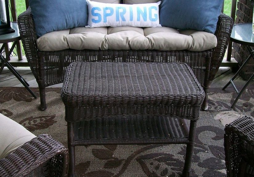
Outdoor pillows, cushions, throws, and rugs are among the easiest ways to decorate a blue front porch because they add color, comfort, and pattern without committing you to paint. Blue-and-white stripes feel timeless. Blue florals lean cottage. Solid indigo pillows with neutral seating feel more modern. A rug with hints of blue can tie together planters, furniture, and a painted door in one stroke.
The best approach is to mix blue with grounding neutrals like ivory, tan, charcoal, or natural jute. This keeps the porch feeling layered rather than overly themed. You want “stylish outdoor retreat,” not “gift shop near a lighthouse.”
4. Add Blue Planters and Pottery
Blue ceramic pots can be magical on a front porch. They bring color, shine, and texture, especially against brick, white trim, or natural wood. Large blue planters flanking the front door create symmetry and a sense of arrival. Smaller blue pots grouped with terracotta or concrete containers create a more relaxed, collected look.
For the plants themselves, leafy greens are the safest and strongest partner for blue. Ferns, boxwood, rosemary, dwarf olive trees, ivy, and trailing vines all look fantastic with blue containers. If you want flowers, white blooms, lavender tones, and deep pinks play especially well with blue accents.
5. Pair Blue With Natural Materials
One of the smartest ways to keep a blue porch from feeling cold is to bring in warm texture. Wicker, rattan, teak, cedar, jute, and weathered wood all soften blue beautifully. A porch with blue cushions and woven chairs feels more welcoming than a porch with blue cushions and a lot of hard, shiny surfaces.
This is also where black metal and aged brass help. A black lantern, brass door knocker, or simple wall light can give blue a tailored edge. The mix of cool color and warm texture is what makes a porch feel designed instead of decorated.
6. Use Blue in Small Repeats
The secret to a polished porch is repetition. If your front door is blue, echo that color in a planter, pillow, or wreath ribbon. If the ceiling is blue, bring in a rug with a blue border. If your chairs are painted blue, let the doormat stay neutral and the planters stay earthy. The idea is to create a visual conversation, not a shouting match.
Color Pairings That Make Blue Look Better
Blue is versatile, but it still likes good company. Some pairings are especially effective on front porches:
- Blue + White: crisp, classic, clean, and timeless.
- Blue + Natural Wood: warm, relaxed, and inviting.
- Blue + Black: modern and sharp, especially with simple lines.
- Blue + Green: fresh and garden-friendly, ideal for plant-filled porches.
- Blue + Terracotta: earthy and charming with a Mediterranean or cottage feel.
- Blue + Soft Gray: elegant, quiet, and grown-up.
If you want a livelier look, warm accents such as coral, soft yellow, rust, or even orange flowers can energize blue beautifully. These colors are especially useful in summer and fall when you want the porch to feel seasonal without repainting anything.
How to Style a Blue Porch for Different Home Types
Coastal or Cottage Homes
Go lighter and breezier. Use pale blue ceilings, white trim, striped cushions, woven furniture, and plenty of potted greenery. Weathered finishes work well here because they add character without fuss.
Farmhouse Homes
Choose muted blue-gray or dusty blue. Pair it with black hardware, simple lanterns, natural wood benches, and neutral textiles. This creates a porch that feels calm, practical, and stylish rather than overly precious.
Traditional Homes
A blue front door or a soft blue ceiling is usually enough. Add matching planters, a symmetrical furniture layout, and classic accessories like rocking chairs, topiaries, and a seasonal wreath.
Modern Homes
Use blue more sparingly but more deliberately. A deep blue door, oversized charcoal planters, minimal seating, and sleek sconces create an architectural look. The palette should stay edited and clean.
Seasonal Decorating Ideas for a Blue Front Porch
A blue porch adapts beautifully through the year. In spring, style it with white flowers, soft greenery, and a simple botanical wreath. In summer, lean into stripes, blue hydrangea-inspired accents, lanterns, and lighter fabrics. In fall, blue actually looks fantastic with pumpkins, especially white pumpkins, muted orange tones, dried grasses, and deep burgundy mums. In winter, evergreens, warm lights, plaid throws, and natural wreaths make blue feel cozy instead of chilly.
This is another reason blue is such a strong porch color: it gives you a steady base while the accessories do the seasonal heavy lifting.
Mistakes to Avoid
The biggest mistake is using too many different blues at once. If one is pastel, another is teal, and another is navy, the porch can start to feel accidental. Stick to one dominant blue family and vary it slightly if needed.
Another mistake is forgetting balance. Blue is cool-toned, so it usually needs warmth nearby. Bring in wood, woven textures, terracotta, greenery, or warm metals to keep the space inviting. Also, do not underestimate scale. Tiny planters can look lost on a large porch, while giant furniture can overwhelm a narrow one. Blue cannot fix proportion problems, no matter how pretty it is.
Finally, avoid over-accessorizing. A great porch does not need twenty decorative objects and a ceramic seagull with a mysterious attitude. It needs a few intentional pieces that work together: seating, greenery, lighting, and color repetition.
Final Thoughts
Decorating with blue on a front porch is one of the smartest ways to boost curb appeal while creating a space that feels calm, welcoming, and full of personality. Blue can be subtle or striking, traditional or modern, depending on how you use it. The key is to choose the right shade for your home, repeat it thoughtfully, and balance it with texture and natural elements.
If you want the easiest win, start with a blue ceiling, a blue door, or blue textiles. Then build outward with planters, lighting, and simple furniture. Done well, a blue front porch feels less like decoration and more like a mood: fresh air, cool shade, and the pleasant sense that whoever lives here probably knows how to make iced tea properly.
Experiences and Everyday Living With a Blue Front Porch
There is a difference between a porch that looks good in photos and a porch that actually feels good to live with. Blue tends to do both. In everyday life, a blue front porch often feels calmer than brighter, hotter colors. On a busy morning, when people are juggling keys, bags, coffee, and approximately seven thoughts at once, blue has a way of making the entrance feel less hectic. It is not magic, but it is close enough for people with overflowing calendars.
One of the nicest things about a blue porch is how it changes through the day. In the morning, pale blue ceilings and blue-gray furniture can feel crisp and fresh, especially with soft natural light. By afternoon, deeper blues start to look richer and more grounded. In the evening, blue becomes surprisingly cozy when paired with warm porch lighting. That contrast, cool color and warm glow, is what makes many porches feel like an actual outdoor room instead of a leftover slab near the front door.
Homeowners also tend to notice that blue is easier to decorate around than trendier colors. It welcomes greenery, so even simple plants can make the porch look well cared for. It flatters natural materials, so older wood rockers or a weathered bench suddenly look intentional instead of merely old. It works with seasonal accessories, so you can swap pillows, wreaths, lantern fillers, pumpkins, or holiday greens without fighting the base color every few months.
There is also an emotional side to the experience. A blue front porch often feels more restful and more neighbor-friendly. People linger. Deliveries get set down in a spot that feels neat rather than forgotten. Guests hesitate for a second before ringing the bell, not because they are unsure, but because the porch already feels like part of the hospitality. Even the homeowners tend to use it more. A pair of chairs and a small side table suddenly become a place for evening chats, quick phone calls, or watching the weather roll in with dramatic flair.
Blue is especially effective if your front porch is modest in size. Small porches can feel crowded fast, but blue helps visually open them up when used on ceilings, doors, or textiles. That can make the whole entry feel lighter. On larger porches, deeper blues create definition and prevent the space from feeling bland or oversized. So whether the porch is tiny, sprawling, screened, formal, rustic, or somewhere in between, blue tends to adapt without much fuss.
Perhaps the best real-life quality of a blue front porch is that it rarely feels dated. Tastes change, trends come and go, and yet blue keeps showing up because it can shift styles without losing its charm. Dress it up with polished lanterns and tailored cushions, and it feels elegant. Pair it with wicker, ferns, and a casual striped rug, and it feels relaxed. Add black accents and minimal shapes, and it feels modern. That kind of flexibility is exactly what makes people stick with blue once they try it. A blue front porch does not just decorate the house. It quietly improves the experience of coming home.