Table of Contents >> Show >> Hide
- Why a Bright Blue Front Door Works So Well
- The Psychology of BlueUseful, Not Fluffy
- Curb Appeal and Value: Does a Blue Door Help?
- How to Choose the Right Bright Blue for Your Home
- Finish, Paint Type, and Durability: The Nerdy Stuff That Saves You Regret
- Step-by-Step: Painting a Bright Blue Front Door Like a Pro
- Common Bright Blue Door Mistakes (and Easy Fixes)
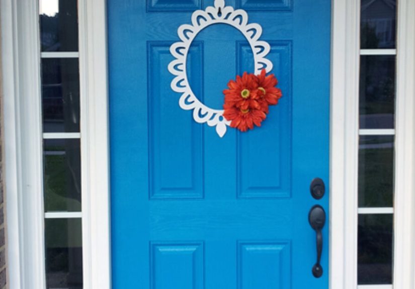
- Design Pairings That Make a Blue Door Look Expensive
- Seasonal Styling for a Blue Front Door
- A Year of Living with a Bright Blue Front Door: Real Experiences
- Conclusion
If your house were a person at a party, your front door would be the one doing the handshake, remembering names, and making everyone feel welcome before they even step inside. And a bright blue front door? That’s the charismatic friend with excellent taste, great playlists, and zero fear of being memorable.
A blue door is playful without being chaotic, bold without being obnoxious, and stylish without requiring a full exterior renovation budget. It can wake up a sleepy facade, add personality to neutral siding, and create that “Wait, this house is adorable” moment from the curb. This guide breaks down how to choose the right blue, how to paint your door so it actually lasts, how to style it year-round, and what real homeowners experience once they commit to the color.
Think of this as your complete bright-blue-door blueprint: practical, design-savvy, and honest about what works in real life (including pollen, fingerprints, weather, and opinions from your mother-in-law).
Why a Bright Blue Front Door Works So Well
1) It creates an instant focal point
Exterior design works best when the eye has somewhere to land first. On most homes, that focal point should be the entry. Blue naturally draws attention, especially against white, gray, beige, black, brick, or natural wood. Instead of your facade feeling “flat,” it feels intentional.
2) It signals personality without repainting the whole house
Repainting your entire exterior can be expensive and time-consuming. A front door is the opposite: compact project, high visual payoff. You can test a bold style choice in a contained way. If you love it, great. If you don’t, repainting one door is far less dramatic than repainting 2,000 square feet of siding.
3) It balances welcoming and confident
Many homeowners want curb appeal that feels warm but not boring. Bright blue does both. It reads fresh and friendly in daylight, and with the right hardware and lighting, it looks polished at night.
The Psychology of BlueUseful, Not Fluffy
Blue is commonly associated with calm, trust, and stability, which helps explain why it shows up so often in branding, uniforms, and home design. But here’s the smart caveat: color response is not one-size-fits-all. Context matters. Culture matters. Lighting matters. Your personal associations matter.
Translation: if bright cobalt makes you feel energized and happy, that’s your answer. If dusty denim blue makes you exhale and relax, that’s also your answer. The “best” blue is the one that supports the mood you want every time you walk up to your home.
Curb Appeal and Value: Does a Blue Door Help?
Let’s talk money, because paint isn’t free and neither is your Saturday. Housing and remodeling data suggests entry updates can make a real difference in perceived appeal. Front-door color studies have shown some shades can positively influence buyer interest, while large remodeling datasets continue to rank entry-related improvements among strong ROI projects.
Important reality check: paint color alone will not magically add tens of thousands to a sale price. Condition, neighborhood, layout, and pricing strategy still dominate. But a well-chosen, well-executed entry color can improve first impressions and buyer emotionwhich absolutely matters in competitive markets.
How to Choose the Right Bright Blue for Your Home
Start with undertones
Two blues can look nearly identical on a paint chip and wildly different on a front door. Why? Undertones. A blue with green undertones can feel coastal and cheerful. A blue with gray undertones feels more classic and grounded. A blue with violet undertones can look richer and moodier.
Match your fixed elements first
Before choosing your shade, look at the non-negotiables: roof color, brick tone, stone, walkway color, and trim. These elements don’t move, so your blue should work with them.
- Warm brick or tan stone: try blue-greens or softened teals.
- Cool gray siding: try crisp cobalt, navy-leaning bright blue, or French blue.
- White exterior: almost any bright blue worksjust choose your vibe (playful or polished).
- Black-and-white facade: saturated blue adds drama without looking random.
Test in real light, not store light
Paint swatches in fluorescent lighting are notorious liars. Tape large sample boards to the door area and check morning, noon, late afternoon, and nighttime with porch lights on. Blue shifts dramatically with sunlight and shadows.
Pick your style lane
- Coastal cheerful: aqua, pool blue, sea-glass blue.
- Classic Americana: true medium blue, heritage blue, colonial-inspired tones.
- Modern punch: saturated cobalt or electric-leaning blue with clean lines.
- Moody elegant: deep jewel blue with brass or matte black hardware.
Finish, Paint Type, and Durability: The Nerdy Stuff That Saves You Regret
Choose the right sheen
For front doors, satin, semi-gloss, and gloss are common because they’re more durable and easier to wipe clean than flatter finishes. If your door has visible texture or imperfections, very high gloss can highlight every bump. Semi-gloss is the sweet spot for many homes: durable, cleanable, and attractive without mirror-level drama.
Use exterior-grade paint, not leftovers from your hallway
Exterior doors deal with UV, moisture, dust, and temperature swings. Use paint specifically made for exterior surfaces. Premium formulas improve color retention, adhesion, and weather resistance.
Prime strategically
If you’re covering a dark color with a bright blue, or switching paint types, primer is your best friend. It improves adhesion and helps color read true fasterfewer coats, less frustration, fewer muttered words.
Respect weather windows
Even great paint can fail if applied in bad conditions. Check label ranges for temperature and humidity, avoid painting before rain, and don’t paint a hot surface in direct blazing sun if you can avoid it. Good conditions = smoother finish and longer lifespan.
Step-by-Step: Painting a Bright Blue Front Door Like a Pro
Step 1: Remove or mask hardware
Take off knobs, locksets, kick plates, and numbers if possible. If not, mask carefully. Clean lines are what separate “DIY charming” from “weekend panic project.”
Step 2: Clean thoroughly
Use a degreasing cleaner and remove dirt, oils, pollen, and mystery smudges. Paint needs a clean surface to bond.
Step 3: Sand and repair
Lightly sand to dull glossy areas and smooth rough spots. Fill minor dents or cracks. Wipe dust completely.
Step 4: Prime where needed
Spot-prime repairs or prime the full door if changing color significantly or if adhesion is questionable.
Step 5: Paint in the right order
For paneled doors, paint recessed panels first, then rails, then stiles, then edges. Keep a wet edge and avoid overworking partially dried paint.
Step 6: Let it dry fully between coats
Don’t rush recoat time. Two thin coats beat one thick coat every time.
Step 7: Reinstall hardware and enjoy immediate serotonin
Once fully cured, reinstall hardware, update your doormat, and step back. You just gave your home a personality upgrade.
Common Bright Blue Door Mistakes (and Easy Fixes)
- Skipping prep: Peeling starts where cleaning and sanding didn’t happen.
- Choosing color from a tiny chip: Always test a large sample board.
- Ignoring undertones: “Why does this look turquoise now?” Usually undertones + light.
- Wrong sheen for the door condition: High gloss can magnify imperfections.
- Painting in bad weather: Humidity and rain can ruin finish quality.
- Forgetting the full entry composition: Door color should coordinate with trim, hardware, and lighting.
Design Pairings That Make a Blue Door Look Expensive
Hardware pairings
- Polished brass: warm, classic, and high-contrast.
- Matte black: modern and graphic.
- Brushed nickel: clean and understated.
Trim and surrounding colors
- Crisp white trim: bright, fresh, and energetic.
- Cream trim: softer, traditional look.
- Charcoal accents: sophisticated contrast.
Accessories that complete the look
- Simple modern sconces
- Oversized house numbers
- Planters with layered greenery
- Natural-fiber doormat in a warm neutral
- Seasonal wreaths with controlled color palette
Seasonal Styling for a Blue Front Door
Spring
Pair with white flowers, fresh greens, and light wood accents. Think clean and breezy.
Summer
Lean coastal: striped doormat, lanterns, light-toned planters, and citrusy florals.
Fall
Blue plays beautifully with rust, ochre, and burgundy. Pumpkins and mums pop against saturated blue.
Winter
Evergreen wreaths, warm lights, metallic accents, and neutral textiles keep things cozy but elegant.
A Year of Living with a Bright Blue Front Door: Real Experiences
When I first painted my front door bright blue, I expected two things: (1) a mild curb appeal upgrade, and (2) at least one neighbor to say, “That is… bold,” with the kind of smile that means “I would never do this.” Both happened. What I didn’t expect was how much the color would change the way I felt about coming home.
Week one was mostly excitement and anxiety. Excitement because the door looked amazing from the street. Anxiety because I kept stepping outside every two hours to ask very important scientific questions like: “Is this still perfect?” and “Did I just see a dust speck?” By day three, I had accepted that exterior paint exists in the real world with wind, pollen, fingerprints, and package deliveriesnot inside a design catalog where nothing ever touches the surface.
Around month one, something interesting happened: people started smiling at the house. Delivery drivers commented. Friends who had visited before said the place felt “happier,” even though nothing else changed. One neighbor asked for the color name and painted her mudroom door a similar shade. Another texted me a photo of a cobalt planter and said, “I blame your door for this purchase.” That’s how color spreads through a neighborhoodone tiny act of courage at a time.
In summer, the bright blue looked crisp in strong sunlight and slightly deeper in evening shade. I learned quickly that hardware matters. After swapping a tired old handle for cleaner, darker hardware, the whole entry looked more intentional. Same paint. Same door. Completely different impression. That was a valuable lesson: color is powerful, but composition is what makes it look expensive.
Fall was my favorite season with the blue door. Pumpkins, copper tones, and dried grasses looked amazing against it. I used to overdecorate the entry because I felt the facade needed “help.” After painting the door, I actually used fewer decorations. The color did more of the heavy lifting, so I could keep the styling simple and still get compliments.
Winter taught me maintenance discipline. Moisture, temperature shifts, and extra traffic can stress any entry surface. I kept a small jar of leftover paint for tiny touch-ups and cleaned the door with mild soap and water. Five-minute maintenance every few weeks prevented the “how did this get so grimy?” surprise.
The funniest part? Family reactions evolved over time. Initial responses ranged from “Love it!” to “Are you sure this isn’t too bright?” Six months later, the skeptics stopped noticing the boldness and started describing it as “just your style.” That’s the secret with strong color: it feels loud for five minutes, then it becomes part of your home’s identity.
There were practical takeaways, too. First, test large samples outside before committing. The color that looked perfect online was not the one I chose after seeing it in morning and afternoon light. Second, prep matters more than paint brand loyalty arguments on the internet. Cleaning, sanding, and patient dry times made the finish look professional. Third, keep expectations realistic: doors are high-contact surfaces. They will need occasional care, and that’s normal.
But the biggest takeaway was emotional, not technical. A bright blue front door changed the tone of everyday routines. Leaving for errands felt a little more upbeat. Coming back after a long day felt more welcoming. The entry became less “functional opening in wall” and more “small daily joy portal.” That might sound dramatic until you experience it. Home design is full of expensive upgrades, but this one was relatively affordable and genuinely high impact.
If you’re on the fence, here’s my advice: choose the blue that makes you grin when you see it, commit to proper prep, and style the entry with restraint. You don’t need twenty accessories. You need one confident color choice and a clean, cared-for finish. Your front door is the beginning of your home story. There is no rule saying that story has to start in beige.
Conclusion
A bright blue front door is one of the rare upgrades that blends personality, practicality, and curb appeal in a single weekend project. Done thoughtfully, it can refresh your exterior, strengthen first impressions, and make daily life feel a little more fun. The key is simple: choose a blue that suits your architecture and lighting, use the correct exterior products and finish, follow prep and weather best practices, and treat the door as part of a complete entry composition. If you do that, your front door won’t just look betterit will feel like home the moment you see it.