Table of Contents >> Show >> Hide
- Why Natural Linen Works So Well in Bedrooms
- Meet the Color: What Is Benjamin Moore Natural Linen?
- Sampling: Don’t Skip This Unless You Love Repainting
- Pick the Right Sheen for a Bedroom (Yes, It Matters)
- Prep Work That Makes Natural Linen Look Expensive
- Step-by-Step: Painting Your Bedroom With Natural Linen
- Color Pairings: What Looks Amazing With Natural Linen
- Real Bedroom Scenarios (So You Can Predict the Outcome)
- Common Mistakes (And How to Fix Them)
- FAQ
- Real-World Experiences: What It’s Like Living With Natural Linen in the Bedroom
- Conclusion
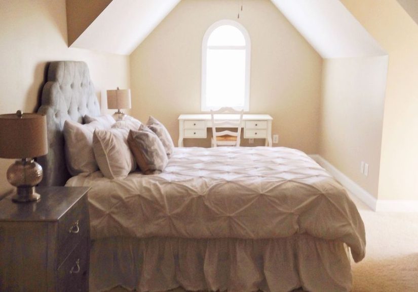
If your bedroom walls could talk, they’d probably ask for a color that says “calm, collected adult” instead of
“I panic-bought paint at 9:47 p.m. and now everything looks like oatmeal.” Enter Benjamin Moore Natural Linen:
the sandy neutral that’s warm, relaxed, and surprisingly good at making your room feel put togethereven if the “decor”
is mostly laundry in a tasteful pile.
In this guide, you’ll get the full scoop on how Natural Linen behaves in real bedrooms, what undertones to watch for,
which sheen makes it look expensive (and not shiny like a waxed apple), plus step-by-step painting tips that help you
nail a pro-looking finish the first time.[1][2]
Why Natural Linen Works So Well in Bedrooms
Bedrooms ask for a very specific vibe: softer than your living room, warmer than your office, and ideally not so stark
that you feel like you’re sleeping in a dentist’s waiting room. Natural Linen hits that sweet spot because it’s a
light-to-medium warm neutralbright enough to keep things airy, but grounded enough to feel cozy.[1][2]
- It’s calming without being bland: Think “linen sheets” energynatural, soft, and easy to live with.[1]
- It plays nicely with common bedroom materials: Oak floors, beige carpet, brass hardware, woven textures, and white bedding all get along here.[2]
- It’s a mood stabilizer for mixed finishes: If your room has warm wood + cooler textiles + a random black dresser you refuse to replace, Natural Linen can bridge the gap.[2]
Meet the Color: What Is Benjamin Moore Natural Linen?
The quick identity card
Natural Linen is Benjamin Moore color 966 (also often referenced as CC-90 in the Color Classics context). Benjamin Moore describes it as a
“sandy neutral” with rustic warmth and elegance.[1][2]
The big practical number to know: LRV 59.84. LRV (Light Reflectance Value) is basically how much light the color reflects on a 0–100 scale.
Around 60 means it’s comfortably in the “light-medium” zonebright enough for an open feel, but not so bright it disappears at noon.[1]
Undertones: the reason it doesn’t go “pink-beige sad”
Natural Linen is warm, but it’s not that yellow-orange warmth that can scream “2003 Tuscan kitchen.” The interesting part is its
subtle green undertone, which helps keep it earthy and prevents that dreaded pink cast that can happen with many beiges.[2]
Translation: it tends to feel grounded and modern. In some lighting, people notice a faint peachy moment, but overall the
green-beige base is what sets the tone.[2]
How lighting changes Natural Linen in a bedroom
This color is a chameleonbut like, a polite chameleon. Here’s what to expect:[2]
- South-facing (lots of warm daylight): Natural Linen looks lighter and creamier, sometimes reading closer to a pale tan.[2]
- North-facing (cooler light): It gets richer and a touch more muted; the green-beige character is more noticeable and cozy.[2]
- Evening ламps / warm bulbs: Warm light can amplify the “sandy” vibegreat for a snug bedroom, but test if you’re sensitive to warmth.
- Cool LEDs: Cool bulbs can pull forward the earthy/green side. Sometimes that’s sophisticated; sometimes it’s “why does my wall look slightly khaki?” (Bulb swap fixes a lot.)
Sampling: Don’t Skip This Unless You Love Repainting
Natural Linen looks different depending on your trim color, floor tone, and lightingso the paint chip is only the first date,
not the marriage. Sampling is where you avoid expensive regret.[2][9]
How to test it the smart way
- Test larger than you think you need: Big swatches or sample boards show undertones better than tiny squares.[2]
- Place it near your trim: The contrast (or lack of it) changes how the wall color reads.
- Check it throughout the day: Morning, midday, evening, and under your actual bedroom lampsnot the blinding overhead “interrogation light.”[2]
- Compare it to one lighter and one deeper option: This helps your eyes “calibrate” and makes the choice easier.[2]
Pick the Right Sheen for a Bedroom (Yes, It Matters)
Sheen isn’t just about shineit affects how the color looks, how forgiving your walls are, and how easy it is to clean.
Bedrooms usually do best with matte or eggshell, depending on your lifestyle and your walls’ personality.[3][4]
Matte: cozy, modern, and forgiving
Matte is a favorite for bedrooms because it’s soft-looking and hides minor wall issues better than shinier finishes.
If your bedroom has angled light or walls with “character” (read: patches, dents, or that one spot from a moved headboard),
matte keeps things calm.[3][4]
Eggshell: the “best of both worlds” option
Eggshell has a subtle sheen that adds a gentle glow and gives you more wipeability than matte. It’s often recommended for bedrooms
when you want a balance of elegance and practicalityespecially if the room gets moderate use or you’re not trying to tiptoe around
your walls forever.[3][5][6]
Satin: for kid bedrooms (or messy adults with snacks)
Satin is tougher and more washable, but it reflects more lightso it can highlight wall imperfections. Great for kids’ rooms or
high-touch areas, but if you’re chasing a soft, spa-like bedroom, satin may feel a bit too “notice me.”[4][5]
For trim and doors, most pros still lean toward semi-gloss or similar higher-sheen finishes to create crisp definition.[3][4]
Prep Work That Makes Natural Linen Look Expensive
Natural Linen is light enough that surface flaws can show if you skip prepespecially in daylight. The good news: prep is mostly
boring, not difficult. Put on a playlist, embrace your inner responsible adult, and do these steps:[7][8]
- Clear the room: Move furniture, remove wall decor, and pop off outlet/switch covers (it’s fast and looks cleaner).[7]
- Patch and sand: Fill holes, let dry, sand smooth. Your future self will thank you when the wall doesn’t look like it has acne scars.[7][8]
- Clean the walls: Dust and wipe. Paint sticks better to “clean” than “mysteriously sticky.”[7][8]
- Prime when it matters: Prime bare drywall, stains, repaired areas, or when going from dark to light. Choose a primer that fits the situation (bonding for slick surfaces, stain-blocking for marks).[7][8]
Step-by-Step: Painting Your Bedroom With Natural Linen
If you want the cleanest finish, work top to bottom and keep a steady pace so you don’t get lap marks. Here’s a reliable workflow
used by pros and DIY guides alike:[7][8]
1) Tape (or don’t) but be consistent
Pros often cut in freehand, but painter’s tape is totally fineespecially if you’re newer. Press it down firmly so paint doesn’t
sneak under like it pays rent.[7][8]
2) Cut in first
Use an angled brush to paint a clean border around ceilings, corners, trim, doors, and windows. Work in manageable sections so the
cut-in edge doesn’t dry before you roll and blend it.[8]
3) Roll like you mean it
Load the roller evenly, then apply paint in a big “W” or “M” shape and fill it in without lifting too much. Light pressure beats
brute force. Two coats are common for consistent color and coverageespecially with lighter neutrals.[7][8]
4) Remove tape the right way
If you taped, peel it back slowly at a 45-degree angle once the paint is dry to the touch (but not fully cured). If it sticks, score
the edge gently to avoid pulling paint off the wall.[7][8]
Color Pairings: What Looks Amazing With Natural Linen
Trim colors that work (crisp vs. creamy)
Trim is the frame; walls are the art. Natural Linen can look more modern with a crisp white, or more traditional with a softer warm white.
If you want a Benjamin Moore-approved direction, Natural Linen is shown with coordinating whites like White Heron OC-57.[1]
- Crisp, modern contrast: Bright whites (think clean and sharp) make Natural Linen feel fresher and slightly more contemporary.[2]
- Soft, blended contrast: Warmer whites create a gentler transitiongreat for cozy bedrooms and classic styles.[2]
- Pro tip: If you love White Dove for trim/doors, you’re not aloneit’s repeatedly cited as a long-running bestseller because it’s versatile and subtly warm.[12]
Accent colors that make it sing
Natural Linen plays well with muted, nature-inspired hues and calm mid-tones. Benjamin Moore’s own coordinating suggestions include
Dune White 968, Ocean Floor 1630, and Stormy Monday 2112-50all excellent directions for bedding, rugs, or an accent wall if you’re brave and/or caffeinated.[1]
Want a quick palette cheat sheet?
- Soft blues/blue-grays: Calm, airy, and very “hotel-but-better.”[1]
- Sage/olive greens: Echo the subtle green undertone and feel naturally restful.
- Charcoal or inky navy: Adds depth without making the whole room heavygreat for headboards, curtains, or one moody wall.
- Terracotta or clay accents: Adds warmth and personality while still feeling grounded.[2]
Materials and finishes that look expensive with this color
- Natural woods: Oak, walnut, and woven textures complement the sandy base.
- Warm metals: Brushed brass, bronze, champagne nickel.
- Textiles: Linen, cotton, boucle, and chunky knits make the walls feel intentionally cozy.
Real Bedroom Scenarios (So You Can Predict the Outcome)
Small, north-facing bedroom with cool daylight
Natural Linen can look richer and slightly more muted here; the earthy undertone is more obvious. If you love a cocooning vibe, perfect.
If you want brighter, pair it with crisp white trim and add warm lighting (2700K–3000K style warmth) to keep it inviting.[2]
Large, south-facing bedroom with lots of sun
It will likely read lighter and creamier, giving you a soft, relaxed look. If you’re worried about it feeling too pale, add contrast:
darker wood furniture, a deeper area rug, or moody accents like Stormy Monday-inspired blues/charcoals.[1][2]
Beige carpet or warm-toned floors
This is Natural Linen’s comfort zonewarm floors tend to make it look cohesive and intentionally layered, not “matchy-matchy.”
Use different textures (not different beiges) to keep the room interesting.[2]
Cool gray flooring (modern builds)
This is where you must sample. A warm beige on cool gray floors can sometimes read a bit “muddy” depending on the lighting.
If it feels off, a slightly greiger neutral may be a better fitor adjust lighting and textiles to warm the room back up.[2]
Common Mistakes (And How to Fix Them)
“It looks more yellow than I expected.”
- Check your bulbsvery warm lighting can exaggerate warmth. Try a slightly more neutral warm bulb or layered lighting.
- Add cooler accents (soft blues, crisp whites) to rebalance the room visually.
“Now it looks a little green.”
- That undertone can show more in cool lightespecially north-facing rooms. Warmer lamps and warmer textiles often solve it.[2]
- Compare it against trim: a too-cool white can make the wall look greener by contrast.
“The finish looks streaky or shiny.”
- Higher sheen + uneven walls = spotlight on every flaw. Consider matte/eggshell for bedrooms.[3][4]
- Maintain a wet edge while rolling, and don’t overwork drying paint.
FAQ
Is Natural Linen too dark for a bedroom?
Usually no. With an LRV around 60, it stays fairly light, especially in brighter rooms. In low-light spaces it may feel deeper and cozier,
so sampling is key.[1][2]
Do I need primer before painting Natural Linen?
Prime if you’re covering stains, painting repaired drywall, switching from a dark color, or dealing with slick/glossy surfaces.
Match the primer type to the wall condition (bonding vs stain-blocking vs general-purpose).[7][8]
What’s the best sheen for Natural Linen in a primary bedroom?
Most people love matte for the soft, modern look. If you want easier cleanup, go eggshell.
Save satin for kid rooms or higher-touch situations.[3][4][5]
Real-World Experiences: What It’s Like Living With Natural Linen in the Bedroom
Here’s what homeowners and designers commonly report after the paint dries, the furniture moves back in, and life resumes (with its
charming habits like coffee cups on nightstands and pets that believe every bed is their bed).
Week 1: The “why does it look different every hour?” phase. The first thing people notice is that Natural Linen isn’t static.
In the morning, it can look lighter and a touch fresher; in late afternoon, it often warms up; at night, it settles into that cozy,
sandy-beige comfort zone. This is normaland actually part of the charm. You start to realize the color isn’t trying to dominate the room;
it’s reacting to it. Many folks say that once they stop expecting one “single” look and accept the shifting, it becomes more soothing than
a perfectly flat neutral.[2]
Texture becomes the star. Natural Linen tends to make fabrics look better. White bedding looks softer (less clinical), linen drapes
look richer, and woven baskets suddenly feel like they belong in a magazine spreadeven if you bought them during a late-night “I’m organizing my life”
delusion. Bedrooms painted in this color often feel more “layered” without requiring a full decor overhaul. People who previously had cool grays in the
bedroom frequently describe the switch as moving from “clean” to “comforting.”
It’s surprisingly forgiving with imperfect decorating. One of the most practical “lived with it” takeaways is how well it tolerates
mismatched woods and mixed metal finishes. That’s not a license to chaos, but it helps if your nightstands don’t match your dresser because you’re a
person with a budget and a personality. The subtle earthy undertone often helps the walls connect disparate piecesespecially when you add a few bridging
elements like warm white pillows, a natural fiber rug, or art with muted greens/blues.[2]
Lighting upgrades feel more impactful. People often notice their bulb choices more after painting. If you install softer bedside lamps,
add dimmers, or swap harsh cool LEDs for warm ambient lighting, Natural Linen rewards you by looking calmer and more expensive. In other words, this is a
color that politely encourages better mood lightinglike a friend who brings candles to dinner and then pretends it’s “no big deal.”
The sheen decision shows up in daily life. In matte, bedrooms tend to feel velvety and relaxed, and minor wall waves don’t announce
themselves. In eggshell, the walls have a gentle glow and handle occasional wipe-downs better. People with pets or kids often appreciate eggshell’s
practicality; people chasing a boutique-hotel vibe often prefer matte. Either way, most “I regret this” stories are actually “I chose a shinier sheen
than my walls deserved,” which is why matte/eggshell dominate bedroom recommendations.[3][4][5]
Long-term vibe: restful, not boring. After a few months, Natural Linen tends to fade into the background in the best waymeaning you’re
not constantly “noticing” the walls. Instead, you notice how restful the room feels, how easy it is to change bedding colors seasonally, and how your
bedroom no longer feels like it’s trying to win an argument with your furniture. If you want a neutral that supports sleep, softness, and flexibility,
this one earns its keep.
Conclusion
Painting a bedroom with Benjamin Moore Natural Linen (966) is a smart move if you want warmth without heaviness, calm without blandness,
and a neutral that adapts to real life (and real lighting). With an LRV just under 60, subtle earthy undertones, and strong compatibility with whites,
woods, and muted accent colors, it’s an easy foundation for a bedroom that feels genuinely restfulnot staged.[1][2]
Sample it properly, pick a bedroom-friendly sheen (matte or eggshell for most people), prep your walls like you’re trying to impress your future self,
and you’ll end up with that “quiet luxury” lookminus the “quiet luxury” budget.