Table of Contents >> Show >> Hide
- Why Kolor’s Office Style Feels So Fresh
- What “Radical Color” Actually Means in a Workplace
- Lessons Offices Can Learn From Kolor in Germany
- How to Bring Radical Color Into an Office Without Causing Visual Chaos
- Where Kolor’s Influence Makes the Most Sense
- The Common Mistakes to Avoid
- Why Kolor in Germany Still Matters
- Experiences With Radical Color in the Office: What It Actually Feels Like
- Conclusion
Office design has spent decades flirting with beige like it was a long-term commitment. Beige walls. Beige cubicles. Beige carpet. Beige energy. Then along comes Kolor in Germany with a better idea: what if the office did not look like a waiting room for tax season? What if workspaces could be sharp, playful, grown-up, and just a tiny bit rebellious?
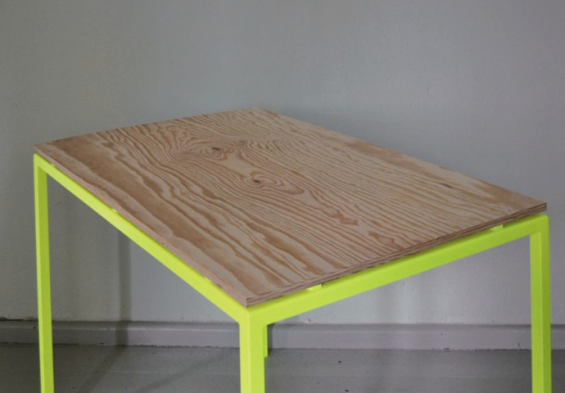
That is the spark behind Kolor, the Berlin-based design studio known for minimalist forms, natural materials, and bold jolts of neon. The studio’s office pieces, especially the designs that pair raw plywood with fluorescent yellow-painted metal, feel like a cheerful interruption to traditional workplace furniture. They are clean without being sterile, colorful without turning the room into a kindergarten, and practical without looking as if they were designed by a spreadsheet.
What makes Kolor especially interesting is that the brand does not use radical color as decoration alone. The color is structural, directional, and emotional. It highlights supports, edges, and moments of contact. It turns a shelf bracket, table leg, or frame into the visual punchline of an otherwise disciplined design. In other words, Kolor understands something many offices still miss: a workplace can be serious about work without looking serious all the time.
Why Kolor’s Office Style Feels So Fresh
The magic starts with contrast. Kolor often combines two very different personalities in one object: warm, natural plywood and electric neon accents. The plywood keeps the piece grounded, tactile, and human. The fluorescent color wakes it up. One material says, “I appreciate craftsmanship.” The other says, “I have no intention of being boring.” Together, they create office furniture that feels both rational and surprising.
This balance matters. Radical color works best when it has something calm to push against. If everything in a room is bright, then nothing stands out. Kolor seems to understand that restraint is what makes the boldness land. A thin tabletop, a light metal frame, an adjustable shelf, a clean silhouette, then bam: a fluorescent detail that changes the whole mood of the piece. It is like adding hot sauce to a very well-made sandwich. The sandwich still matters.
That approach also helps Kolor avoid a trap common in colorful office design: visual exhaustion. Bright colors can energize a workplace, but too much intensity in every direction can turn a productive room into a stress festival. Kolor’s designs stay lean, open, and breathable. The color is concentrated. The shapes are disciplined. The result is office furniture that feels lively rather than loud.
What “Radical Color” Actually Means in a Workplace
Radical color does not mean painting every wall in the office neon yellow and hoping for the best. That is not bold design; that is an HR incident waiting to happen. In a well-designed office, color should have a job. It can define zones, support wayfinding, reinforce brand identity, encourage certain moods, and help specific areas feel more social, focused, or creative.
That is why current workplace thinking has become much more nuanced. Designers increasingly use color not as wallpaper, but as strategy. Warm, saturated tones can make collaboration areas feel inviting and energetic. Softer greens and blues can calm focus spaces. Neutral backgrounds can give the eye a place to rest. Wood, stone, and other natural materials add warmth and authenticity. The smartest offices combine these moves rather than betting everything on one “statement” wall and calling it innovation.
Kolor fits neatly into this modern office conversation. Its furniture does not overwhelm the room. It creates moments of visual identity inside it. A fluorescent support under a desk, a bright shelving element against a pale wall, or a small shot of color in office accessories can change how a space feels without forcing every employee to work inside a giant highlighter.
Lessons Offices Can Learn From Kolor in Germany
1. Use bold color as an accent, not a flood
Kolor’s work suggests that color is strongest when it is targeted. A single radical note can make an object memorable. In office design, this means applying bright color to frames, edges, handles, partitions, shelving supports, acoustic elements, or small collaboration zones instead of coating every available surface.
2. Pair bright hues with honest materials
Natural plywood is doing serious emotional labor here. It keeps the fluorescent elements from feeling synthetic or gimmicky. In a workplace, wood tones, matte finishes, textiles, and natural light can soften bolder colors and make them feel intentional rather than aggressive. Color likes good company.
3. Let the office tell a story
Today’s offices are often asked to do more than house desks. They are meant to communicate brand culture, attract talent, support hybrid work, and give people a reason to come in. Kolor-style color can help tell that story. A creative firm might use electric accents to signal experimentation. A design studio might use bright shelving and smart storage to show visual confidence. Even a conservative company can use selective color to say, “We are modern, not mausoleum.”
4. Respect different work modes
Not every zone should be equally intense. Collaboration spaces can handle more visual energy. Quiet rooms and heads-down workstations need more calm. The best offices create a rhythm of stimulation and relief. Kolor’s furniture works because the forms are composed even when the color is bold. That is an excellent lesson for full-office planning.
5. Small objects can change the whole atmosphere
You do not need a full renovation to bring this idea into a workplace. Shelves, organizers, file storage, hooks, lighting, desk accessories, and statement tables can all deliver the effect. Sometimes the fastest route out of office blandness is not demolition. It is one really good shelf and the courage to use yellow.
How to Bring Radical Color Into an Office Without Causing Visual Chaos
Let’s say you love the Kolor look but your office currently resembles a grayscale weather forecast. Start with a neutral foundation: pale wood, soft white, warm gray, muted charcoal, or desaturated earth tones. Then add one radical accent color in a controlled way. Neon yellow is the obvious Kolor move, but vivid orange, acid green, cobalt, or punchy red can also work if the palette is balanced.
Next, decide where the color belongs. A reception area can handle a little drama. So can a café corner, project room, creative studio, or informal meeting zone. Focus areas, on the other hand, often benefit from a quieter visual field. Radical color should guide energy, not steal attention from everyone’s actual job.
Lighting matters, too. Bright hues behave differently under warm LEDs, cool task lighting, and daylight. A color that looks exciting at noon can look slightly alarming by 5 p.m. Texture matters as well. Matte finishes usually feel more sophisticated than glossy ones, especially in offices that already have reflective screens, glass walls, and enough glare to power a solar panel.
Finally, think in layers. Color works best when it is supported by layout, acoustics, materiality, and function. A bright breakout room with terrible acoustics is still a terrible breakout room. A cool neon shelf in a cluttered office just becomes colorful clutter. Kolor’s designs feel memorable because the fundamentals are handled first. The color is the kicker, not the entire joke.
Where Kolor’s Influence Makes the Most Sense
Creative studios: Design firms, advertising agencies, fashion teams, and architecture offices can use radical color to reinforce the kind of inventive thinking they want to project. In these settings, bold accents feel native rather than forced.
Hybrid collaboration hubs: If the office is no longer just rows of desks but a place for workshops, brainstorming, social connection, and team rituals, brighter zones can help signal a more dynamic purpose.
Reception and client-facing areas: A selective burst of color in the entry sequence can instantly make a company feel contemporary, intentional, and awake. First impressions are still a thing, even when half the meetings are on Zoom.
Libraries, shelves, and storage walls: This is where Kolor’s influence really shines. Storage is necessary, but it does not have to look apologetic. Bright shelving or graphic supports can make organization feel like part of the design rather than the design’s punishment.
Office accessories and stationery: For companies not ready to commit to furniture, smaller objects offer a smart testing ground. File folders, bookends, organizers, and wall hooks can inject identity with less risk and less budget drama.
The Common Mistakes to Avoid
The first mistake is using radical color without a visual rest stop. Every bright element needs something quieter nearby. The second is confusing “fun” with “random.” A workplace should not feel like several unrelated palettes fought in the parking lot and all made it inside. The third mistake is ignoring the people who use the space. Some employees thrive in highly stimulating environments. Others absolutely do not. Inclusive office design means creating variety, not imposing one mood on everyone.
Another mistake is leaning on color to do all the work. If the furniture is clunky, the circulation is awkward, or the lighting is poor, no amount of bold paint will save the day. Radical color is not a shortcut. It is a multiplier. It amplifies what is already good and exposes what is not.
Why Kolor in Germany Still Matters
Kolor’s office aesthetic still feels relevant because it solves a very modern problem: how to make a workspace feel human, memorable, and contemporary without overdecorating it. The answer is not endless corporate branding, faux-homey clichés, or one giant mural of “innovation.” It is thoughtful contrast. Strong color. Clear form. Useful objects. A little wit. A little restraint. And a refusal to accept that office furniture must always look like it was chosen by committee and fear.
In that sense, Kolor is not simply selling colorful furniture. It is offering a design attitude. The message is that utility and personality can coexist. An office can be efficient and still have a pulse. A shelf can organize your files and improve your mood. A table leg can be fluorescent yellow and still behave professionally. Frankly, some of us wish the same could be said for office group chats.
Experiences With Radical Color in the Office: What It Actually Feels Like
Walk into an office shaped by the Kolor philosophy and the first thing you notice is not “yellow” or “neon” or even “design.” What you notice is alertness. The space feels awake. Not noisy, not frantic, not trying too hard to be the cool kid at the coworking party. Just awake. There is a difference, and it is surprisingly physical. Your eye moves more. Your posture changes a little. You start scanning the room with curiosity instead of resignation.
That experience matters more than people think. In a dull office, the furniture disappears, but not in a good way. It dissolves into visual fog. Everything is technically functional, yet nothing gives you a spark of orientation or delight. You sit down, do your work, and feel vaguely as though time is passing through a filter. Radical color interrupts that numbness. It does not magically make email fun, because let us remain tethered to reality, but it can make the environment feel more intentional and alive.
One of the most interesting experiences in a color-forward office is how small details begin to guide behavior. A bright shelving edge can draw you toward a resource wall. A vivid collaboration nook feels more social before anyone even says a word. A restrained desk area next to a more energetic meeting zone creates a subtle emotional map of the workplace. People often talk about office layout, but color is layout’s charismatic cousin. It tells you what a space wants to be.
There is also a tactile pleasure in the Kolor approach because the color is usually paired with something grounded, like plywood, matte metal, or other honest materials. That combination keeps the experience from feeling synthetic. You are not surrounded by shiny plastic shouting for attention. You are in a space where natural texture and bold pigment negotiate a peace treaty. The result is easier to live with day after day.
Over time, the emotional effect becomes more nuanced. In the morning, a bright accent can feel energizing. In the middle of the afternoon, when everyone’s brain starts wandering toward snacks and questionable decisions, those visual signals can help the office avoid the dreaded post-lunch slump. In social settings, color can loosen the mood and make a workplace feel less stiff. In creative conversations, it seems to give permission for ideas to be a little less polished at first, which is often where the best thinking begins.
At the same time, the best experiences with radical color come from balance. People need choice. They need calmer corners, softer light, quieter tones, and places where the eye can rest. That is why Kolor’s influence works so well when it appears as punctuation rather than a full-volume speech. The office feels expressive, but still usable. Distinctive, but not exhausting. Memorable, but not chaotic.
Ultimately, the experience of radical color in the office is not just visual. It is cultural. It signals that somebody cared enough to make the workplace feel like a designed environment rather than a leftover one. It suggests confidence. It tells employees and visitors that this company is not sleepwalking through its own identity. And in a work era when offices have to earn people’s attention all over again, that kind of message is not superficial at all. It is strategic. Also, it looks much better than beige.
Conclusion
“Radical Color for the Office: Kolor in Germany” is really a story about proportion, confidence, and timing. Kolor shows that bold office design does not require visual chaos. It requires a smart relationship between color, material, and purpose. The studio’s mix of fluorescent accents, clean lines, and natural surfaces feels especially relevant now, when offices are being redesigned to support collaboration, identity, flexibility, and well-being all at once.
The biggest takeaway is simple: color should not be treated as an afterthought in workplace design. Used well, it can shape mood, define zones, express brand character, and make everyday work feel more human. Kolor proves that even the most ordinary office object can become memorable with the right balance of discipline and daring. Which is a nice reminder for the modern workplace. The future of the office may be flexible, hybrid, and multifunctional, but it does not have to be colorless.
![18 Best Types of Charts and Graphs for Data Visualization [+ How to Choose]](https://corkopencoffee.org/wp-content/uploads/2026/05/18-best-types-of-charts-and-graphs-for-data-visualization-how-to-choose-qKM1PBYG-thumb.jpg)