Table of Contents >> Show >> Hide
- What Is Stain Shading?
- Before You Begin: Think Like a Finisher, Not a Gambler
- Supplies for a Basic Stain Shading Setup
- How to Do Stain Shading Step by Step
- 1. Prep the surface until it deserves the stain
- 2. Use conditioner when the wood is likely to blotch
- 3. Transfer the design lightly
- 4. Lay in the lightest tone first
- 5. Build shadows in small sections
- 6. Scrub, feather, and blend the edges
- 7. Use detail tools for accents
- 8. Deepen selectively, not everywhere
- 9. Seal the piece without ruining the effect
- Common Stain Shading Mistakes and How to Fix Them
- Best Beginner Projects for Practicing Stain Shading
- Why Stain Shading Works So Well
- Experience Section: What It Feels Like to Learn Stain Shading in Real Life
- Final Thoughts
If you have ever looked at a piece of furniture with a stained flower, leaf, feather, or dramatic wood-toned pattern and thought, “Excuse me, how is that not wizardry?” welcome to the club. Stain shading is one of those techniques that looks wildly advanced until you understand what is actually happening: you are not painting thick color on top of wood, you are building tone, contrast, and softness with translucent stain. In other words, you are basically drawing with wood finish and a little nerve.
This stain shading tutorial is designed for beginners who want real results, not vague “just blend it” advice. We will cover how to prep the wood, choose the right stain, map light and shadow, create smooth gradients, fix common mistakes, and finish the project so it survives actual life and not just a flattering Instagram angle. Whether you want to decorate a tabletop, dresser drawer, tray, sign, or cabinet panel, the method is the same: start light, build dark, soften the edges, and let the wood grain do some of the heavy lifting.
What Is Stain Shading?
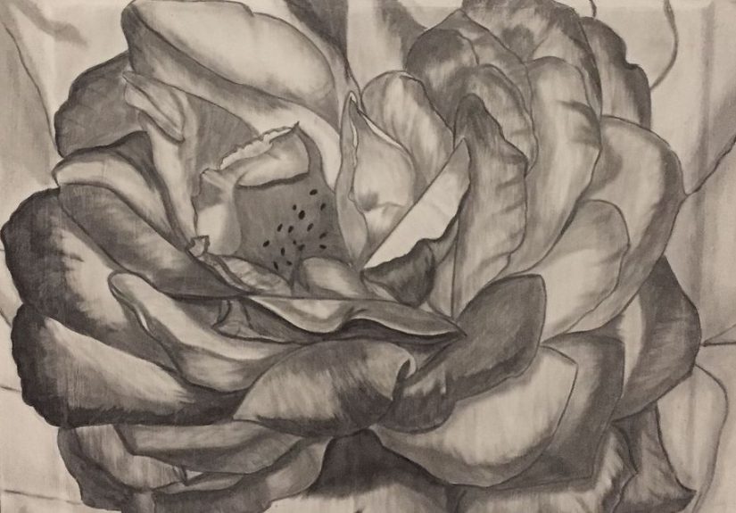
Stain shading is a decorative finishing technique that uses wood stain to create depth, form, and dimension instead of applying the stain in one flat, even coat. Rather than treating stain like a plain color wash, you use it the way an artist uses charcoal or transparent glaze. Darker areas sit where shadows would naturally fall. Softer areas get scrubbed or feathered out. Midtones connect everything so the design looks intentional instead of like a suspicious coffee spill.
The magic of stain shading comes from transparency. Paint tends to cover. Stain tends to tint. That means the grain can still show through, which gives the finished image a warmer, richer, more organic look. It is especially effective for floral motifs, leaves, scrollwork, feathers, rustic signs, botanical borders, and faux antique details. If your goal is “handmade but elegant” rather than “I attacked this with a craft brush at midnight,” stain shading is an excellent move.
Before You Begin: Think Like a Finisher, Not a Gambler
The biggest rookie mistake is jumping straight into the design before the surface is ready. Wood stain is honest to a fault. It highlights scratches, glue residue, uneven sanding, and mystery fingerprints from three hours ago. If your prep is sloppy, your shading will be too. Harsh? Yes. Helpful? Also yes.
Start with a test board made from the same wood species as your project. This is not optional unless you enjoy emotional plot twists. Different woods absorb stain differently. Pine, birch, maple, cherry, and alder are especially known for uneven absorption and blotching. A scrap board lets you test your stain color, your pressure, your blending technique, and your topcoat before you commit to the real piece.
Also, decide early what kind of look you want. Soft and smoky? High contrast and dramatic? Antique and slightly dirty in a charming way? The answer changes how dark you let the stain sit, how much you wipe back, and whether you add extra glaze or a second tone later.
Supplies for a Basic Stain Shading Setup
- Sandpaper in progressive grits, usually 120, 150, 180, and 220
- Vacuum or tack cloth for dust removal
- Pre-stain conditioner for blotch-prone woods
- Wood stain or gel stain in one or two tones
- Lint-free cloths or soft cotton rags
- Small artist brushes or foam brushes for detail work
- Cotton swabs for tiny accents and tight corners
- Pencil, chalk transfer, stencil, or projector for the design
- Clear topcoat such as polyurethane or polycrylic
- Gloves, ventilation, and a workspace where nobody needs the table in the next ten minutes
How to Do Stain Shading Step by Step
1. Prep the surface until it deserves the stain
Sand with the grain and work progressively to a finer grit. Do not start with ultra-fine paper on raw wood and call it a day. That is not prep; that is wishful thinking. Sanding removes old finish, levels filler, and creates a predictable surface so the stain behaves more evenly. Vacuum thoroughly, then wipe away the remaining dust. Any debris left behind can drag through the stain and leave dark streaks or muddy spots.
If the project has dents, scratches, or filler repairs, make sure everything is level before you move on. Shading does not hide bad prep. It spotlights it with dramatic stage lighting.
2. Use conditioner when the wood is likely to blotch
On woods like pine, birch, or maple, a pre-stain conditioner helps reduce patchy absorption. That matters a lot in stain shading because your design depends on controlled transitions. If the wood grabs stain aggressively in random places, your petal or leaf can go from “elegant shadow” to “burnt potato chip” in seconds.
Apply the conditioner evenly, wipe away the excess, and follow the label window for staining. Keep the application consistent across the whole panel so your design area and background do not absorb color differently.
3. Transfer the design lightly
Sketch your pattern with a very light hand. You can freehand it, trace it, use carbon transfer paper, or project the image onto the surface. Light outlines are enough. Dark pencil grooves and heavy marks can show through the stain and make your flower look like it has a comic-book outline problem.
Beginners do best with simple shapes that naturally forgive softness: petals, leaves, feathers, branches, or stylized botanical forms. A realistic human face in stain is ambitious. Start with something that does not require emotional support afterward.
4. Lay in the lightest tone first
Many beginners immediately chase the darkest shadows, but smart shading starts by establishing the overall tone. Apply a thin amount of stain to the design area or background, depending on your composition. Wipe away excess with the grain. This first pass gives you a base value and helps you understand how much darker your second and third passes should be.
If you are creating a flower on a tabletop, for example, you might leave the petals lighter and darken the background later. If you are making a leaf or feather, you may lay a soft midtone over the whole form first, then build the deepest shadows near the center vein, under overlapping sections, or at the base where the form tucks inward.
5. Build shadows in small sections
This is where stain shading starts to look like actual art. Apply more stain to the areas that should be darkest. Think about overlap, depth, folds, recesses, and where light would naturally miss the surface. On petals, that usually means the base, the undersides, and the areas where one petal sits behind another. On carved trim or decorative details, it means grooves, edges, and low spots.
Work in small sections so the stain does not dry before you can shape it. Put down the stain, let it sit briefly if you need more intensity, then soften the edge with a clean rag, finger wrapped in cloth, or a nearly dry brush. You are not just wiping. You are controlling the fade from dark to medium to light. The goal is a gradient, not a hard stop.
One of the best mental tricks here is to stop thinking “coloring in” and start thinking “pushing and pulling value.” Darker areas create depth. Softer transitions create realism. High contrast creates drama. Too much dark everywhere creates mud. That is not mood; that is mud.
6. Scrub, feather, and blend the edges
The best stain shading rarely comes from a perfect first stroke. It comes from blending. After applying stain, use a dry cloth to scrub and feather the edges outward. This is how you get that smooth, smoky fade that makes the design feel dimensional. If the stain is too strong, lift some off. If it is too weak, add a little more and blend again.
A useful rhythm is apply, step back, soften, compare, repeat. Do not judge the piece with your nose six inches from the surface. Stand up. Look at the whole design. Ask where the focal point is. Ask which area needs more contrast. Ask whether one side feels heavier than the other. Then adjust.
7. Use detail tools for accents
Once the big forms are working, refine the details. Cotton swabs are useful for tiny dots, stamens, speckles, and narrow highlights you want to preserve around an edge. Small brushes help define veins, tips, folds, or narrow shadow lines. A cloth-wrapped fingertip is surprisingly effective for crisp little fades and narrow shading bands.
This is also the stage where restraint matters. Details should support the main shape, not compete with it. If every petal has three outlines, five streaks, and a dramatic existential shadow, the eye has nowhere to rest. Let some areas stay soft and quiet. Contrast is strongest when it has company.
8. Deepen selectively, not everywhere
If the piece looks flat, the answer is usually not “make everything darker.” The answer is usually “make a few key areas darker.” Add deeper stain only where it improves the illusion of depth: the deepest overlaps, the core shadows, the background around the focal shape, or the recesses of carved elements. Layering stain can enrich the effect because each pass adds tone while still letting the wood show through.
This is why stain shading looks so rich when it is done well. The image is not sitting on top of the wood. It feels like it belongs to the wood.
9. Seal the piece without ruining the effect
Once the stain is fully dry, apply a protective topcoat. This step locks in your work and gives the surface the durability it needs for real-world use. Satin finishes usually keep the look elegant and forgiving. Gloss can make the contrast pop, but it also highlights every surface flaw and reflects light like it is auditioning for a mirror commercial.
Use thin, even coats and let each coat dry properly. A rushed topcoat can smear uncured stain, dull the shading, or create adhesion problems. If you want maximum depth, a clear protective finish over carefully layered stain is often what gives the project that “how did you do that?” finish.
Common Stain Shading Mistakes and How to Fix Them
Blotchy absorption
This usually comes from uneven prep, thirsty wood, or skipping conditioner on blotch-prone species. If the problem is mild, a gel stain or glaze layer can soften the contrast. If it is severe, the unhappy truth is that sanding back and starting over may be the better path.
Streaky shadows
Streaks happen when too much stain dries before it is blended or when the cloth pressure is inconsistent. Re-wet the area slightly if the product allows it, blend with the grain, and avoid dragging a dirty rag across the whole surface like a windshield wiper.
Muddy details
If everything looks brown and tired, you probably overworked the surface or darkened too many areas. Let it dry, then restore contrast by keeping the highlights cleaner and limiting your deepest darks to fewer, smarter places.
Harsh outlines
If the design looks cartoonish, soften the edges with a nearly dry cloth or brush. Realistic stain shading depends on transition more than outline. Unless your design style is intentionally graphic, softer edges usually look more convincing.
Best Beginner Projects for Practicing Stain Shading
If you are new to the technique, do not begin with your dining table, your heirloom cabinet, or the one piece of furniture your family actually likes. Practice on inexpensive wood panels, small trays, scrap boards, plant stands, signs, drawer fronts, or thrifted side tables. Good beginner motifs include magnolia petals, dahlias, fern leaves, feathers, paisleys, and simple scrollwork.
These shapes teach you the core skills: where to place darks, how to blend a fade, how to repeat a motif, and how to create drama without overcomplicating the drawing. They also give you a safe place to learn the most important finishing lesson of all: every beautiful piece started with at least one weird-looking middle stage.
Why Stain Shading Works So Well
What makes stain shading special is the balance between control and unpredictability. You control the design, the value, the blending, and the contrast. The wood contributes grain, warmth, natural variation, and character. That combination is hard to fake with opaque paint alone. The result feels handcrafted, layered, and just a little bit addictive.
It also scales beautifully. The same approach can be used for delicate petal shading on a jewelry box, antique-style glazing on a cabinet door, darkened recesses on carved trim, or a dramatic oversized floral on a tabletop. Once you understand the language of light, shadow, and transparency, the projects multiply quickly. So does your confidence.
Experience Section: What It Feels Like to Learn Stain Shading in Real Life
The real experience of learning stain shading is a funny mix of confidence, panic, surprise, and then a very strong desire to stain absolutely everything that stands still long enough. The first few minutes usually feel easy. You sand the surface, draw the design, open the stain, and think, “I am basically a finishing genius.” Then the stain touches the wood, sinks faster than expected, and suddenly you are negotiating with a flower petal that now looks like a suspicious bruise. This is normal.
One of the most common beginner experiences is realizing that stain moves differently from paint. Paint often sits where you put it. Stain has opinions. It absorbs, spreads, softens, darkens as it sits, and occasionally makes you rethink your life choices. That is why first projects tend to involve a lot of stepping back, squinting, and muttering things like, “Okay, that leaf got dramatic fast.” The good news is that stain shading becomes much easier the moment you stop trying to force it and start guiding it.
Another very real experience is discovering that your best tool may not be the fancy brush you bought with great optimism. It may be your finger wrapped in a soft cloth. It may be a humble cotton swab. It may be that one rag you almost threw away. Many people begin with brushes and then switch to cloth application because the shading becomes easier to control. You can smear less, soften faster, and create cleaner fades. It feels less like painting and more like sculpting value.
There is also a distinct moment, somewhere in the middle of the project, when the piece looks worse before it looks better. This is the emotional valley of stain shading. The background is half dark, the petals are uneven, one side is stronger than the other, and you briefly suspect that the furniture had greater potential before you got involved. Then you deepen the right shadow, soften the right edge, wipe back one heavy area, and suddenly the design wakes up. That turnaround is part of the learning curve, and honestly, it is part of the fun.
Over time, experience teaches a few things that no supply list can. First, contrast matters more than complexity. A simple flower with smart shadows usually beats an intricate pattern with timid values. Second, patience is a better tool than force. Letting the stain sit a little, wiping with intention, and layering slowly almost always looks better than trying to finish everything in one heroic pass. Third, scrap wood is not boring. Scrap wood is freedom. It is where you learn how long your stain takes to darken, how your wood species behaves, and how much pressure creates the edge you want.
The most rewarding experience, though, is the shift in how you see surfaces. After practicing stain shading, you stop looking at furniture as “table,” “drawer,” or “cabinet.” You start seeing blank panels, possible motifs, areas for contrast, and grain that could work with the design. A thrift-store side table becomes a canvas. A plain tray becomes a botanical study. A forgettable box becomes a tiny show-off piece. That is when you know the technique has really clicked. You are no longer just following a tutorial. You are designing with stain.
Final Thoughts
If you want a decorative wood-finishing technique that feels artistic without being impossibly fussy, stain shading is worth learning. It combines the depth of glazing, the warmth of stained wood, and the satisfaction of making something look far more expensive than it has any right to. Start with a test board, keep your design simple, build the shadows slowly, and let the grain help you. Your first project does not need to be flawless. It just needs enough contrast, enough softness, and enough courage to get to the finish line.
And once you finish that first successful piece, fair warning: ordinary furniture may begin to look suspiciously under-decorated.