Table of Contents >> Show >> Hide
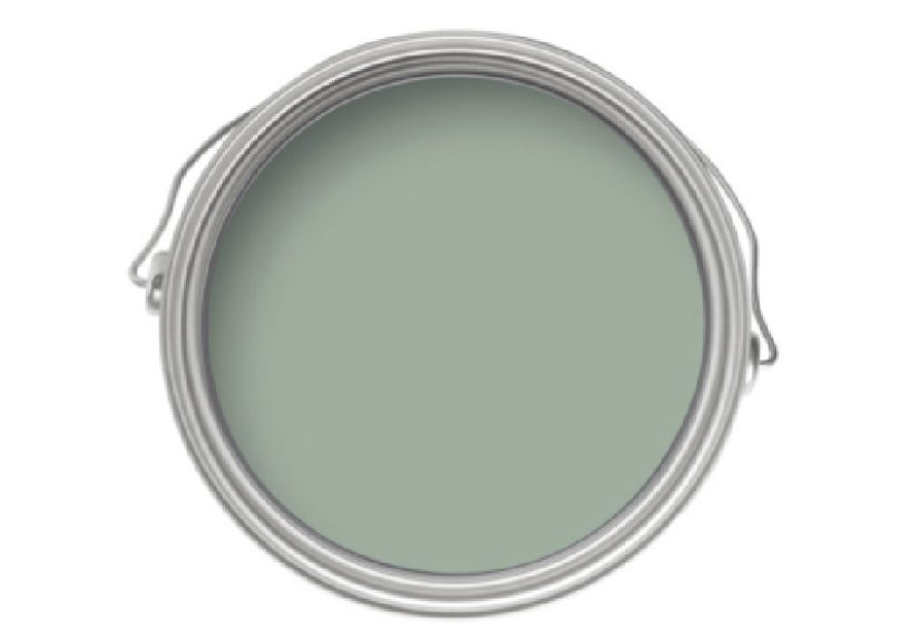
- What Exactly Is Green Blue No. 84?
- Undertones and Light: Why This Color “Changes”
- Is Green Blue No. 84 Light or Dark?
- Where Green Blue No. 84 Looks Best
- The Best Whites and Accent Colors to Pair With Green Blue No. 84
- Choosing the Right Sheen and Finish
- How to Sample Green Blue No. 84 the Right Way
- Application Tips: Getting the Color to Look Its Best
- Similar Colors and “Close Enough” Alternatives
- FAQ: Quick Answers Before You Commit
- Conclusion: Why Green Blue No. 84 Keeps Winning Fans
- Real-World Experiences With Green Blue No. 84 (What People Notice After Living With It)
- 1) The color shift is realplan for it
- 2) It’s surprisingly flattering in bathrooms
- 3) It behaves like a “color-neutral” when styled thoughtfully
- 4) Trim choices change the entire personality
- 5) The “right finish” reduces maintenance stress
- 6) It photographs beautifullybut don’t choose it for Instagram
Some paint colors behave like introverts: dependable, quiet, and basically the same in every room.
Green Blue No. 84 is not that paint color. This one is a straight-up mood ring for your walls
shifting between soft green and light blue depending on the time of day, your lighting, and what you’ve got going on in the room.
If you’ve ever wanted a color that feels calm without being boring, spa-like without screaming “live laugh lavender,”
and interesting without turning your home into a circus tent… welcome.
In this guide, we’ll break down what Green Blue No. 84 looks like in real spaces, why it’s famous for bathrooms (but not limited to them),
how to pair it with trim and finishes, and how to avoid the classic “I swear it looked different on my laptop” heartbreak.
We’ll also cover sampling tips, sheen choices, and a few near-match alternatives if you want the vibe without committing to the exact brand.
What Exactly Is Green Blue No. 84?
Green Blue No. 84 is best known as a balanced, muted blend of green and bluethink sea glass, eucalyptus mist, and that dreamy in-between
color you see where ocean meets shoreline. It’s often described as a “chameleon” shade because it can lean greener in warm light and bluer
in cooler light. That isn’t marketing fluff; it’s what happens when a color is genuinely centered between two families.
Another reason it reads so “livable” is that it tends to behave like a soft neutral when surrounded by the right supporting cast:
warm whites, natural wood, stone, linen, and metals like aged brass or brushed nickel. It’s colorful, surebut it doesn’t pick fights.
Undertones and Light: Why This Color “Changes”
Paint undertones are the sneaky sub-colors that show up when lighting and surrounding materials start meddling. Green Blue No. 84 is a prime example
of undertone dramaexcept the drama is actually kind of lovely. Because it sits so evenly between warm green and cool blue, it can swing either way.
In west-facing rooms with warm afternoon sun, it often looks greener and warmer. In north-facing rooms or shaded spaces, it tends to appear cooler,
bluer, and a bit more misty.
Quick lighting cheat sheet
- North-facing rooms: Cooler and softer; the blue side usually shows up more.
- South-facing rooms: Brighter and truer; you’ll see the “in-between” character most clearly.
- East-facing rooms: Fresh and airy in the morning; slightly calmer by afternoon.
- West-facing rooms: Warmer late-day glow; more green can emerge as sunlight turns golden.
Is Green Blue No. 84 Light or Dark?
If we’re speaking in design terms, Green Blue No. 84 lives in the “mid-light” zonenoticeably tinted, but not heavy.
Many color experts estimate its Light Reflectance Value (LRV) in the high 40s, meaning it reflects a moderate amount of light.
Translation: it won’t swallow your room whole, but it also won’t disappear like a whispery off-white.
A practical bonus: a mid-light blue-green can make smaller spaces feel intentional rather than cramped. That’s one reason this shade is
frequently suggested for bathrooms and powder roomsrooms where you want atmosphere but can’t spare the square footage.
Where Green Blue No. 84 Looks Best
1) Bathrooms that feel like a spa (without the whale sounds)
Blue-green is a classic for bathrooms because it visually cues “water,” “fresh,” and “clean,” while the green side keeps it from feeling icy.
Green Blue No. 84 is often recommended for family bathrooms because it balances warmth and freshnessespecially when paired with crisp white trim
and pale stone or tile.
Best pairings for bathrooms: warm white trim, pale gray-blue accents, light marble, brushed nickel, matte black fixtures,
and natural textures (oak, rattan, linen).
2) Bedrooms that feel calm, not clinical
If you love the idea of a blue bedroom but hate when it turns “cold hotel,” Green Blue No. 84 can be a sweet spot.
It reads soothing, gentle, and grounded. Add creamy bedding, warm woods, and soft brass, and it becomes cozy rather than coastal cliché.
3) Dining rooms and sitting rooms with “quiet personality”
This color has enough depth to look intentional in a dining roomespecially with wallpaper, art, or vintage pieces.
In some published interior spaces, Green Blue has been used as a sophisticated wall color that plays nicely with patterned textiles
and classic architectural details.
4) Cabinets, built-ins, and trim for a color-drenched look
Designers have increasingly leaned into “color drenching”painting walls and trim (and sometimes ceilings) in one color family.
Green Blue No. 84 works well here because it can read almost neutral when repeated across surfaces, especially if you keep the surrounding palette restrained.
If you want a bold-but-wearable statement, this is a strong candidate.
The Best Whites and Accent Colors to Pair With Green Blue No. 84
Trim and ceiling whites
A safe, polished approach is pairing Green Blue No. 84 with a soft, warm white on trim and ceilings. Many brands recommend a specific complementary white
chosen to share undertones, which helps the whole scheme feel “meant to be together” rather than “I picked these at 9:47 p.m. under a lamp.”
- Warm whites: help pull out the green warmth and keep the room inviting.
- Clean/cool whites: sharpen the blue side and feel more modern, especially with sleek finishes.
Accent colors that play nicely
- Soft gray-blue: reinforces the airy, water-inspired vibe (great for towels, rugs, or an adjacent room).
- Warm greige or sandy neutrals: balance the coolness and make it feel more grounded.
- Inky navy or charcoal: adds contrast for a tailored, classic look.
- Dusty blush or muted terracotta: gives a modern, lived-in warmth (especially good with brass).
Choosing the Right Sheen and Finish
Color is only half the story; sheen changes how the color reads and how it performs. More sheen reflects more light, which can make the color look brighter
and also highlight wall imperfections. Less sheen feels softer and more “velvety,” but may be less forgiving in high-moisture or high-traffic areas
unless you choose a product engineered for it.
Bathrooms and moisture-prone rooms
In bathrooms, look for finishes designed to resist moisture and to clean easily. Many painting guides suggest satin or eggshell for bathroom walls because
they’re easier to wipe down than dead-flat finishes. If you prefer a more matte look, choose a durable matte product specifically labeled for kitchens/baths
or with mold/mildew resistance.
Living rooms, bedrooms, and low-traffic spaces
Matte or low-sheen finishes can be gorgeous heresoft, calm, and flattering. If your walls have dings or texture inconsistencies, lower sheen can be your
best friend (it hides the crimes).
Trim, doors, and cabinetry
For woodwork, go tougher and slightly shinier. You’ll want a finish that can handle fingerprints, scuffs, and “why is there jam on the doorframe?”
(A question that haunts parents and snackers alike.)
How to Sample Green Blue No. 84 the Right Way
If there’s one rule worth tattooing on a painter’s tape roll, it’s this: don’t trust the tiny chip. Paint shifts on a full wall and under
real lighting. Testing correctly saves you money, time, and emotional stability.
Sampling steps that actually work
- Test more than one shade. Pick 3–5 similar blue-green options so you can see subtle differences.
- Go big. Use a large sample area (or a movable board) so you’re not judging a color in postage-stamp mode.
- Move it around. Try at least two walls if your room has uneven lighting.
- Watch it all day. Morning, afternoon, eveningthis is how you catch the “chameleon” effect.
- Compare undertones. Hold your sample next to a true white and a true blue/green reference to reveal what’s hiding underneath.
Application Tips: Getting the Color to Look Its Best
A color like Green Blue No. 84 rewards good prep. The smoother the wall and the more consistent the base, the more “even” and intentional the final result looks.
Skipping prep is how you end up blaming the color for what was actually a drywall situation.
- Prep matters: clean, patch, sand, and prime so the finish looks uniform.
- Use the recommended primer tone: mid-tone primers often help saturated/mid colors reach full depth faster.
- Two coats minimum: especially for nuanced colors that can flash if coverage is uneven.
- Ventilation in bathrooms: humidity affects dry time and can lead to dull patches if you rush.
- Pick the right tools: a quality roller cover reduces stipple and helps the color read smoother.
Similar Colors and “Close Enough” Alternatives
If you love the Green Blue No. 84 vibe but want an easier-to-find or different-budget option, there are several close cousins in other paint lines.
Be aware: “similar” isn’t “identical.” Differences in pigments, base formulas, and sheen can shift the final look.
Still, these are often mentioned as nearby matches:
- Benjamin Moore Catalina Blue: a close muted green-blue with a slightly grayer feel.
- Sherwin-Williams Quietude: a similar calm tone that can read a touch greener depending on the setting.
- Other muted blue-greens: consider gentle sea-salt, spa, or misty teal families and compare undertones in your room.
FAQ: Quick Answers Before You Commit
Is Green Blue No. 84 warm or cool?
Bothdepending on light and surroundings. It can lean greener (warmer) in golden light and bluer (cooler) in shaded or north-facing light.
That flexible personality is a big part of its appeal.
Will it make a small bathroom feel smaller?
Usually not, especially if you keep trim and ceilings light and use reflective finishes strategically (mirrors, bright fixtures, light tile).
Because it’s mid-light and not overly saturated, it often feels enveloping rather than heavy.
What’s the safest trim color?
A soft white with compatible undertones. If you want the blue side to pop, go cleaner and crisper on trim. If you want a warmer, cozier feel,
choose a warmer white.
Can I color-drench with it?
Yes. Many designers recommend using the same shade on walls and trim for a modern, immersive lookespecially when the color is nuanced rather than neon.
Keep furnishings and textiles in a tight palette so the room feels intentional, not chaotic.
Conclusion: Why Green Blue No. 84 Keeps Winning Fans
Green Blue No. 84 is the rare color that feels fresh and timeless. It’s calm without being sleepy, colorful without being loud,
and versatile enough to move from bathroom to bedroom to dining room without feeling like you’re forcing a theme.
If you want a paint color that looks curated but still easy to live withthis is one of the best candidates in the blue-green universe.
Real-World Experiences With Green Blue No. 84 (What People Notice After Living With It)
Below are experience-based observations homeowners and designers commonly report when they use Green Blue No. 84 in real spaces.
Consider this the “post-honeymoon reality check”except in this case, the relationship usually gets better with time.
(Unlike that trendy chair you bought online that looked “sculptural” and turned out to be “un-sittable.”)
1) The color shift is realplan for it
One of the first things people notice is how dramatically the shade can change throughout the day. Morning light might make it feel airy and
slightly bluer, like a pale coastal haze. By late afternoonespecially in warmer, west-facing lightit can look more green, more botanical, and a bit deeper.
At night under warm bulbs, it often becomes cozier and reads like a soft green-blue neutral. The takeaway: if you love it at only one time of day,
you’re not done testing. Most happy users are the ones who appreciate the shifting effect rather than expecting a single “frozen” look.
2) It’s surprisingly flattering in bathrooms
Bathrooms have a reputation for being harsh spaces: overhead lighting, mirrors, white fixtures, and reflective tile can make some colors look stark.
People often report that Green Blue No. 84 softens the room without making it dingy. The green component brings warmth (so you don’t feel like you’re
brushing your teeth inside a glacier), while the blue keeps it clean and fresh. Many find it especially pleasing with warm white trim and simple, calm materials:
white tile, light stone, and brushed metal fixtures.
3) It behaves like a “color-neutral” when styled thoughtfully
A common surprise: once the whole room is pulled together, Green Blue No. 84 doesn’t always read as a “bold color.”
In homes with lots of natural texturesoak floors, woven baskets, creamy linensit can feel as easy as a gray, just more alive.
That’s why people who were initially nervous about painting an entire room often end up wishing they’d gone bigger sooner:
it stops feeling like an accent and starts feeling like atmosphere.
4) Trim choices change the entire personality
Users frequently mention that the trim color is the make-or-break decision. Pair it with a warmer white and the room feels softer, calmer, and slightly more traditional.
Pair it with a clean, crisp white and it becomes sharper and more modern, with the blue notes showing up more clearly.
If you’re torn, many people test two whites on trim samples next to the wall color before committingbecause swapping trim later is the sort of “weekend project”
that mysteriously lasts until the next presidential election.
5) The “right finish” reduces maintenance stress
In family homes, a repeated theme is durability. People who use a bathroom-appropriate, wipeable finish (or a scrubbable matte designed for busy rooms)
report being much happier long-termespecially in kids’ baths, hallways near powder rooms, or laundry areas where splashes and fingerprints are part of life.
When the finish is right, the color feels luxurious and practical. When it’s wrong, you’ll be spot-cleaning like it’s a competitive sport.
6) It photographs beautifullybut don’t choose it for Instagram
Yes, it photographs well. But people also notice that phone photos can exaggerate the green or blue side depending on camera settings and lighting.
Many homeowners learn to trust what they see with their own eyes over what their phone decides is “accurate.”
The happiest stories usually come from people who chose the color because it made the room feel good in real lifenot because it matched a saved pin.