Table of Contents >> Show >> Hide
- Start With the Wood’s Undertone, Not the Wood’s Name
- Match Temperature First, Then Decide on Contrast
- The Best Color Families for Wood Furniture and Floors
- How to Pair Colors With Specific Wood Tones
- Do Not Forget LightingIt Changes Everything
- Can You Mix Different Wood Tones? Yes, Absolutely
- Simple Room-by-Room Examples
- Mistakes to Avoid
- Final Thoughts
- Real-World Experiences and Practical Lessons From Decorating With Wood
- SEO Tags
Wood has a funny way of acting like the quiet person at a party who somehow controls the whole mood of the room. Your walls may be painted, your sofa may be fabulous, and your throw pillows may be trying very hard, but if your wood furniture and floors are sending one message while your color palette is sending another, the room can feel a little off. Not tragic. Not haunted. Just… confused.
The good news is that choosing colors that complement wood furniture and floors is less about memorizing designer jargon and more about learning to spot undertones, balance contrast, and respect the lighting in the room. Once you understand those three things, decorating becomes much easier. You stop guessing and start making decisions that actually make the wood look richer, warmer, lighter, cozier, or more dramaticdepending on what you want.
In this guide, we’ll break down how to work with warm woods, cool woods, light floors, dark furniture, mixed finishes, and tricky rooms that look completely different at 8 a.m. than they do at 8 p.m. We’ll also go through specific color families that tend to work beautifully with wood and explain why they do. By the end, you’ll know how to create a room that feels intentional instead of “I bought the paint first and panicked later.”
Start With the Wood’s Undertone, Not the Wood’s Name
The biggest mistake people make is talking about wood in broad labels like “brown,” “oak,” or “dark.” That is a little like describing every dog as “furry.” Technically true. Deeply unhelpful.
Wood has undertones, just like paint does. Some woods lean yellow, orange, golden, or red. Others lean gray, taupe, ash, or even slightly greenish-brown. The undertone is what determines whether a wall color will look harmonious or awkward next to it.
Common wood undertone categories
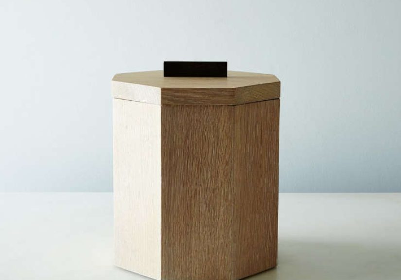
- Warm woods: honey oak, cherry, maple, hickory, walnut with amber, red, orange, or golden notes
- Cool woods: gray-washed oak, ash, weathered finishes, smoked woods, taupe-brown stains
- Neutral woods: some white oaks, medium browns, and balanced stains that do not read strongly warm or cool
Before you pick wall paint, hold a few white paper sheets next to your floor or furniture in daylight. The white makes undertones easier to see. If the wood suddenly looks yellow, red, or orange, you are dealing with warmth. If it looks smoky, muted, or slightly gray, it is leaning cool. That one little test saves a shocking amount of decorating regret.
Match Temperature First, Then Decide on Contrast
Once you know whether the wood is warm or cool, the next decision is whether you want the room to feel blended and calm or bold and dramatic.
If you want a soft, cohesive look, stay within a similar temperature family. Warm wood usually looks beautiful with warm whites, creamy neutrals, greige, taupe, soft beige, muted terracotta, olive, and warm sage. Cool wood tends to shine with crisp whites, blue-grays, soft charcoals, dusty greens, cool taupes, and restrained blues.
If you want contrast, that works toobut it should still feel intentional. Dark wood furniture can look stunning against pale walls. Blonde floors can look sophisticated against moody paint. The trick is to create contrast in depth without creating a color war. Think “interesting tension,” not “these two colors are no longer on speaking terms.”
High-contrast vs. low-contrast rooms
High contrast: dark walnut floors with creamy off-white walls, or light oak flooring with a deep charcoal or navy accent wall. This approach highlights the wood and gives the room definition.
Low contrast: medium brown wood with taupe walls, or dark cherry furniture with a moody green-brown backdrop. This creates a quieter, layered look that feels cozy and polished.
The Best Color Families for Wood Furniture and Floors
You do not need a single “perfect” shade before moving forward. What you really need is the right color family. Once you get the family right, narrowing down the exact paint becomes far less painful.
1. Warm whites and soft creams
These are classic for a reason. Warm whites flatter most wood tones because they soften contrast and keep the room from feeling stark. They are especially good with darker wood furniture, red-brown finishes, and honey-toned floors. A creamy white can make antique wood feel fresh without stripping away its character.
What to avoid: icy whites with warm wood. They can make yellow or red undertones in the wood look louder than intended and sometimes a bit dated.
2. Greige, taupe, and beige
If neutrals had a reliable best friend award, greige would win. It bridges beige and gray, which makes it useful when your wood has mixed undertones or when you want flexibility. Taupe and warm beige are especially attractive with oak, walnut, and cherry because they feel grounded without stealing attention.
This family works well in living rooms, hallways, bedrooms, and open-plan spaces where the wood needs to coexist with a lot of other materials.
3. Sage, olive, and earthy greens
Green is one of the most forgiving companions for wood because it feels natural next to a natural material. Soft sage pairs beautifully with light to medium warm woods, while olive can enrich darker woods and more traditional furniture. Green also helps wood read intentional rather than heavy.
If your room is packed with woodfloors, table, trim, cabinets, shelvesa muted green can break up the brown without fighting it.
4. Dusty blues and blue-greens
Blue is a great partner for warm wood because it offers contrast without chaos. Soft blue-gray, smoky blue, and muted teal can make amber floors or cherry furniture look more sophisticated. Blue-greens are especially effective when you want the room to feel relaxed but not sleepy.
With very orange-toned wood, a dusty or slightly grayed blue usually works better than a bright sky blue. Muting the color helps the room feel grown-up.
5. Charcoal, deep green, and moody colors
If you love drama, wood is your ally. Rich wood furniture looks gorgeous against dark, saturated walls. Think charcoal, forest green, inky blue, or deep brown-gray. This palette makes a room feel cocoon-like, elegant, and expensive in the best possible way.
The key is balance. Add lighter bedding, art, rugs, trim, or lamps so the room does not feel like it is preparing for a Victorian séance.
6. Terracotta, clay, and muted rust
These shades are warm, earthy, and especially good with natural wood furniture, medium walnut, and lighter oak floors. They create warmth without going full pumpkin-spice-lobby. Muted clay tones can be especially inviting in dining rooms, entryways, and bedrooms where you want warmth and softness.
How to Pair Colors With Specific Wood Tones
Light wood floors: maple, white oak, pale ash
Light wood floors are versatile because they can feel Scandinavian, coastal, modern, or traditional depending on the colors around them. Good pairings include warm white, soft greige, sage, dusty blue, and muted charcoal. If the floor leans yellow, keep the wall color slightly creamy or earthy. If it leans ashy, cooler grays and cleaner whites can work better.
Medium wood floors: classic oak, chestnut, balanced brown stains
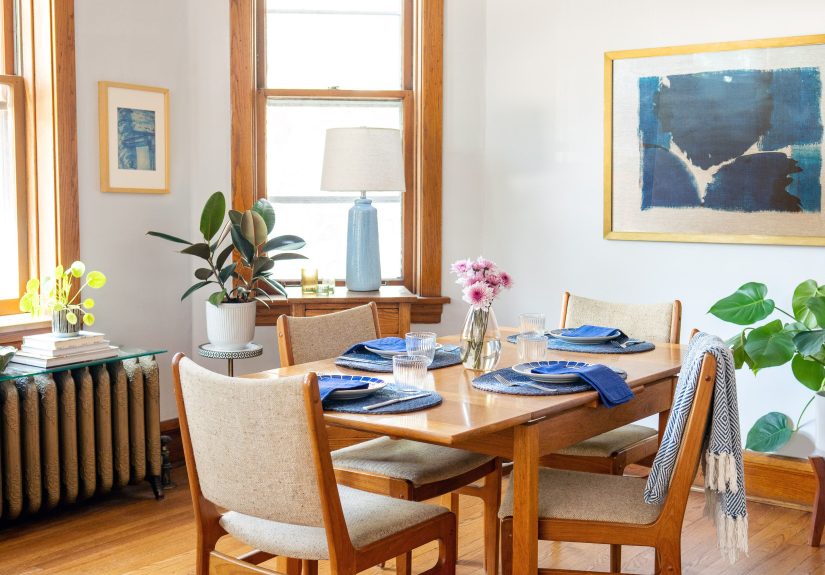
Medium woods are easiest to decorate around because they rarely dominate the room. They work well with taupe, soft mushroom, olive, warm white, navy, slate blue, and earthy green. These floors are the diplomacy majors of the design world: easy to get along with and surprisingly adaptable.
Dark wood floors: walnut, espresso, mahogany
Dark floors can look luxurious, but they need thoughtful contrast. Pair them with off-white, cream, pale greige, putty, misty blue, or muted green to brighten the room. If you want a dramatic look, echo the depth with darker walls but add enough light textiles and reflective surfaces to keep the room open.
Orange or red-toned wood
This is where many people panic. Do not fight red or orange-toned wood with the wrong gray. Instead, calm it down with soft blue-green, dusty teal, warm white, mushroom, olive, or gentle greige. The right contrast can modernize these finishes without pretending they are something they are not.
Do Not Forget LightingIt Changes Everything
A paint color that looks angelic in a showroom can turn moody, muddy, or oddly minty once it meets your actual room. Natural light direction matters. Artificial bulbs matter. Even the time of day matters.
General lighting rules
- North-facing rooms: cooler light, so warm whites and warmer neutrals often help balance the chill
- South-facing rooms: stronger warm light, so both warm and cool colors can work depending on the desired mood
- East-facing rooms: bright in the morning, cooler later in the day
- West-facing rooms: softer in the morning and warmer, more amber later in the day
Always sample paint next to your wood furniture or floors and look at it in daylight, lamplight, morning light, and evening light. This is not overthinking. This is preventing your “soft beige” from becoming “mysterious peach” after sunset.
Can You Mix Different Wood Tones? Yes, Absolutely
You do not need every wood finish in a room to match. In fact, rooms with all identical wood pieces can feel flat, heavy, or overly staged. Mixing wood tones adds depth and makes a space feel collected over time.
The trick is to keep the undertones compatible. Warm woods can mix with other warm woods. Cool woods can mix with other cool woods. Neutral wood is the social butterfly that can often bridge both. Contrast is welcome, but the base tone should not feel random.
How to make mixed woods look intentional
- Repeat each wood tone at least twice somewhere in the room
- Use rugs, upholstery, metal, stone, or glass to break up large areas of wood
- Let one wood tone dominate while the others support it
- Keep the palette grounded with one shared color family on the walls
If you have oak floors, walnut furniture, and a reclaimed pine table, do not panic. Add a soft rug, linen curtains, and a balanced wall color, and suddenly the room looks layered instead of accidental.
Simple Room-by-Room Examples
Living room with dark walnut furniture and medium oak floors
Try warm off-white walls, olive pillows, a muted blue-gray rug, and brass or black accents. The palette keeps both wood tones grounded while giving the room air and contrast.
Bedroom with cherry dresser and dark wood bed frame
Choose a moody but soft wall color such as dusty green, warm taupe, or deep blue-green. Add white bedding, a textured cream throw, and light curtains to prevent the room from feeling heavy.
Dining room with light oak table and pale wood floors
Use sage, clay, or soft mushroom on the walls. These tones add depth without overpowering the natural warmth of the wood. Black dining chairs or dark metal lighting can add crisp contrast.
Home office with gray-stained wood floor
Go with clean white, blue-gray, muted green, or even a soft charcoal accent wall. Cool undertones keep the space feeling cohesive and focused.
Mistakes to Avoid
- Choosing paint before studying the wood: the room should respond to fixed elements, especially floors
- Using the wrong white: some whites are warm, some are cool, and the wrong one can make wood look too yellow, pink, or dull
- Overusing gray with warm wood: some grays can make orange or red undertones look harsher
- Ignoring lighting: samples are not optional when wood is involved
- Matching everything too closely: a room needs variation to feel rich and lived-in
- Letting wood dominate every surface: bring in fabric, paint, art, and texture for relief
Final Thoughts
Choosing colors that complement wood furniture and floors is really about reading the roomliterally. Start by identifying whether the wood feels warm, cool, or neutral. Then decide whether you want the palette to blend softly or create contrast. From there, let lighting guide your final choice and use texture to soften spaces that feel too woody or visually heavy.
Wood is timeless because it already carries color, movement, and character. Your job is not to overpower it. Your job is to give it good company. The right wall color, rug, trim, and accents can make everyday wood furniture and floors look custom, layered, and beautifully intentional. And that is much better than spending three weekends staring at paint chips while whispering, “Why does this beige look angry?”
Real-World Experiences and Practical Lessons From Decorating With Wood
One of the most common experiences people have when decorating around wood furniture and floors is assuming the wood will behave like a neutral that matches everything. Then the paint goes up, and suddenly the floor looks more orange, the dresser looks redder, and the entire room feels warmeror colderthan expected. That happens because wood is never just “brown.” It reacts to the colors around it. In real homes, this is often the moment when people realize that undertones matter more than the label on the stain.
Another very relatable experience is falling in love with a paint color online, in a magazine, or in a store, only to discover it looks completely different at home. A soft gray in the sample card can turn blue next to ash-toned floors. A creamy white can look too yellow next to maple. A nice greige can suddenly go pink beside cherry furniture. This is why experienced decorators almost always sample first and live with the swatch for a day or two. What looks calm at noon may look muddy at sunset, especially in rooms with strong western light.
Many homeowners also discover that dark wood furniture feels less “heavy” when the room includes softer materials. A plush rug, woven shades, linen curtains, boucle chairs, or even matte pottery can completely change the mood. The wood stops feeling dominant and starts feeling intentional. This is one of the most practical lessons in decorating: color does not work alone. Texture is often the secret ingredient that makes a palette feel balanced.
There is also the experience of mixing wood tones, usually by necessity rather than design ambition. Maybe the floor came with the house, the dining table was inherited, and the media console was bought three years later during a midnight online shopping moment that felt wise at the time. Surprisingly, these rooms can end up looking richer than rooms where everything matches exactly. Once people stop trying to force a perfect match and instead focus on compatible undertones and enough contrast, the room starts to feel layered, relaxed, and real.
Perhaps the most helpful long-term lesson is this: the best color choices tend to feel steady, not shouty. A wall color that supports the wood in morning light, evening light, and all four seasons will usually outlast trendier choices that look dramatic for five minutes and exhausting forever after. In practice, that means people often end up happiest with nuanced colorswarm whites, earthy greens, soft taupes, dusty blues, and muted clay tonesbecause those shades give wood room to look beautiful without turning the room into a design argument.