Table of Contents >> Show >> Hide
- What Makes a Great Bedroom Color Scheme (Spoiler: It’s Not Just the Walls)
- How to Choose Bedroom Colors in 5 Steps (Without Spiraling)
- 8 Bedroom Color Schemes That Consistently Look Good
- Common Bedroom Color Mistakes (And Easy Fixes)
- Conclusion: Your Best Bedroom Color Scheme Is the One You’ll Love at Night
- Real-World Experiences With Bedroom Color Schemes (The Stuff That Happens After the Paint Dries)
Picking a bedroom color scheme sounds easy until you’re standing in the paint aisle holding seven “almost the same” swatches, questioning every life choice that led you here. (Why are there 43 versions of “warm white” and why do they all look like different kinds of milk?)
The good news: you don’t need a design degree or psychic powers to choose bedroom paint colors that feel calm, stylish, and actually you. You just need a simple systemplus a few tried-and-true palettes that work in real American homes with real lighting, real furniture, and real “I do not want to repaint this again” energy.
What Makes a Great Bedroom Color Scheme (Spoiler: It’s Not Just the Walls)
A bedroom color scheme is the full mix: wall color, trim, ceiling, bedding, rugs, curtains, wood tones, metal finishes, and the little accents that make the room feel finished. The best schemes do three things:
- Support sleep: soft contrast, gentler saturation, and a mood that doesn’t scream “conference room.”
- Work with your light: north-facing cool light and warm afternoon sun don’t treat paint the same.
- Stay flexible: you can swap pillows or art without the room falling apart like a bargain bookshelf.
If you’re optimizing for rest, most people gravitate toward calm bedroom colors: soft whites, warm neutrals, muted blues and greens, and deeper shades like navy or charcoal used thoughtfully (not as a jump scare).
How to Choose Bedroom Colors in 5 Steps (Without Spiraling)
1) Start with what isn’t changing
Look at your “non-negotiables”: flooring, a big rug, a headboard, a dresser you love, or that quilt your aunt will absolutely ask about if it’s missing. Your color palette should play nice with these pieces.
2) Decide the vibe in plain English
Don’t overthink it. Choose one: hotel calm, cozy cottage, clean and airy, moody and dramatic, or bright and happy. Your vibe determines saturation (how strong the color is) and contrast (how bold the differences are).
3) Use the 60–30–10 rule
This is the easiest “designer math” you’ll ever do:
- 60% = dominant (walls or bedding in a neutral room)
- 30% = secondary (bedding, rug, drapes, large furniture)
- 10% = accent (pillows, art, lamp shades, a bench, a spicy little throw)
4) Watch undertones like a hawk
Undertones are the secret sauce (or secret sabotage). Two paints can both be “white,” but one leans creamy/yellow and another leans gray/blue. Pair the wrong undertone with your floor or bedding and suddenly your “calming bedroom colors” feel… vaguely seasick.
Quick trick: compare your swatches against a plain sheet of white paper. Undertones show up fast when there’s a clean reference.
5) Sample in the room, not on your phone
Paint looks different at 8 a.m., 2 p.m., and 10 p.m. Tape large samples to multiple walls and live with them for a couple days. Your future self (who wants to sleep, not repaint) will thank you.
8 Bedroom Color Schemes That Consistently Look Good
Below are eight bedroom color ideas with specific, easy-to-execute palettes. Use them exactly as written or treat them like a menu: pick a base, choose a supporting color, and sprinkle in accents until it feels like home.
1) Warm White + Natural Wood + Matte Black
Why it works: Warm whites feel cozy instead of clinical, wood adds warmth, and black brings crisp definition. This is the “clean-but-not-cold” classic for modern, Scandinavian, and transitional bedrooms.
- Walls: Sherwin-Williams Alabaster (SW 7008) or Behr Blank Canvas (DC-003)
- Secondary: light oak, walnut, or rattan textures
- Accents: matte black picture frames, curtain rods, or bedside lamps
Pro move: Keep bedding in warm whites/ivory and add contrast with a charcoal throw so the room reads soft, not flat.
2) Soft Sage + Cream + Brass
Why it works: Sage is one of the most popular calming bedroom colors because it reads “nature” without feeling like you moved into a houseplant. Creamy whites keep it warm and restful.
- Walls: a muted sage or gray-green (think “soft garden,” not “traffic light”)
- Secondary: cream bedding, linen curtains, textured ivory rugs
- Accents: warm brass hardware, antique gold frames, or honey-toned wood
Pro move: Add one darker anchor (olive pillow, deep green art) to keep sage from drifting into “too sweet.”
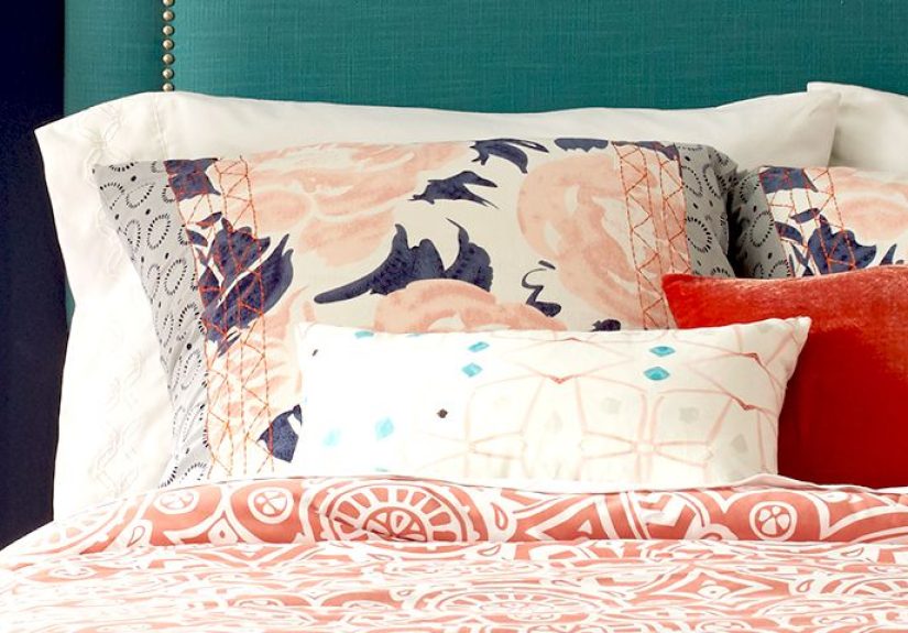
3) Dusty Blue + Crisp White + Navy
Why it works: Blue is a go-to for bedrooms for a reasonit’s visually quiet. Dusty blue feels relaxed; navy adds structure; white keeps it fresh.
- Walls: a soft, muted blue (dusty denim vibes)
- Secondary: white bedding and trim for brightness
- Accents: navy pillows, a navy upholstered headboard, or deep blue curtains
Pro move: If you’re nervous about navy, use it in textiles first. You can always promote it to “accent wall” later.
4) Greige + Blush + Walnut
Why it works: Greige (that perfect gray-beige middle) is a neutral bedroom palette MVP. Add blush for softness and walnut for grounded warmth. It’s cozy, flattering, and quietly romantic without going full “valentine aisle.”
- Walls: a warm greige or mushroom tone
- Secondary: blush bedding, rose-toned throws, or dusty pink curtains
- Accents: walnut furniture, cognac leather, or woven baskets
Pro move: Keep blush muted (dusty rose) so it feels grown-up and timeless.
5) Charcoal + Linen + Cognac
Why it works: This is “boutique hotel,” at home. Charcoal walls can make a bedroom feel cocooned and restful when you balance them with light textiles and warm leather/wood.
- Walls: charcoal or near-black on one wall (or all walls if you’re brave and the room gets decent light)
- Secondary: linen bedding, off-white rugs, soft cream drapery
- Accents: cognac leather bench, brass sconce, warm wood nightstands
Pro move: Add layered lightingtable lamps, sconces, and warm bulbsso the dark color feels luxe, not cave-ish.
6) Terracotta + Sand + Olive
Why it works: Earth tones create instant warmth and comfort. Terracotta is energetic without being loud; sand is a soft neutral; olive adds depth. Great for boho, Spanish, southwestern, and modern organic bedrooms.
- Walls: terracotta as an accent wall or muted clay tone throughout
- Secondary: sandy beige bedding and jute or sisal textures
- Accents: olive pillows, vintage brass, dark wood frames
Pro move: Mix textures (linen, chunky knits, woven baskets). Earthy palettes look best when they feel touchable.
7) Lavender-Gray + Warm White + Antique Gold
Why it works: Lavender doesn’t have to be “kids’ room.” When it’s dusty and gray-leaning, it reads soft, sophisticated, and calmingespecially paired with warm white trim and golden accents.
- Walls: a muted lavender, lilac, or violet-gray
- Secondary: warm white bedding and creamy rugs
- Accents: antique gold mirror, brass lamp, soft blush artwork
Pro move: Keep patterns subtle (tone-on-tone) so the palette stays serene.
8) Blue-Green + Bright White + Light Oak
Why it works: Blue-green shades hit the sweet spot: fresh like coastal air, grounded like a forest trail. They pair beautifully with bright whites and pale woods for a clean, uplifting bedroom color scheme.
- Walls: Benjamin Moore Quiet Moments (1563) for a gentle blue-gray, or a similar soft blue-green
- Secondary: bright white trim, crisp bedding, simple curtains
- Accents: light oak furniture, brushed nickel, woven textures
Pro move: Add one “warm” element (tan leather, beige rug) so the room doesn’t lean too cool.
Common Bedroom Color Mistakes (And Easy Fixes)
- Going too bright too fast: If a color feels loud, try a muted version (add gray to the idea) or use it as a 10% accent.
- Ignoring the ceiling: A ceiling that’s too stark can make walls look dingy. Consider a softer white overhead.
- Clashing undertones: If your “neutral” looks weird next to your floors, it’s undertone drama. Swap to a neutral that matches the floor’s warmth or coolness.
- Not enough contrast: All-mid-tones can feel bland. Add crisp trim, darker accents, or texture for dimension.
Conclusion: Your Best Bedroom Color Scheme Is the One You’ll Love at Night
Trends come and go, but sleep is forever. Start with your light, your fixed pieces, and the mood you want. Build a palette with a reliable neutral, a supportive secondary color, and a handful of accents. Then sample like a responsible adult who does not want to spend another weekend painting.
Whether you land on a soft neutral bedroom palette, a moody navy moment, or a sage-and-cream sanctuary, the goal is the same: a room that feels like a deep exhale.
Real-World Experiences With Bedroom Color Schemes (The Stuff That Happens After the Paint Dries)
Here’s the part no one tells you: the “best” bedroom paint colors aren’t just about taste. They’re about real lifelighting changes, messy closets, mismatched furniture you swear you’ll replace “someday,” and the fact that your bedding probably rotates between “freshly washed” and “I’ll do laundry tomorrow” more often than you’d like to admit.
One of the most common experiences homeowners report is color shockthat moment when a paint looks perfect on the tiny swatch, then suddenly feels twice as intense on four walls. This happens constantly with blues and greens. The fix is simple: choose a shade that’s one or two steps softer than your first instinct, especially if your bedroom gets strong daylight. Muted colors tend to feel calmer and more expensive over time, while highly saturated shades can feel energizing (which is great for a gym, less great for a place where you’re trying to fall asleep).
Another real-life lesson: undertones become louder at night. Warm bulbs pull warm (yellow/cream) undertones forward, and cool LEDs can turn certain grays a little icy. That’s why so many people paint a “safe gray” and wake up to walls that read faintly purple, green, or blue depending on the lamp. The practical move is to test samples under your nighttime lighting, not just during the day. If you watch TV in bed with lamps on, test your paint in “Netflix mode,” not “sunlit morning mode.”
Many people also discover that a bedroom color scheme lives or dies by contrast. A room can be painted the prettiest greige on Earth and still feel blah if everything else sits in the same middle tone. The game-changer is adding clear contrast in trim, bedding, or accents. For example: if your walls are mid-tone, go brighter on bedding and trim; if your walls are light, bring in deeper accents (navy, charcoal, black frames, dark wood). This is why “all beige everything” sometimes looks like a rental, while “beige + black + wood” looks intentional.
In smaller bedrooms, people often worry dark colors will shrink the spacebut a lot of real rooms prove the opposite can happen. Deep navy or charcoal can make the edges visually recede, creating a cozy, enveloping feel that reads sophisticated (especially with good lighting and light textiles). The key is balance: pair dark walls with lighter bedding, reflective accents (mirrors, metal), and layered lamps so the room stays inviting rather than heavy.
Finally, there’s the most human experience of all: your taste changes slower than your shopping cart. That trendy bright color you love today might feel exhausting in a year. That’s why many designers recommend putting “trend” into accentspillows, art, throws, even a painted nightstandwhile keeping the main bedroom color scheme grounded in timeless neutrals, softened blues/greens, or moody classics like navy. It’s not boring; it’s strategic. You get a bedroom that feels great now and still makes sense later.